Most mornings, I grab my phone before I’m even fully awake, just tapping through apps out of habit. Checking balances, looking at prices, maybe opening a wallet or two. But if something feels confusing or slow, I close it instantly. That’s exactly how I felt when I first opened the Pixels dashboard, except this time, I didn’t close it. It felt calm, simple, and surprisingly easy to move through, like it wasn’t trying too hard to impress me.
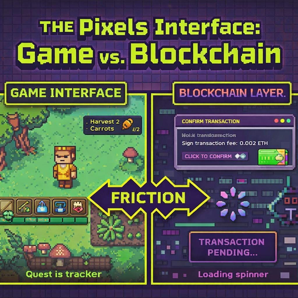
What really stood out to me was how natural everything felt. I didn’t have to think about where to click or what anything meant. It reminded me more of a game than a typical crypto platform. Instead of overwhelming me with information, it let me explore at my own pace. The more I clicked around, the more I understood, without feeling like I was learning something complicated.
I also noticed how it changed my behavior. Usually, I open crypto apps with a purpose and leave quickly. But here, I stayed longer. I explored things I didn’t plan to. It didn’t feel like a task anymore, it felt like an experience. That kind of design makes a big difference because it removes hesitation and makes users feel comfortable.
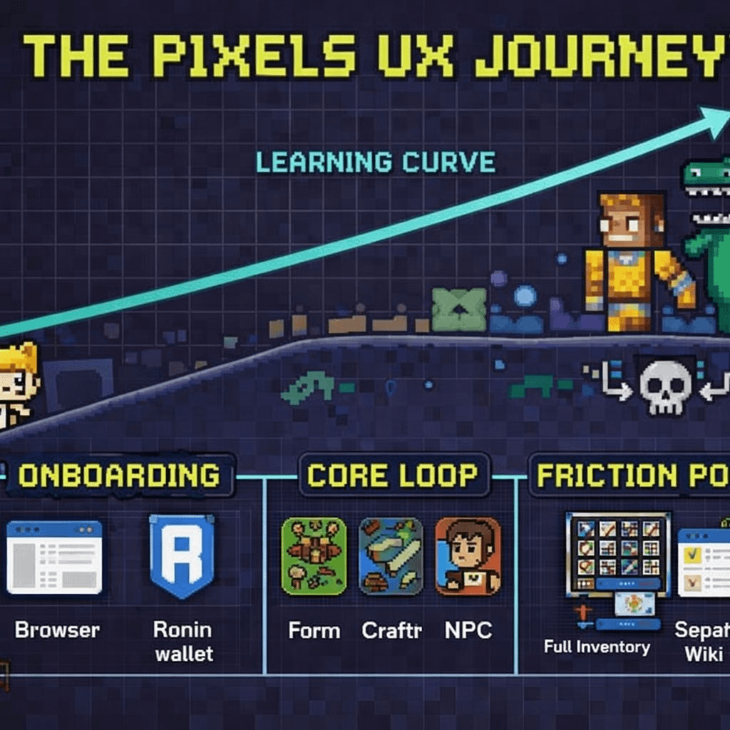
In the bigger picture, Pixels shows where crypto is heading. People don’t want complex dashboards anymore, they want something simple, clear, and human. If platforms continue moving in this direction, crypto could become something people use daily, not just occasionally. And honestly, that’s what makes this kind of experience so important.