I’ve tried enough Web3 game interfaces to recognize a pattern almost immediately.
Buttons that don’t explain themselves.
Menus that assume you already understand the system.
Wallet connections that fail silently, leaving you unsure whether the issue came from you or the product.
It’s not just a few bad designs, it’s a broader problem across the space. Many Web3 games are built by people who understand blockchain technology deeply, but not always the experience of someone using the product for the first time.
So when I opened Pixels, I was expecting the usual friction.
The first surprise was how easy it was to get started.
The dashboard is browser-based, which already removes a major barrier. No downloads, no extra launchers just connect your Ronin wallet and you’re in.
That simplicity matters more than it seems.
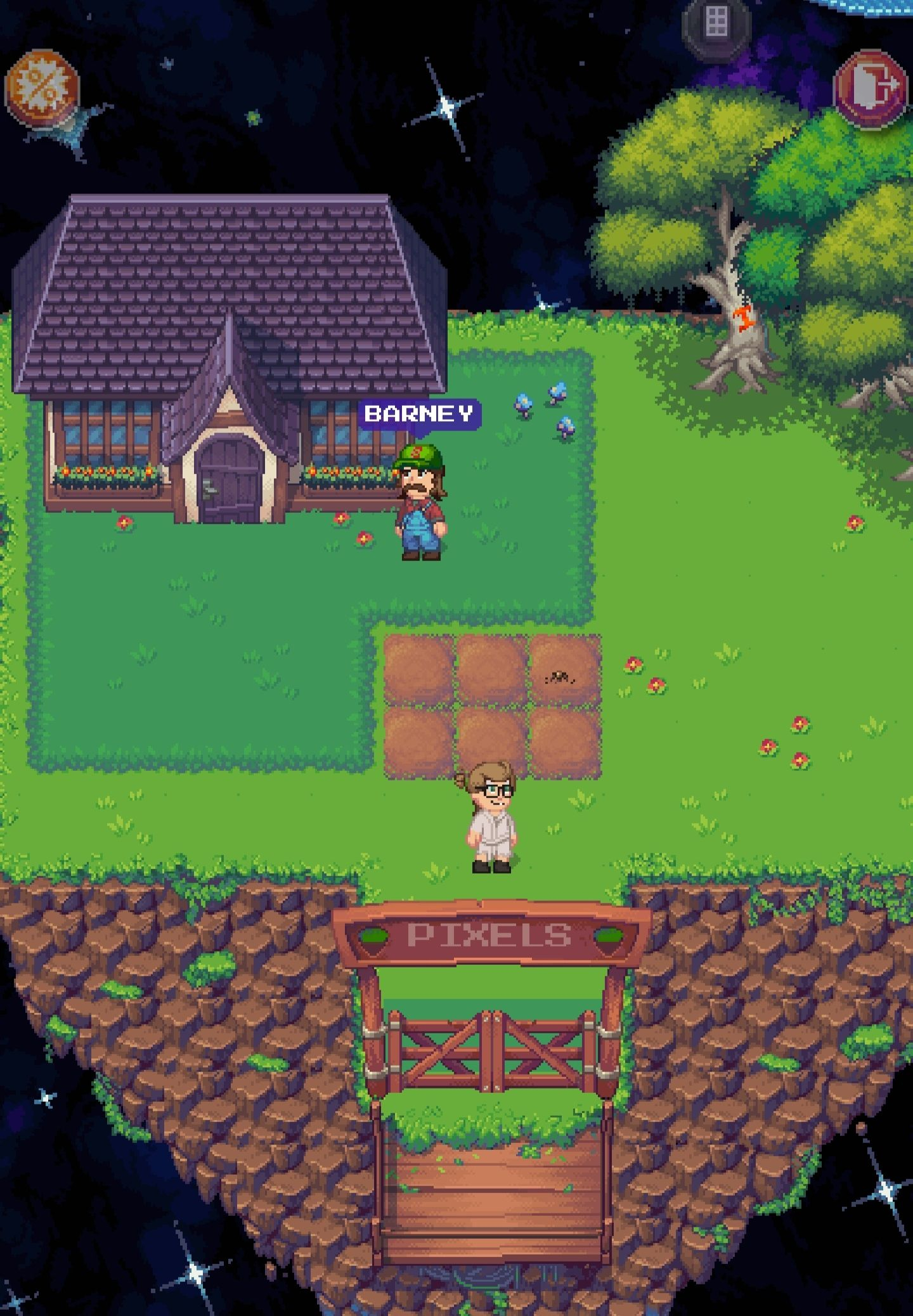
You’re dropped into a pixel-style world that feels intentionally minimal. The retro visual design does more than create nostalgia—it helps reduce cognitive overload. Even when there’s a lot happening on screen, it doesn’t feel cluttered.
That’s a design decision that quietly improves the experience.
Navigation is handled through a hotbar at the bottom of the screen.
Inventory, quests, map, settings- they’re all placed where you’d expect them to be. More importantly, they’re easy to find. Within a few minutes, I was able to move around and access key features without needing any external guide.
That might sound basic, but in Web3 gaming, it’s not always guaranteed.
The quest tracker stays visible without being distracting.
The map is clear and readable.
These are small details, but they shape how comfortable the experience feels over time.
The friction starts when the blockchain layer becomes visible.
Actions that require on-chain transactions interrupt the flow. You’re taken out of the game, prompted to confirm in your wallet, and then left waiting for the transaction to process.
When you return, there’s sometimes a gap did the action go through or not?
That uncertainty breaks immersion.
To be fair, this isn’t a Pixels-only issue. It reflects a larger challenge in Web3 gaming right now. But as a player, you don’t separate the two you just feel the disruption.
The inventory system works, but it begins to show limitations as you progress.
Once you’re holding multiple resource types, managing items becomes less intuitive. Sorting options are limited, and finding specific items can take longer than it should.
It’s functional but not efficient.
And over longer sessions, that kind of friction becomes noticeable.
The land management interface is where things feel the least polished.
If you own land, you’ll interact with a separate set of menus that aren’t as intuitive as the core gameplay UI. The options are there, but the layout assumes familiarity.
For new landowners, this creates an unnecessary learning curve.
It’s not inaccessible but it’s not welcoming either.
Where Pixels succeeds is in the part that matters most the core loop.
Moving through the world, interacting with characters, tending to your farm these interactions feel smooth and considered. The interface doesn’t fight you while you play.
That’s a big win.
Most of the issues sit at the edges where gameplay connects with blockchain systems.
And that’s really the honest summary.
The game interface works well.
The Web3 layer still needs refinement.
Whether that balance works depends on how much the game itself engages you.
For me, it was enough to keep going.
But I still found myself opening a separate tab for extra information which says more than any feature list could.