Candlestick-Diagramme sind die japanische Version von Balkendiagrammen und sind in den letzten Jahren in der westlichen Chartanalyse sehr beliebt geworden.
Sie zeigen vier Preise an: den Eröffnungspreis, den täglichen Höchst- und Tiefstpreis sowie den Schlusskurs. Die dünnen Linien (Docht und Zündschnur) repräsentieren den täglichen Bereich von hoch bis niedrig. Der Docht ist die obere dünne Linie oder der obere Schatten über dem Kerzenkörper, und die Zündschnur ist die untere dünne Linie oder der untere Schatten unter dem Kerzenkörper. Der breite Teil (Kerzenkörper) misst die Distanz zwischen dem Eröffnungs- und dem Schlusskurs. Wenn der Schlusskurs höher ist als der Eröffnungspreis, ist der Kerzenkörper grün oder weiß (positiv); wenn er niedriger ist, ist die Farbe des Körpers rot oder schwarz (negativ).
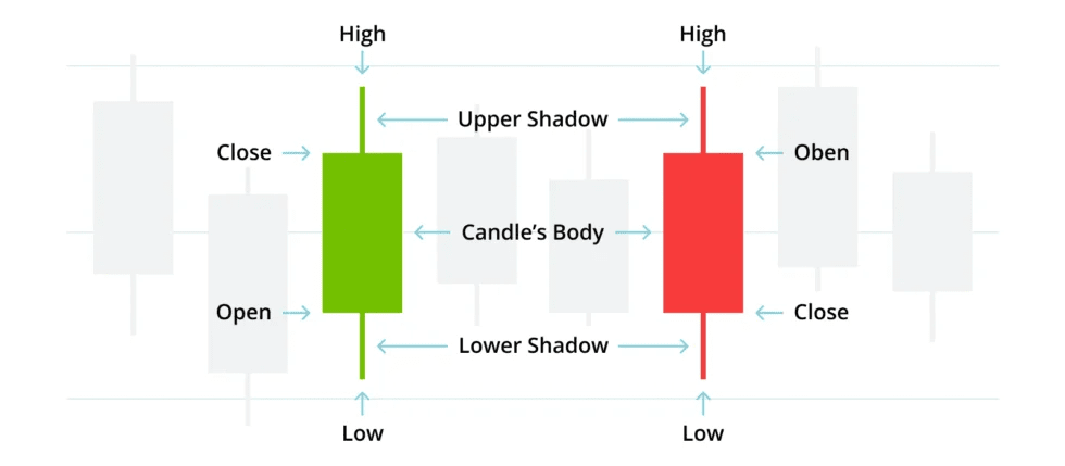
Das Schlüsselelement des Kerzencharts ist die Markierung zwischen den Eröffnungs- und Schlusskursen. Kerzencharts können verschiedene Zeitintervalle darstellen, nicht nur täglich, sondern auch im Minutentakt oder monatlich.
❤️✨FOLGE FÜR MEHR WISSEN✨❤️
$BTC $DOLO $WOO #WriteToEarnUpgrade #charts #StrategyBTCPurchase #Market_Update #knowlegde