
I've opened a lot of Web3 game interfaces that made me feel like the product was never actually tested on a human being.
Buttons that don't tell you what they do. Menus that assume you already know what everything means. Wallet connection flows that fail silently and leave you wondering if the error was yours or theirs. It's a genre problem, not just a few bad studios. Web3 games tend to be built by people who understand blockchains better than they understand the person sitting in front of a screen for the first time.
So when I loaded Pixels for the first time, I was ready to be annoyed.
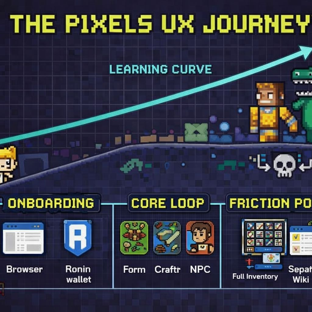
The dashboard is browser based, which already puts it ahead of anything that requires a separate launcher download. You log in, connect your Ronin wallet, and land in a top-down pixelated world. The retro visual style does some useful work here. Because everything looks deliberately simple, the interface doesn't feel cluttered even when there's a lot on screen. That's a design choice that pays off more than it might seem.
Navigation is mostly handled through a hotbar at the bottom of the screen. Your inventory, quests, map, and settings all live there. I found most things within a few minutes without reading any documentation, which is a low bar but one a surprising number of Web3 games don't clear. The quest tracker is visible without being intrusive. The map is readable. These sound like basic things because they are basic things, and yet.
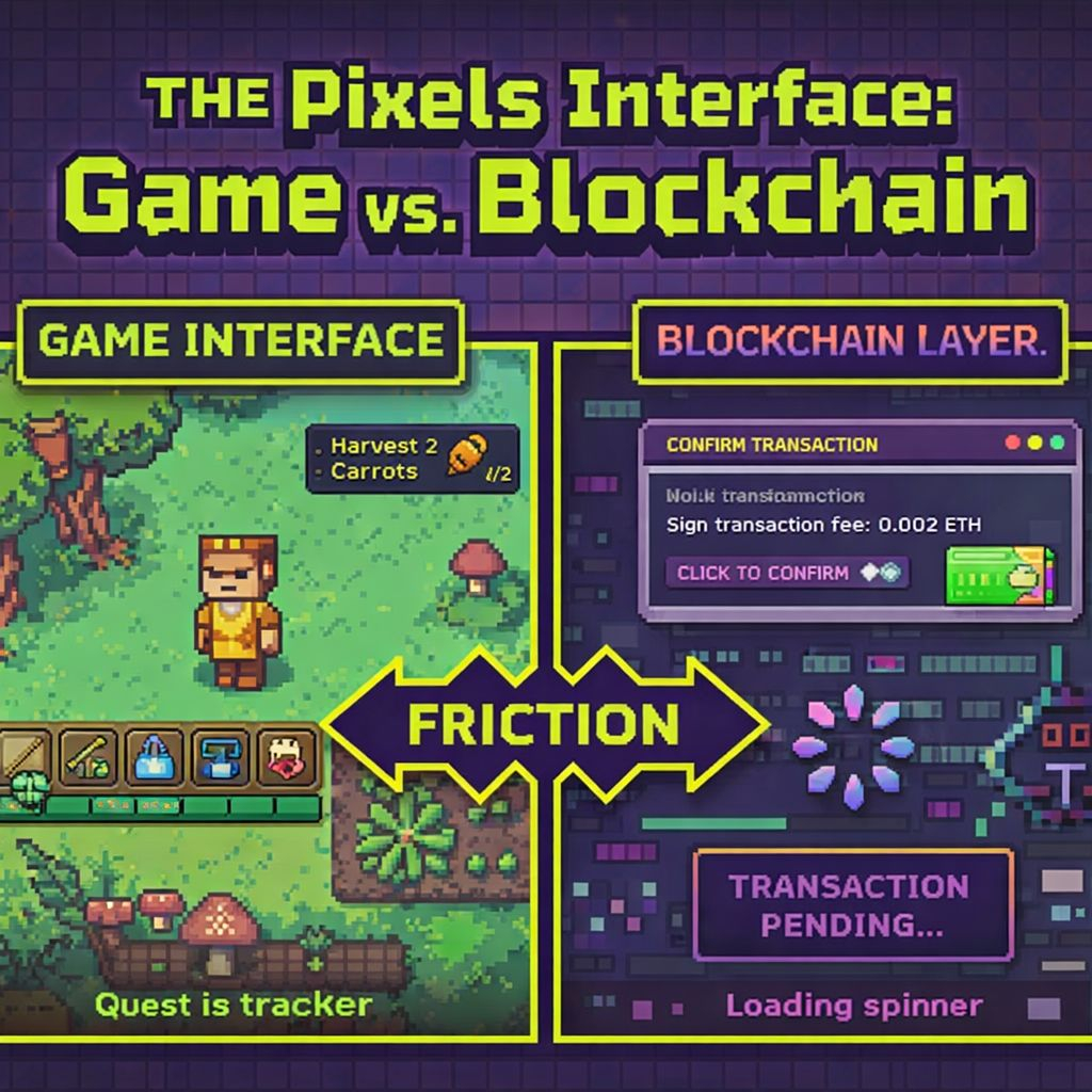
Where it gets messier is anywhere the blockchain layer surfaces. Crafting an item that requires an on-chain transaction takes you out of the game flow in a way that's hard to smooth over. You're suddenly looking at a wallet confirmation popup, waiting for a transaction to process, then returning to a game that may or may not have updated its state correctly yet. I had a few moments where I wasn't sure if my action had gone through or not. That uncertainty is jarring in a way that has nothing to do with Pixels specifically and everything to do with how on-chain games work right now.
The inventory system is functional but starts to show strain once you're holding multiple resource types. Sorting is limited. Finding a specific item when your bags are full requires more scrolling than it should. It's not broken, but it's the kind of friction that adds up over a long session.
The land interface is where I had the most questions. If you own land, managing it is handled through a separate set of menus that felt less polished than the core gameplay UI. The options are there but the layout assumes you already know what you're looking for. For new landowners that learning curve is steeper than it needs to be.
What Pixels gets right is that the core loop, the part you spend most of your time in, feels considered. Moving around the world, talking to NPCs, tending your farm. That section of the UI is clean enough that it doesn't fight you. The problems cluster around the edges, in the places where the game has to interface with Web3 infrastructure.
That's probably the honest summary of the whole dashboard. The game part of the interface works. The blockchain part of the interface is tolerable on a good day and frustrating on a bad one. Whether that trade-off is acceptable depends on how much the game itself pulls you in.
For me it pulled enough to keep going. But I kept a separate browser tab open for the wiki, which tells you something.