on-chain "capitulation" + macro "liquidity ahead."
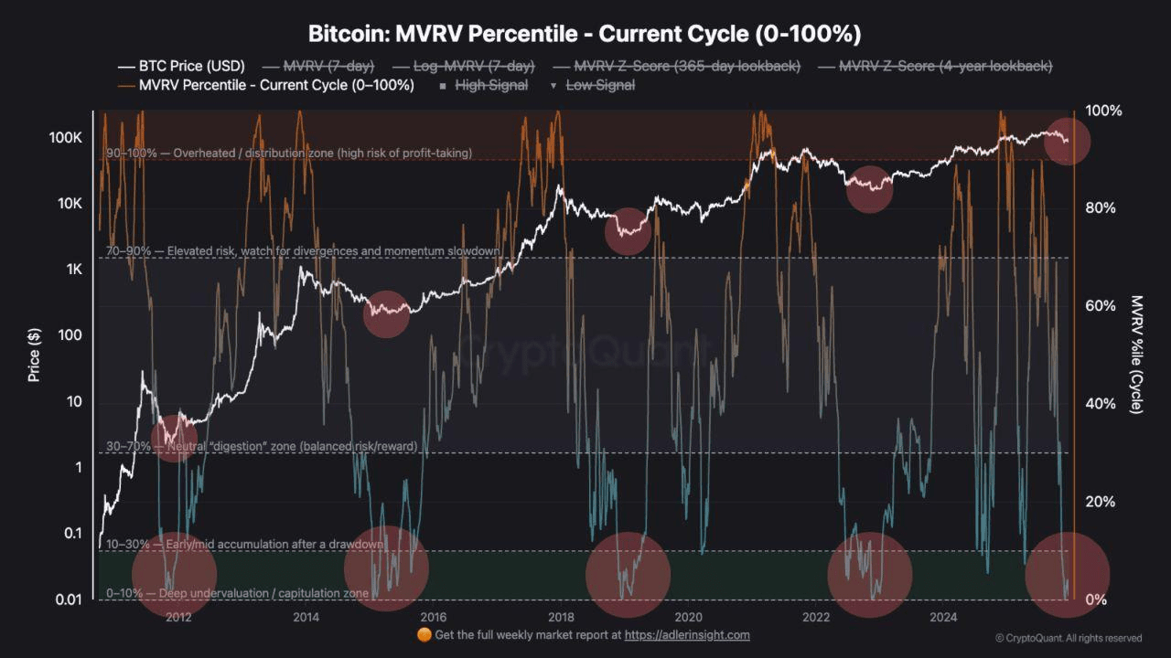
1. Bitcoin: MVRV Percentile - Current Cycle
This is an on-chain metric that shows how overvalued or undervalued BTC is relative to the realized price within the current cycle.
When the indicator drops into the 0-10% zone, the market is usually in a state of deep discount/capitulation: most holders are in the red, the sentiment is extremely toxic, "all is lost."
Historically, such zones have coincided with periods of extreme stress:
🟠2015 - crash of Mt. Gox;
🟠2018–2019 – collapse of the ICO bubble;
🟠2022–2023 - FTX/Luna/Celsius.
Currently, MVRV is again at the bottom of the range, meaning the market is trading again as if "the best times are already behind us."
🗓️ Important: "the bottom by metric" does not mean "reversal tomorrow".
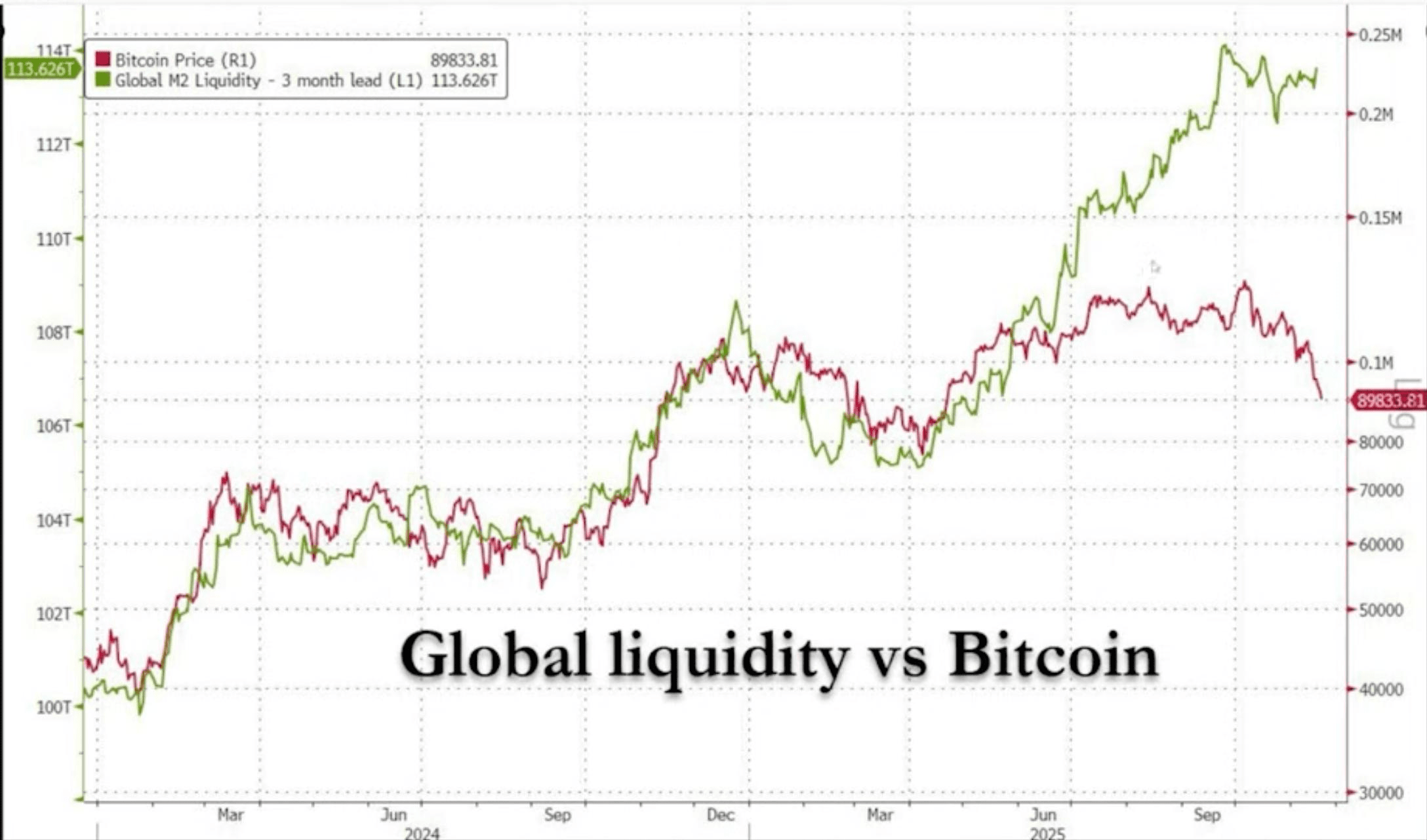
2. Global Liquidity vs Bitcoin
This graph compares the price of BTC (red line) with global liquidity M2 (green), with M2 shifted forward by about 3 months – as an attempt to show that liquidity often leads risk assets.
Now a noticeable difference is evident: liquidity is going up, while BTC is lagging. Historically, such imbalances have closed with BTC catching up to liquidity – sometimes with quite a sharp impulse.
If you believe these two graphs and the logic of market cyclicality, then we are in a zone where the risk/potential ratio becomes interesting:
🔴On-chain - the sentiment seems like capitulation,
🔴For macro – liquidity looks stronger than what is reflected in the price of BTC.