This latest 4-hour candlestick chart reveals the secrets of the bulls and bears behind the UNI price.
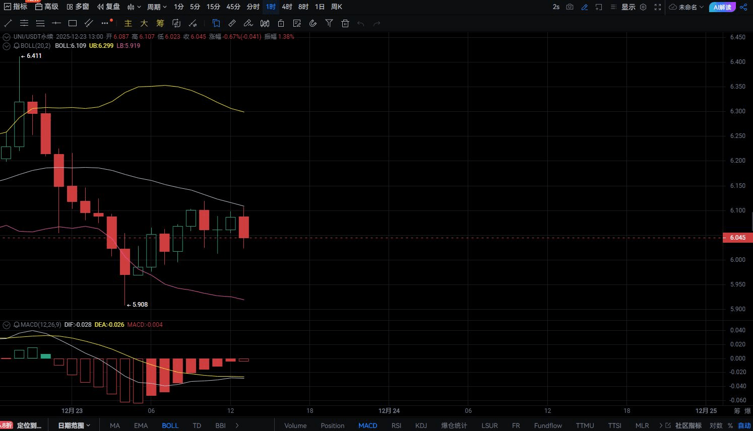
Just as the key governance proposal voting for UNI enters its final stages, a real-time technical analysis chart conveys an exciting signal. The UNI price has stabilized above $6.2, which is the latest answer given by the market in the past 72 hours.
Let’s delve into this key 4-hour candlestick chart, which may indicate the beginning of a new trend.
01 The core information revealed by the chart: a breakout is in progress
From the UNI 1-hour chart, it can be clearly seen that the price is running above the middle band of the Bollinger Bands and has tested the upper band resistance multiple times. This position is typically regarded as a short-term strong signal.
More attention should be paid to the MACD indicator—the fast and slow lines are both running above the zero axis, and the histogram is showing an expanding positive value. This structure indicates that bullish momentum is accumulating, with no signs of exhaustion yet.
The arrangement of candlesticks in the chart shows a characteristic of 'higher highs and higher lows', which is a typical formation of an ascending channel. Although there have been red pullback candlesticks during this period, they have all been quickly recovered by subsequent green bullish candlesticks, indicating strong buying support below.
For me personally, the $6.0-$6.1 area has shifted from resistance to support, which is the most important signal given by the chart. After breaking through this threshold, it has confirmed twice with pullbacks, none of which have effectively broken down, which is technically significant.
02 Key points and immediate strategy adjustments.
The first support level has been raised to the $6.05-$6.10 range, instead of the previous $5.86. This area combines previous high points converting to support and the double protection of the Bollinger Band midline.
The primary resistance above is in the $6.35-$6.45 range, corresponding to the upper Bollinger Band and previous high pressure points. If the price breaks through this area with volume, the short-term target could be around $6.8.
The most noteworthy signal currently is whether a top divergence will appear on the 1-hour level. If the price makes a new high while the MACD fails to do so, it will be a warning signal for a short-term correction. However, the chart currently shows both moving upward in sync, indicating a healthy trend.
From trading volume observations, the recent upward process has generally seen green candlesticks accompanied by increased volume, while the red candlesticks during corrections show a decreasing volume characteristic, which is a typical healthy price-volume relationship during an uptrend.
03 Composite judgment combining fundamentals.
The strengthening of technical aspects and progress in fundamentals has created a rare resonance. The governance proposal vote will end on December 25, and current on-chain data shows a high probability of passing.
This dual driving structure of 'technological breakthroughs + fundamental catalysts' is often a precursor to the initiation of significant market movements. The prices shown on the chart may reflect early reactions, likely indicating that well-informed funds are positioning themselves in advance.
It is noteworthy that the price started moving before the positive news was announced, which changes the traditional logic of 'buy on expectations, sell on facts'. The market might have already anticipated the continued impact after the proposal passes—not just a one-time burn, but also a long-term deflation mechanism.
04 Personal latest view: Go with the trend, but stay vigilant.
Based on the latest chart, my view is clearer: the short-term trend has turned bullish, and it's unlikely to see prices below $6 again.
If you are holding a position, you may continue to hold and move the stop-loss up to below $6.0. If you have not entered yet, consider looking for entry opportunities in the $6.10-$6.15 range, taking a small stop-loss to capture potential upside after the proposal passes.
The risk that must be highlighted is the timeliness of the 1-hour chart. This short-cycle chart is sensitive to market sentiment but can easily produce 'false signals' under the influence of large trades. Any trading decision should be confirmed by the daily level.
Another observation point is whether there will be a 'buy the rumor, sell the news' pullback after the proposal passes. The key support level indicated on the chart will be the litmus test for judging the real strength of the market—if the pullback does not break below $6.0, it will prove that the bullish pattern is solid.
This 1-hour chart is telling a story about breakthroughs and confirmations. Each candlestick records the collective decisions of market participants, while technical indicators attempt to decipher the emotional codes behind these decisions.
How do you interpret the current chart signals for UNI? Where do you think the key technical levels are? Feel free to share your technical analysis views in the comments!
If you would like to receive more real-time chart interpretations and key technical level reminders, be sure to follow us—let's seek certainty in volatility and seize opportunities in trends together!
