Chart Patterns That Actually Work: Your Visual Guide to Trading Success 📊
Ever stared at a price chart and felt like you're reading hieroglyphics? You're not alone. But here's the good news: certain patterns repeat themselves over and over in the markets, and learning to spot them can give you a serious edge.
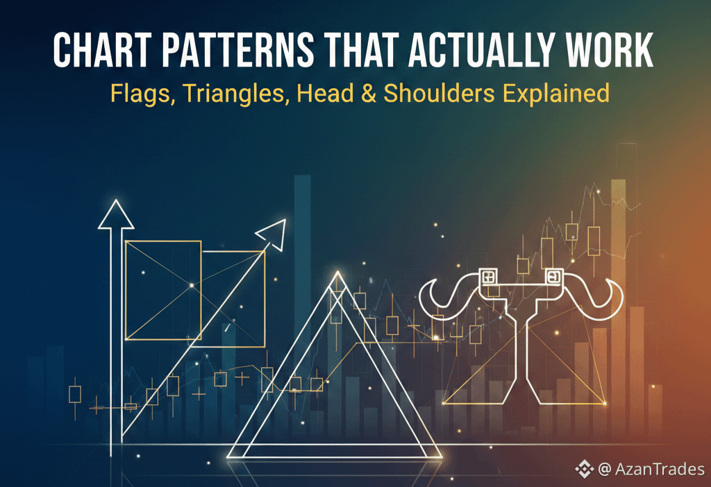
Let me break down three of the most reliable chart patterns that traders have been using for decades. These aren't magic formulas, but they're as close as you'll get to reading the market's intentions.
The Flag Pattern: The Market's Pause Button
Imagine a stock that's been climbing aggressively, then suddenly takes a breather. It moves sideways or drifts slightly downward in a tight channel. That's a flag pattern, and it's usually a continuation signal.
Think of it like a runner catching their breath before the next sprint. The stock consolidates after a strong move, building energy for the next leg up (or down, in a bearish flag). When price breaks out of that tight channel, it often continues in the original direction with renewed momentum.
The key is spotting that sharp "flagpole" move first, followed by the tight consolidation. If you see this after a strong uptrend, start watching for the breakout above the upper channel line.
Triangles: When the Market Can't Decide (Until It Does)
Triangles form when a stock's price swings get tighter and tighter, creating converging trendlines. You've got three main types: ascending, descending, and symmetrical.
An ascending triangle shows higher lows but resistance at the same level—buyers are getting more aggressive. This often breaks upward. A descending triangle is the opposite, with lower highs hitting the same support level, typically breaking down.
Symmetrical triangles squeeze from both sides, and the breakout direction is less predictable. The real magic happens at the apex where the lines meet. As the triangle tightens, volatility compresses like a coiled spring, and when it breaks, moves can be explosive.
Head and Shoulders: The Reversal King
This is probably the most famous pattern in technical analysis, and for good reason—it works. A head and shoulders pattern signals that an uptrend is running out of steam and a reversal may be coming.
Picture three peaks: the middle one (the head) is highest, with two lower peaks on either side (the shoulders). The "neckline" connects the lows between these peaks. When price breaks below the neckline after forming the right shoulder, that's your signal.
The inverse head and shoulders works the same way but upside down, signaling a potential reversal from a downtrend to an uptrend. What makes this pattern powerful is that it shows a clear shift in market psychology from bullish to bearish (or vice versa).
Why These Patterns Actually Work
Here's the thing: these patterns work not because of magic, but because they reflect human psychology and mass behavior. When thousands of traders see the same pattern and act on it, it becomes a self-fulfilling prophecy to some extent.
But don't just trade patterns blindly. Combine them with volume analysis—strong breakouts should come with increased volume. Use them alongside support and resistance levels, and always have a stop-loss plan.
The Bottom Line
Chart patterns are tools, not guarantees. Even the best patterns fail sometimes, which is why risk management is crucial. Start by paper trading these patterns until you get comfortable recognizing them in real-time.
The beauty of flags, triangles, and head and shoulders is that they appear across all timeframes and all markets—stocks, crypto, forex, you name it. Once you train your eye to spot them, you'll start seeing opportunities you never noticed before.
Remember: the goal isn't to catch every move, but to identify high-probability setups that give you an edge. Master these three patterns, and you'll have a solid foundation for reading what the market might do next.
Stay Tuned, Part 8 dropping Tomorrow 🔥
#Tecnicalanalaysis #AzanTrades