
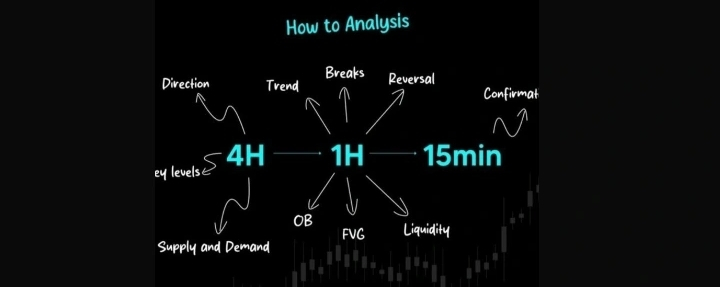

In trading, looking at a single timeframe is like trying to read a book through a keyhole. You might see a few words clearly, but you completely lose the context of the story. Successful market analysis relies on a top-down approach, mapping the market from the macro picture down to the micro execution.
Here is how you can break down the market matrix using three distinct timeframes: the 4-Hour, the 1-Hour, and the 15-Minute charts.
The 4-Hour Chart: Establishing the Macro Anchor
The 4-Hour (4H) timeframe serves as your foundation. It provides the institutional perspective, filtering out daily market noise and showing where the true money is moving. When analyzing the 4H chart, your focus should be on three core elements:
Direction: Is the market structurally making higher highs and higher lows, or is it in a clear macro markdown phase? Knowing the overall bias prevents you from trading against the dominant tide.
Key Levels: Identify major support and resistance zones that have historical significance. These are the areas where the market is highly likely to react again.
Supply and Demand: Map out the major higher-timeframe supply and demand zones. These zones act as your structural boundaries, telling you exactly where major buyers and sellers are waiting to step back into the market.
The 1-Hour Chart: Mapping the Intraday Narrative
Once the macro boundaries are set, move down to the 1-Hour (1H) chart. This is your transitional canvas, where you identify the intraday mechanics and look for the specific setups developing within your 4H zones. On the 1H chart, look for:
Trend & Breaks: Is the internal intraday trend aligning with the 4H direction? Look for structural breaks (Break of Structure or Change of Character) that indicate the shorter-term trend is shifting to match the macro bias.
Reversals: Watch how price action behaves as it approaches your key levels. Are there early signs of exhaustion or momentum shifts?
OB, FVG, & Liquidity: This is where you locate your specific points of interest. Identify Order Blocks (OB) where institutional volume rests, look for Fair Value Gaps (FVG) that price might want to rebalance, and spot liquidity pools (equal highs or lows) that the market might sweep before moving.
The 15-Minute Chart: Executing with Precision
The 15-Minute (15min) timeframe is purely for execution. You do not use this chart to guess where the market is going next; you use it to find the safest, most high-probability entry point based on everything you mapped out on the higher timeframes.
Confirmation: When price enters a 1H Point of Interest inside a 4H demand zone, drop to the 15min chart and wait for your confirmation trigger. This could be a lower-timeframe structural shift, a liquidity sweep followed by a sharp displacement, or a specific candlestick pattern.
By waiting for 15min confirmation, you significantly reduce your invalidation distance. This allows for tighter stop-loss placement, which directly optimizes your risk-to-reward ratio.
Bringing It All Together
The secret to consistency isn't a magical indicator; it is structural alignment. When the 4H chart provides the direction, the 1H chart provides the narrative, and the 15min chart provides the precise execution trigger, you are no longer guessing. You are trading with the structural flow of the market.