Most people in DeFi usually notice the loud things first.
🔥 Big APRs.
🔥 Big partnerships.
🔥 Big trading volume.
🔥 Big announcements.
But honestly, after spending more time actively using STON.fi, I’ve started appreciating something else more lately: the smaller interface features that quietly improve the entire experience.
Not the flashy stuff.
The practical stuff.
I was reading through the latest STONfi blog update earlier, and what stood out to me wasn’t necessarily “new features” alone… it was the thinking behind them.
The platform is slowly becoming easier to understand without dumbing DeFi down completely.
And honestly, that balance matters a lot.
The Token Labels Feature Is More Important Than It Looks
This was probably the first thing that caught my attention.
STONfi now gives clearer labels for suspicious or non-standard tokens instead of throwing everything into one vague warning category.
Labels like:
- Fake
- Honeypot
- Taxable
At first glance, some people may see this as just another small interface addition.
But if you’ve spent enough time in DeFi, you immediately understand why this matters 👀
Not every risky token behaves the same way.
A fake token pretending to imitate another asset is completely different from a token that secretly charges heavy taxes inside its contract.
And a honeypot, where users can buy but cannot sell, is an entirely different danger on its own.
What I personally like is that STONfi now makes this context visible before interaction happens.
That’s important.
Because many times in DeFi, users only discover problems after they already interacted with the token.
Making users manually enter suspicious token contract addresses instead of casually discovering them through normal search also feels like a smart protective layer honestly.
The Yield-Bearing APY Display Makes Farming Easier To Understand
This part honestly deserves more attention.
A lot of users look at farming pools and only focus on the visible APR numbers without fully understanding where the returns are actually coming from.
STONfi now shows additional APY information for yield-bearing assets like tsTON or tsUSDe directly inside pool views.
And personally, I think this makes the farming structure much easier to read.
Because sometimes:
- rewards come from farming incentives
- rewards come from the pool itself
- rewards come from the yield-bearing asset
- or all three combined
Without clear visibility, newer users can easily misunderstand what they’re actually earning from.
The extra APY label quietly solves that confusion.
And honestly, clarity like this helps users make smarter decisions instead of simply chasing high percentages blindly.
The Boost Farm APR Cards Feel More User-Friendly
I also liked the way STONfi explains the Boost Farm APR campaigns directly inside the interface.
Instead of making users search through long announcements or external threads, the platform explains:
- how the boost works
- who qualifies
- what users need to stake
- what multipliers are available
Simple example:
- staking 500+ STON gives up to 1.5× APR
- staking 1000+ STON gives up to 2× APR
It sounds basic…
but trust me, many DeFi platforms still make users figure these things out themselves 😅
Good interface design isn’t only about adding features.
It’s about reducing confusion.
And I think STONfi is slowly getting better at that.
TradingView Integration Honestly Makes The Experience Smoother
This might actually be my favorite update personally.
Having TradingView charts directly inside the swap window simply makes sense.
Before this, checking price action usually meant:
open another tab → search the chart → analyze → return back to the swap page.
Now the market context is already much closer to the actual action.
And the addition of longer 3-month and 6-month chart intervals makes it even more useful for people trying to understand broader movement instead of only short-term candles.
Not every swap requires deep technical analysis of course.
But swapping completely blind is also not ideal 😅
Having chart access one click away genuinely improves the flow.
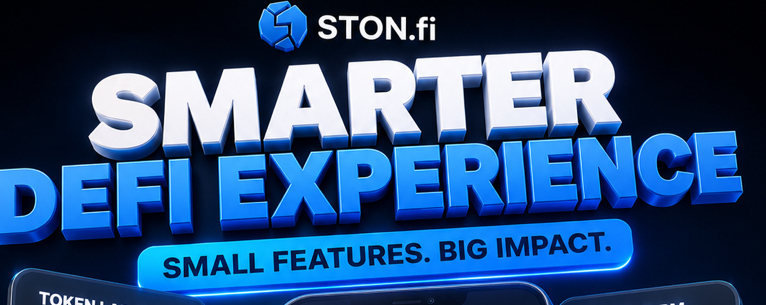
Why These “Small” Features Matter
Honestly, after reading the article fully, I think the most important takeaway is this:
STONfi is not only trying to make DeFi functional.
It’s trying to make DeFi understandable.
That’s a very different thing.
Good products don’t only help users click buttons.
Good products help users understand what they are doing while using them.
And personally, I think that’s one of the clearest signs that the TON ecosystem is maturing gradually.
The infrastructure keeps improving.
The experience keeps getting smoother.
The tools keep becoming more practical.
Quietly. Step by step.
Most people probably won’t pay attention to interface improvements like these immediately.
But over time, these are usually the exact details that make users stay on a platform longer.
And honestly, after using STON.fi more lately, I can genuinely feel those improvements starting to add up.