I was staring at the OpenLedger white paper at 1:06 a.m. with a cold cup beside my laptop and a clean note still empty. The phrase that kept pulling my attention was not reward. It was graph. I wondered if AI influence could finally become something people can inspect.
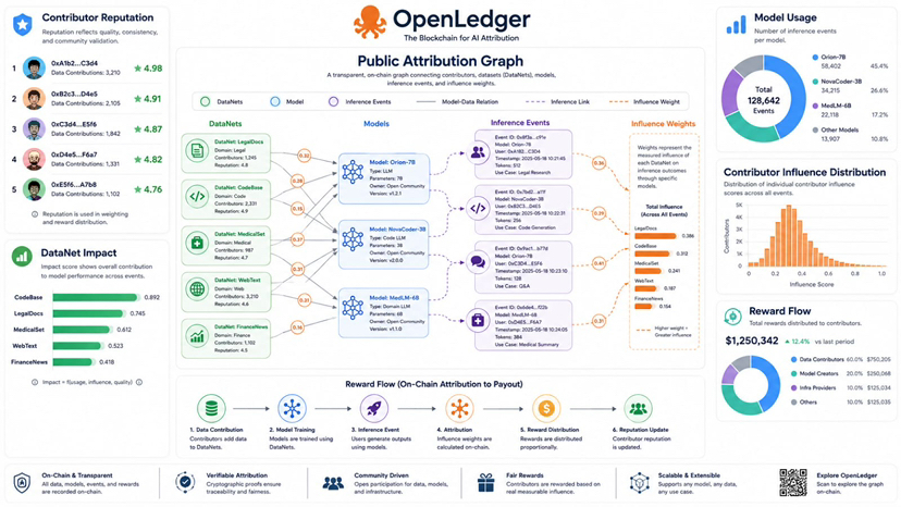
That is why I think the title When AI Influence Becomes a Public Graph fits best. OpenLedger frames Proof of Attribution as a way to connect model behavior with the training data that shaped it. The deeper idea is what happens after influence is measured. The white paper describes a public attribution graph where influence weights model data relations and inference events are stored. To me this is where attribution becomes a living map rather than a private claim.
I see the graph as the memory layer of OpenLedger. A single AI output may look like one answer on a screen. Behind it there can be DataNets contributors model versions adapters inference records and reward flows. If those pieces stay separated then the market has little context. If they are connected in a public graph then contribution becomes easier to read. Builders can see which DataNets carry repeated influence. Contributors can see whether their data is still shaping outputs. Communities can watch where value is forming.
This matters because AI contribution is usually hidden after training. A dataset can help a model improve but the contributor often loses the trail. A model builder can search for better data but may only see claims about quality. OpenLedger tries to replace that weak signal with recorded relations. The DataNet Registry tracks dataset identifiers contributor records usage logs and attribution records. The attribution graph connects those records across inference activity. That is more informative than a static list because it shows movement.
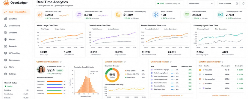
My practical view is that leaderboards can be useful only when they rank real influence. A leaderboard based on upload volume would not tell me much. It could reward noise. A leaderboard based on repeated downstream impact would be more meaningful. If a DataNet keeps influencing useful outputs then that should become visible. If an adapter is used often during inference then that role should be visible too. If a contributor receives repeated rewards then reputation can come from measured impact.
The white paper says this graph can support real time analytics for contributor reputation dataset saturation and underutilized niches. I think that phrase is important because discovery is one of the hardest problems in data markets. Too much similar data can reduce value. Missing niche data can block better specialized models. A public graph can show where data is crowded and where the system still needs stronger contributions. That gives builders a sharper way to decide what to use and gives contributors a sharper way to focus.
I also see a governance angle here. The white paper explains that attribution can support curation and governance. DataNets with high influence across production models may receive greater weight in protocol decisions. Curation adapter prioritization and fee distribution rules can also be shaped by past influence. I find that more grounded than governance based only on attention or ownership. It asks a better question. Who has actually helped the system produce value.
The risk is that a graph can look objective while still carrying weak assumptions. If attribution methods are noisy then rankings may mislead people. If low quality data enters the system and receives influence then reputation can become distorted. If the analytics are too complex then the graph may be public but not useful. OpenLedger has to make the data readable enough for builders contributors and communities. Transparency has to become understanding or it stays cosmetic.
That is why I would judge this feature by practical signs. I would look for DataNets that gain influence through repeated model use. I would look for leaderboards that show actual inference impact. I would look for contributors who can verify their rewards. I would also watch whether underused niches lead to new focused DataNets. That would tell me the graph is helping the market coordinate instead of only displaying history.
My takeaway is simple. OpenLedger’s attribution graph could become one of its most important coordination tools. Rewards matter but rewards need context. Leaderboards matter but only when they reflect real influence. If OpenLedger can make AI contribution visible without turning it into empty scoreboard noise then it can give specialized AI a clearer market map. Final note: I am watching OpenLedger for proof of real usage not just a bigger story. As per market move Open will remain?