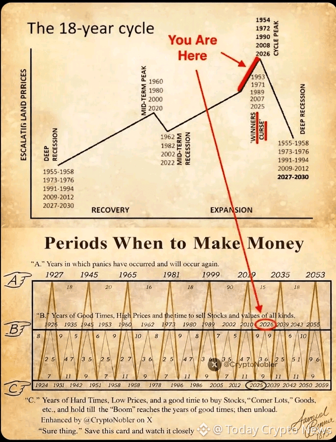
This chart highlights a long-studied economic rhythm often referred to as the 18-year cycle, a pattern observed across decades in land prices, credit expansion, market booms, and recessions..
Rather than focusing on short-term noise, this framework looks at structural phases that repeat over time.
Recovery Phase🤔
This is where pessimism dominates. Liquidity is tight, prices are suppressed, and participation is low. Historically, this phase quietly lays the foundation for the next expansion.
Expansion Phase
Confidence returns. Credit expands. Asset prices rise steadily. This is the phase where most people begin to feel “safe” again, even though risk is gradually building beneath the surface.
→ Winners’ Curse Zone🚀
This is the most dangerous stage.
Prices are high. Sentiment is euphoric. Everyone feels like a winner.
Historically, this phase appears right before major cycle peaks.
The chart marks 2025–2026 as a critical inflection area, aligning with previous historical peaks where markets looked strongest just before conditions reversed.
Cycle Peak🚀
At peaks, leverage is high, valuations are stretched, and certainty is widespread. The mistake most participants make here is assuming strength equals safety.
→ Recession / Reset Phase👉
Liquidity contracts. Excess is flushed out. Prices revert toward long-term norms. This phase creates the best long-term opportunities — but only after patience is rewarded.
📌 Important Context🧠
This chart does not predict exact dates.
It highlights risk zones, not guarantees.
Markets do not collapse because people expect them to.
They correct when confidence becomes one-sided and leverage peaks.
The real value of this chart is awareness:
Understanding where we may be in a broader cycle helps avoid emotional decisions during late-stage expansions.
Cycles don’t end because of fear.
They end because of excess.
History never repeats perfectly, but it often rhymes.
Stay observant. Stay disciplined.