
Something interesting is happening right now that most people are missing.
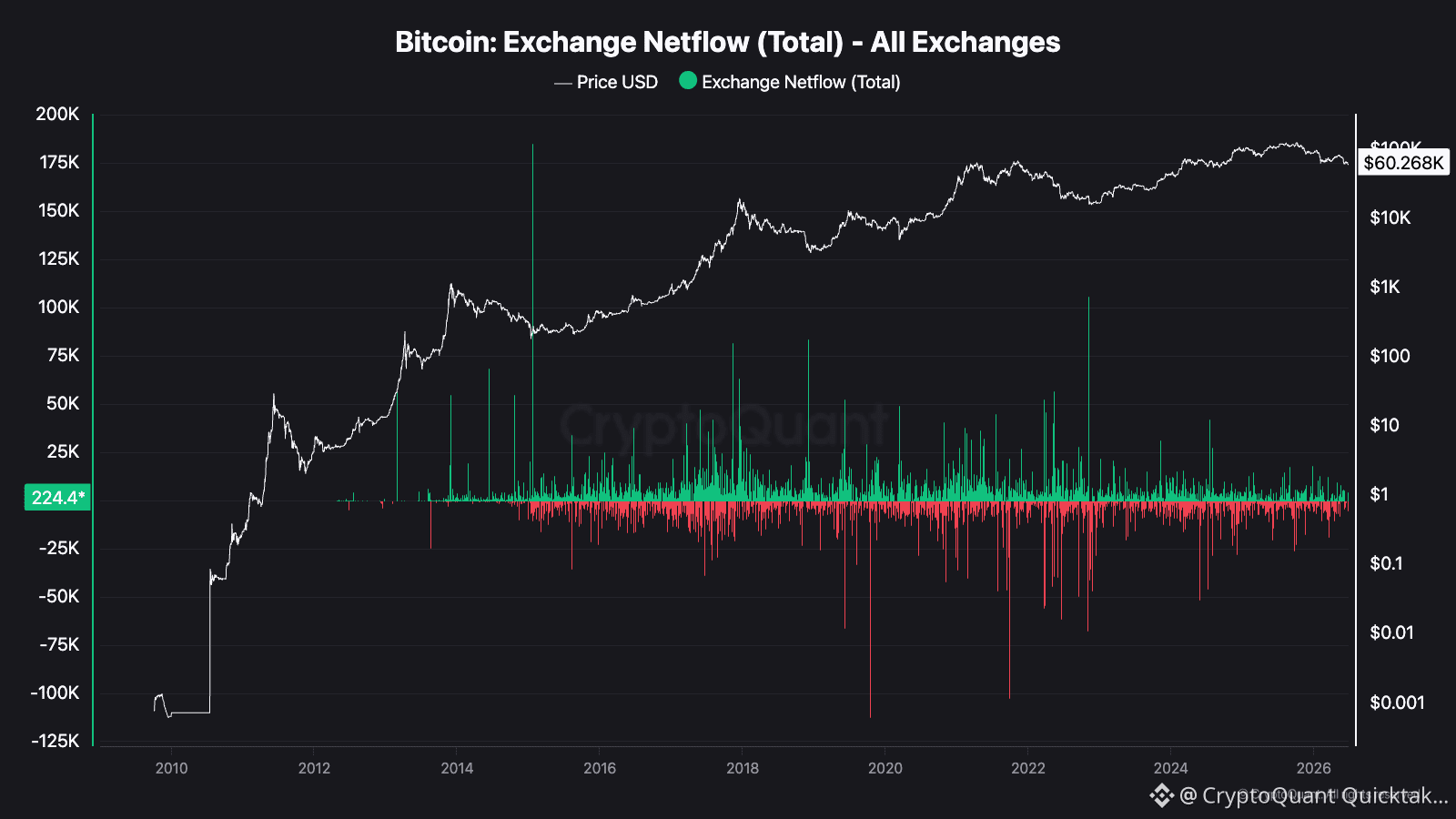
Bitcoin's Exchange Netflow is currently sitting at just 224 BTC, essentially flat. But zoom out and look at the full picture since 2010 and a clear story emerges.
What Is Exchange Netflow?
Simple. Green bars mean Bitcoin is flowing into exchanges. Red bars mean Bitcoin is flowing out. When BTC moves to exchanges it usually means people are preparing to sell. When it leaves exchanges it means people are holding and removing supply from the market.
What The Chart Actually Shows
The biggest green spike in history happened around 2014 to 2016. Massive inflows, Bitcoin was being sold heavily and price was struggling.
The most dramatic red spikes meaning massive outflows happened around 2020 and 2022. Both of those periods preceded major price recoveries.
Right now in 2026 with BTC at $60,268 the netflow is almost perfectly neutral. No panic selling into exchanges. No massive accumulation either. The market is simply waiting.
Why This Matters
When netflow stays consistently low and neutral while price holds above $60K it tells you holders are not rushing to sell. There is no distribution happening at scale. That is quietly bullish.
The danger signal would be a sudden surge of large green bars. That would mean big players moving BTC to exchanges to sell. We are not seeing that right now.
Bottom Line
The lack of exchange inflows at current prices suggests conviction among holders. Nobody is panicking. Nobody is dumping. In a market driven by fear and greed, silence from the netflow chart is actually one of the loudest signals you can get.
Not financial advice. Always do your own research.
Zakariya Sharif
Written by Zakariya Sharif