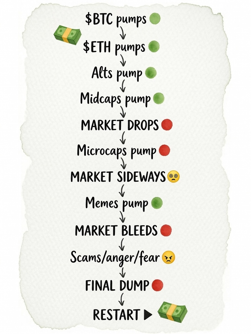
Core pattern it describes (and how accurate it is)
BTC pumps first → Very common and usually true. Bitcoin leads recoveries and early bull legs because it's seen as the "safest" / most liquid crypto asset. New money often enters via BTC.
ETH pumps next → Also classic. ETH usually follows BTC closely and outperforms during parts of the cycle (especially with narrative shifts like staking, L2s, or ETF approvals).
Alts → midcaps → (sometimes microcaps try to pump) → This is the famous "altseason" rotation. Capital flows down the risk curve seeking higher returns. Historically accurate in strong bull markets.
Market drops → microcaps pump → This part reflects the chaotic late-stage behavior: when large/mid alts stall or correct, desperate money chases tiny illiquid coins (hoping for 10–100× moonshots).
Memes pump hard (late-stage euphoria) → Extremely common at peaks. Memecoins often deliver the most absurd gains right before the top (DOGE 2021, countless Solana memes in 2024–2025, etc.). Retail FOMO is strongest here.
Bleed → scams / fear / final dump → restart → This captures the brutal markdown phase: leverage gets wrecked, memes crash 80–95%, alts bleed worse than BTC, panic & scams proliferate, then eventually accumulation starts again for the next cycle.
So yes — broadly it's "right" as a satirical but directionally correct description of retail psychology and capital rotation in euphoric bull markets.
Where it gets less precise or has changed recently
Order isn't always perfectly linear — sometimes memes pump ridiculously early (e.g., Solana meme meta in 2024–2025 sucked liquidity away from "serious" alts very quickly).
This cycle felt different — Bitcoin dominance stayed very high for unusually long (often 55–65%), spot BTC ETFs prolonged BTC strength, and broad altseason was delayed / muted / selective compared to 2017 or 2021. Many alts bled even while BTC made new highs.
Microcaps & memes can pump at multiple points — not only after the big drop.
"Restart" arrow — cycles do repeat every ~4 years around halvings, but macro (rates, regulation, institutional adoption) can stretch or compress them.
In short:
It's not a scientific law or exact roadmap — it's a meme-ified observation of crowd behavior that has happened multiple times.
If you're trading, treat it as a useful mental model / warning sign (especially the "memes go parabolic → everything bleeds" part), but don't bet your life savings assuming it will play out exactly like the diagram every single time.
Markets evolve, but human greed and fear stay the same — that's why these flowcharts keep getting reposted cycle after cycle 😅