It's been a busy few days for the $PIXEL , the main in-game currency for the popular blockchain game @Pixels After a period of quiet, things have really started to heat up, giving holders a dose of volatility and creating some genuine excitement, as well as caution, in the community.
As a casual player who primarily logs on to manage my in-game farm and chat with guildmates, I don't always track the charts, but the recent price action has been hard to miss. Over the last week, we've witnessed some of the highest trading volumes we’ve seen in months, which is a strong indicator of renewed interest. This has translated into a noticeable upward trend on the charts, offering a glimpse of bullish momentum.
The catalyst for this recent surge seems to be a combination of factors. The developers have been steadily rolling out updates for the game, including new quests and expanded farming mechanics, which are slowly increasing the utility of the #PIXEL token within the ecosystem. When players can see a concrete use case for their coins, it often provides a floor of support.
There’s also a broader shift in market sentiment. After a period of relative stagnation, the wider crypto space is experiencing a bit of a recovery, and many alternative coins (altcoins), particularly those linked to the gaming sector, are benefiting from this positive flow of capital. The idea that a rising tide lifts all boats seems to be at play here.
If you look at the technical perspective, which is what the attached chart shows, the movement has been fascinating. I’m no professional day trader, but looking at a candlestick chart can tell you a lot about the market's psychology. Over the period shown, which captures the last 24 hours of trading, we're looking at hourly intervals.
Each vertical bar on the chart—the "candlestick"—summarizes one hour of activity. The thick, main section is the "body." If the body is green, it means the price closed higher than it opened (bullish activity). If it’s red, the price closed lower (bearish activity). The thin lines extending from the top and bottom are the "wicks," representing the highest and lowest prices reached during that hour.
The chart illustrates a clear narrative of the recent action. We started with a strong, massive green candle (1), showing a powerful burst of buying that propelled the price quickly upward. This often happens on significant news or when a key resistance level is broken. This was followed by more green candles, though with smaller bodies (2), indicating that while buyers were still in control, the momentum was slowing slightly as they encountered selling pressure.

This leads to the red candles (3). These are crucial. When you see a large green push followed by red, it signifies "profit-taking." After a swift price increase, some traders inevitably sell to lock in their gains. The larger wicks on these red candles show that while the price did drop, there was still some active buying throughout the hour, preventing a full crash. We then enter a "consolidation" phase (4), characterized by a series of alternating small green and red candles, meaning buyers and sellers are reaching a temporary equilibrium. The chart concludes with a final green candle (5), suggesting that the market is attempting another leg up.
The high-volume bar on the far right of the chart aligns with that initial surge (1), confirming that this move was backed by significant trading activity and wasn't just a low-liquidity anomaly.
As someone holding #PIXEL 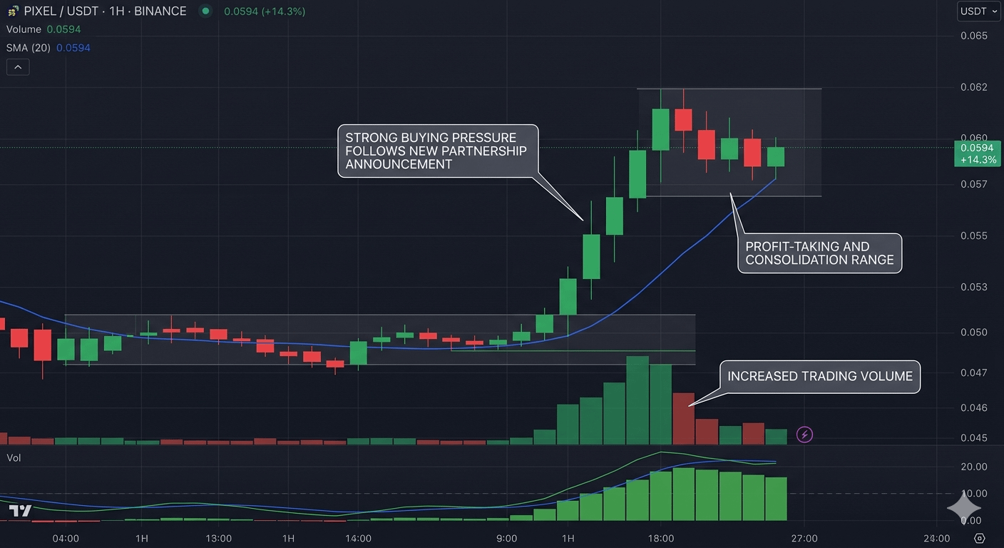 , it’s a moment of both optimism and caution. This renewed activity shows that people are paying attention to the game, and its internal economy still has life. But I’ve learned from too many cycles in this space that what goes up can certainly come down. The key is to stay informed, enjoy the game, and not get too distracted by the short-term noise. For now, seeing the community buzzing and the market chart showing some real movement is a welcome development.