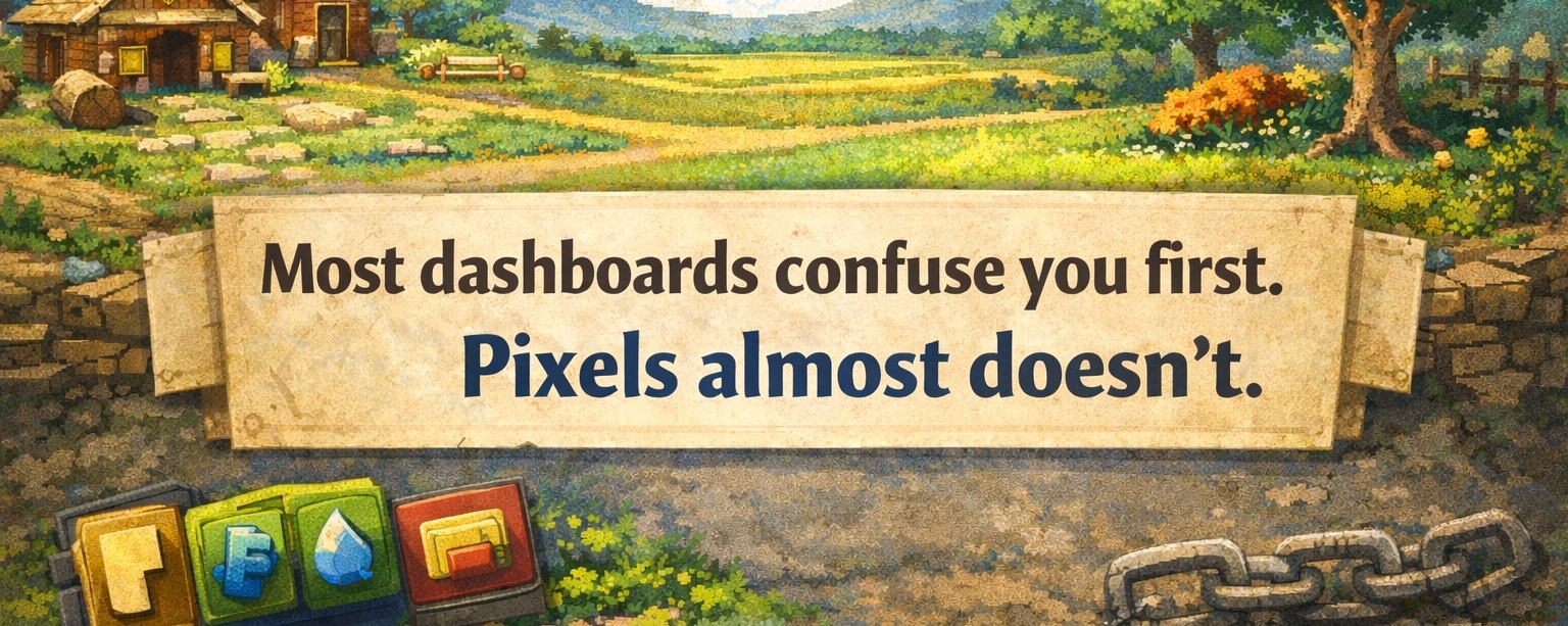
Most Web3 game dashboards feel Like they’re trying to test you before you even start playing.
You Log in, and instead of a game, you see tokens, menus, and confusing icons. I’ve had that moment a lot just sitting there thinking, “Am I here to play… or to figure things out first?”
So when I opeNed Pixels for the first time, I was already expecting the same struggle.
But this time, it felt different.
$PIXEL Within a few minutes, I felt something I don’t usually feel in Web3 games comfort. The screen didn’t overwhelm me. It actually felt like a real game.
The first thing I noticed was the hotbar at the bottom. It was simple and familiar. My tools, seeds, and items were all right there. I didn’t have to think. I just clicked and started playing. That small thing made a big difference.
Then I opened the inventory, and honestly, this is where Pixels really clicked for me. Everything was clean and easy to understand. Items were grouped nicely, and the icons made sense. I didn’t have to guess what anything was. It felt smooth and natural.
The Quest tracker also helped a lot. It stayed on the side, not annoying, but always guiding me. When I planted crops, it updated instantly. That quick feedback made me feel like the game was Responding to me in real time. It kept me engaged without forcing me.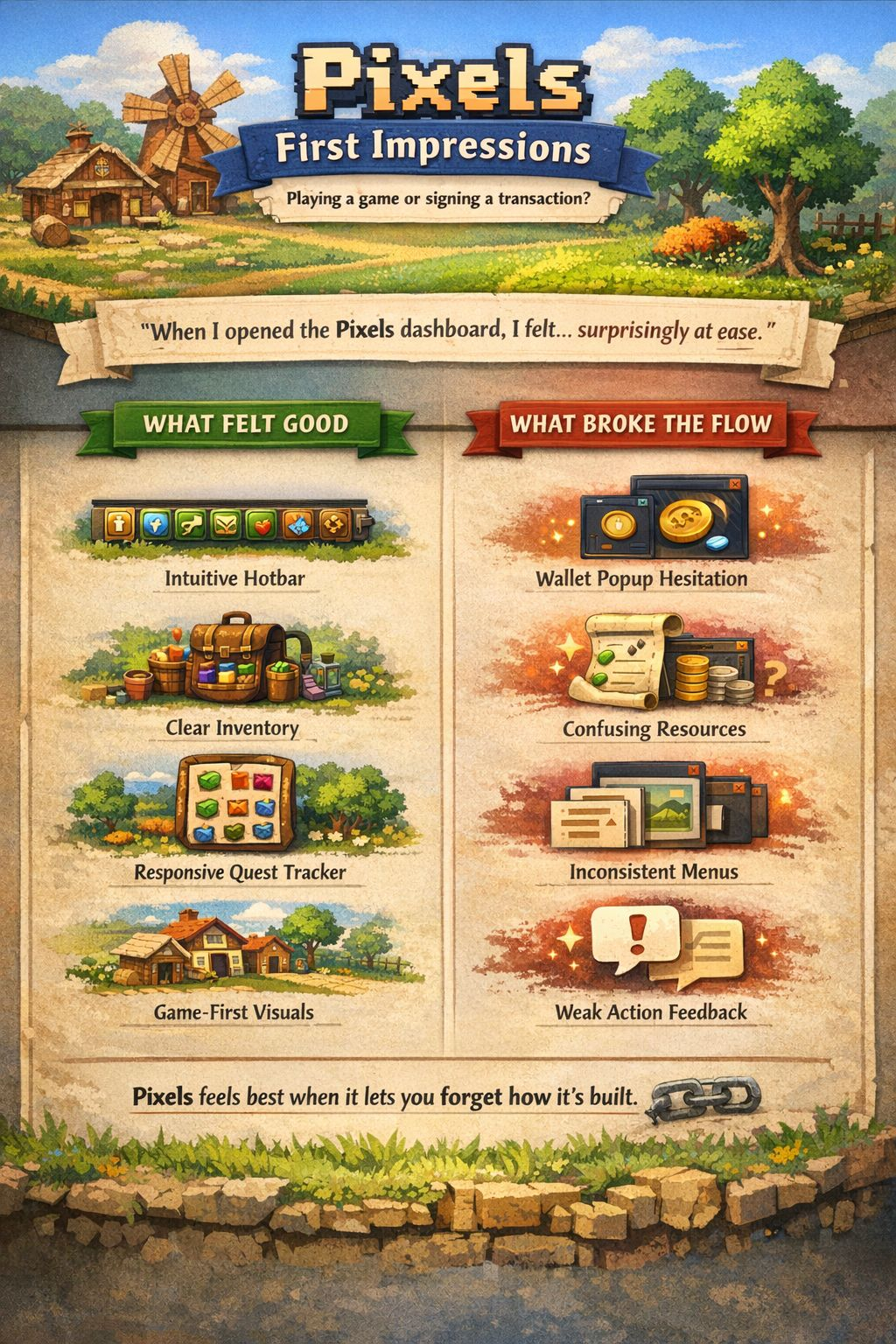
But yeah, it wasn’t Perfect.
The first issue I noticed was the wallet popup. It kind of broke the flow. I clicked something and then paused, wondering if it actually worked. There was a small delay, and no clear confirmation. In Web3, that moment of doubt feels bigger than it should.
I alSo struggled a bit with the resources section. Everything was there, but not very clear. Coins, energy, items — they didn’t stand out properly. I had to look twice sometimes, and that slowed me down.
Navigation Had a few small problems too. Some menus opened as popups, others took over the whole screen. A couple of times, I thought I exited something, but I was still inside another layer. It wasn’t a big issue, but it did feel a bit confusing.
Here’s how it felt overall:
What FelT Good | What Broke the Flow
Easy-to-use hotbar | Wallet popup confusion
Clean inventory design | Unclear resource display
Helpful quest tracker | Inconsistent menus
Feels like a real game | Weak action feedback
The best part about $PIXEL Is how close it gets to feeling like a normal game. Most of the time, I forgot about the blockchain part — and that’s exactly what I want.
But whenever something slowed down or felt unclear, that feeling broke for a second.
And that’s the whole story.
Pixels is at its best when you stop noticing how it works.
