
One thing I learned early from watching charts is that price rarely moves randomly for long. It leaves clues. Sometimes those clues show confidence building quietly before a breakout. Sometimes they show strength fading long before the drop becomes obvious. That is where chart patterns become useful. Not because they can predict the future perfectly, but because they help us read the behavior behind price.
A chart pattern is really the market showing its internal struggle in visual form. Buyers push, sellers react, momentum pauses, pressure builds, and eventually one side starts winning. The more time I spent looking at charts, the more I realized that patterns are less about shapes and more about psychology. They show hesitation, aggression, exhaustion, recovery, and imbalance.
Still, no pattern is magic. A pattern can fail. A breakout can reverse. A perfect-looking setup can still trap traders. That is why chart patterns should always be used for educational understanding, not blind prediction. The real edge comes from learning what the pattern is trying to say, and then waiting for price to confirm it.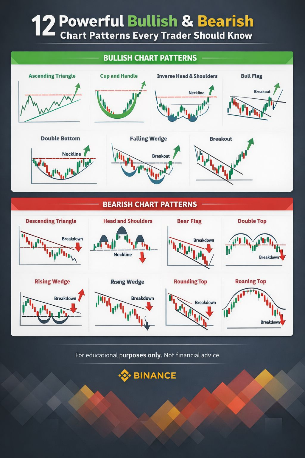
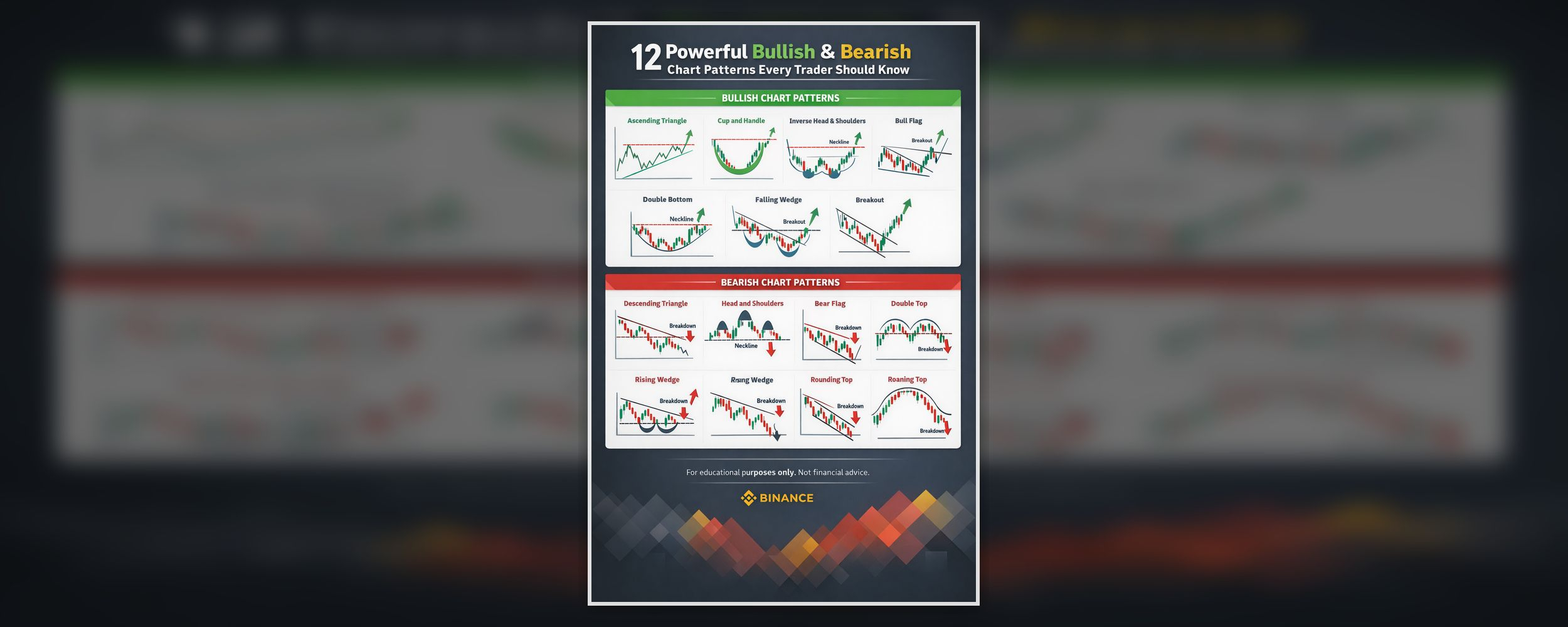
Below are six important bullish chart patterns and six important bearish chart patterns that every trader should understand.
1. Ascending Triangle
The ascending triangle is one of the clearest bullish patterns on a chart. It usually appears when price keeps pushing into the same resistance area, while the lows continue rising. This creates a flat ceiling on top and a rising trendline underneath.
What makes this pattern powerful is the pressure building inside it. Sellers keep defending one level, but buyers are not backing away. Instead, they return earlier on each pullback, which means they are becoming more aggressive. That change matters. It shows demand is increasing even before the breakout happens.
The bullish signal usually appears when price finally breaks above resistance. That breakout suggests the market has absorbed the selling pressure sitting at that level. In simple terms, buyers have pushed through the barrier that had been stopping the move.
This pattern is important because it teaches patience. Many traders get excited too early and enter before resistance breaks. But the true strength of the ascending triangle is not the shape alone. It is the confirmed breakout that matters.
2. Cup and Handle
The cup and handle is a classic bullish continuation pattern. It normally forms after an uptrend, when price pulls back, rounds out into a smooth bottom, and then returns toward its previous high. After that, a smaller pullback forms the handle before price attempts another breakout.
The reason this pattern stands out is because it often shows a healthy recovery rather than a rushed one. The cup reflects a market that corrected, stabilized, and rebuilt strength gradually. The handle then acts like a final pause where short-term traders take profit and stronger hands prepare for the next move.
A good cup and handle usually looks balanced and controlled. The cup should be rounded, not overly sharp, and the handle should stay relatively shallow. If the handle becomes too deep, the structure starts losing strength.
The bullish confirmation comes when price breaks above the handle or the previous resistance area. That breakout suggests the market has completed its pause and is ready to continue upward.
3. Inverse Head and Shoulders
The inverse head and shoulders is a bullish reversal pattern that usually appears after a downtrend. It forms with three lows: a left shoulder, a deeper center low called the head, and a right shoulder that is usually similar to the first one. A neckline is drawn across the highs between these lows.
This pattern matters because it shows the market slowly changing character. The first drop reflects weakness. The deeper second drop shows sellers making one more strong attempt. But when price forms the right shoulder without creating another major breakdown, it often suggests that selling pressure is fading.
The key moment comes when price breaks above the neckline. That move signals that the market is no longer trapped in its old bearish structure. Instead, it is starting to build the first signs of a reversal.
What I like about this pattern is that it often captures the transition from fear to recovery. It does not usually happen in one candle. It happens through a shift in structure, and that makes it meaningful.
4. Bull Flag
The bull flag is a bullish continuation pattern that appears after a strong upward move. First comes a sharp rally, known as the flagpole. Then price enters a short pause, usually drifting slightly downward or sideways inside a narrow range. That smaller structure is the flag.
This pattern often reflects controlled profit-taking, not true weakness. After a fast rally, some cooling off is natural. Traders lock in gains, momentum slows, and price consolidates. But if the pullback remains small and orderly, it suggests that the overall trend is still healthy.
The bullish signal comes when price breaks above the top of the flag. That breakout tells us the pause may be over and buyers are regaining control.
A bull flag works best when the move before it is strong and obvious. Without that earlier momentum, the pattern becomes much less reliable. In other words, the flag only matters because of the flagpole that came first.
5. Double Bottom
The double bottom is a bullish reversal pattern that forms after a decline. Price falls to a low, bounces, returns to test a similar low again, and then starts recovering. On the chart, it often looks like a W.
This pattern is useful because it shows the market testing support twice and failing to break lower. The first bottom brings in buyers. The second bottom tests whether sellers still have enough power to force a fresh breakdown. If they cannot, the market begins to change tone.
The actual bullish confirmation comes when price breaks above the neckline, which is the resistance area between the two bottoms. That breakout suggests the market is no longer just stabilizing. It may be starting a true reversal.
What makes the double bottom popular is that it reflects a simple idea traders understand well: when a support zone holds more than once, the market may be rejecting lower prices.
6. Falling Wedge
The falling wedge is usually considered a bullish pattern, even though price moves downward while it forms. It develops when price makes lower highs and lower lows inside two downward-sloping lines, but the range begins narrowing over time.
That narrowing is the key. The market is still drifting lower, but the selling pressure is becoming less effective. Bears are still pushing, but each move downward has less force behind it. This often signals exhaustion rather than strength.
The bullish trigger usually comes when price breaks above the upper trendline of the wedge. That breakout suggests the weakening downtrend has lost control.
This is one of the most interesting patterns because it reminds traders that a chart can still look bearish on the surface while quietly preparing for a bullish reversal underneath.
7. Descending Triangle
The descending triangle is a bearish pattern that often forms during a downtrend. It shows price repeatedly testing a horizontal support area while the highs continue getting lower. This creates a flat base and a descending upper trendline.
The psychology here is the opposite of the ascending triangle. Buyers are trying to defend one level, but sellers keep pressing harder on every bounce. That repeated pressure usually weakens support over time.
The bearish signal comes when price breaks below the horizontal support. That move suggests buyers have finally lost control of the level they were defending.
What makes this pattern important is how clearly it reflects pressure building to the downside. It often looks calm until support breaks, and then the weakness becomes much more obvious.
8. Head and Shoulders
The head and shoulders is one of the best-known bearish reversal patterns. It usually appears after an uptrend and forms with three peaks: a left shoulder, a higher peak called the head, and a right shoulder that fails to match the head. A neckline connects the support areas between them.
This pattern shows an uptrend beginning to lose strength. The left shoulder still looks normal. The head shows buyers making one more strong push. But the right shoulder reveals that momentum is no longer as strong as before.
The bearish confirmation appears when price breaks below the neckline. That break suggests the market is no longer making strong higher highs and is beginning to roll over.
A head and shoulders pattern often matters most after a prolonged rise, because then it reflects a more meaningful shift from bullish control to growing selling pressure.
9. Bear Flag
The bear flag is the bearish version of the bull flag. It forms after a sharp drop, then enters a short upward or sideways consolidation before continuing lower. The sharp drop is the flagpole, and the pause is the flag.
This pattern usually shows a temporary recovery inside a larger weak trend. After a big decline, some bounce is natural. Short sellers take profits, dip buyers step in, and price stabilizes for a moment. But if that recovery remains limited, it often suggests sellers still control the bigger picture.
The bearish signal comes when price breaks below the lower boundary of the flag. That breakdown implies the pause may be ending and the downtrend may continue.
The bear flag is useful because it teaches traders not to confuse every bounce with a true reversal. Sometimes a bounce is only a pause before another leg down.
10. Double Top
The double top is a bearish reversal pattern that appears after an uptrend. Price rises to a high, pulls back, returns to test a similar high again, and then starts falling. This creates an M-shaped structure on the chart.
The pattern reflects repeated failure at a resistance zone. Buyers managed to push price upward once, but when they return to that same area and still cannot break through convincingly, the market begins to look weaker.
The real bearish confirmation comes when price breaks below the neckline, which is the support area between the two peaks. That break shows the market is no longer simply struggling at the top. It is actually starting to lose support underneath.
The double top is powerful because it captures the moment when bullish momentum stops expanding and starts running out of space.
11. Rising Wedge
The rising wedge is generally considered a bearish pattern, especially when it appears after an uptrend. Price continues climbing inside two upward-sloping lines, but the range tightens over time.
At first, it can look bullish because price is still moving higher. But the narrowing structure reveals that momentum is weakening. Buyers are still pushing upward, just not with the same conviction as before.
The bearish signal appears when price breaks below the lower trendline of the wedge. That move suggests the weakening trend can no longer support itself.
This pattern is valuable because it reminds traders that not all upward movement is healthy. Sometimes price rises while strength quietly fades in the background.
12. Rounding Top
The rounding top is a slower bearish reversal pattern. Instead of a sharp rejection, price gradually loses momentum, flattens out, and then begins curving downward. The structure often looks smooth and subtle.
This pattern reflects a market that is not collapsing suddenly, but slowly losing confidence. Buyers become less aggressive, rallies lose energy, and sellers begin taking more control over time.
The bearish confirmation usually comes when price breaks below an important support zone after the rounded top has formed. That is the point where the gradual weakness becomes more visible.
What makes the rounding top interesting is its quiet nature. Not every reversal is dramatic. Some of the most important shifts happen slowly, before most traders fully notice them.
Final Thoughts
The deeper I studied chart patterns, the more I understood that they are not really about memorizing shapes. They are about learning how price behaves when pressure is building, momentum is fading, or control is starting to shift from one side to the other.
Bullish patterns usually show recovery, accumulation, or growing buying strength. Bearish patterns usually show exhaustion, distribution, or rising selling pressure. But in both cases, the pattern itself is only part of the story. Confirmation, context, volume, and risk management matter just as much.
That is why chart patterns should be treated as educational tools, not promises. They can help traders read the market with more structure and discipline, but they should never replace patience or judgment.
In the end, the real value of chart patterns is simple: they help turn price movement from random noise into something more understandable.
For educational and informational purposes only. This is not financial advice.