STONfi’s Refreshed Website — clarity, speed, and a smoother way into TON DeFi
STONfi has launched a fully refreshed website — and this update is more than a fresh coat of paint. It’s a deliberate redesign aimed at reducing friction, speeding up discovery, and helping anyone — whether brand new to TON or already active in the ecosystem — quickly understand how STONfi’s core features connect.
What changed (and why it matters)
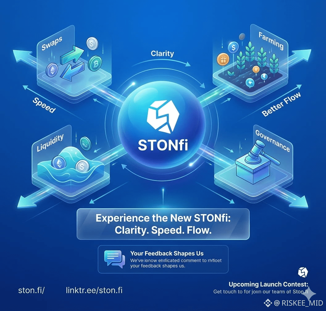
The new site focuses on three practical goals: clarity, speed, and intuitive navigation.
Cleaner layout: Information is grouped and prioritized so visitors see the most important actions and explanations first. That means fewer distractions and faster comprehension for users who want to swap, provide liquidity, stake, or participate in governance.
More intuitive navigation: Key flows — swaps, liquidity pools, farming, and governance — are easier to find and follow. Users no longer need to hunt through multiple pages to complete common tasks.
Faster access to core details: Technical jargon is trimmed back and core mechanics (fees, impermanent loss basics, apy mechanics, governance rights) are surfaced in plain language so newcomers can make informed choices quickly.
These changes reduce cognitive load and help users make better, faster decisions — which is exactly what a DEX and liquidity aggregator should deliver.
A better experience for every user
The redesign benefits different audiences in specific ways:
Newcomers: Short, clear explanations and guided navigation reduce onboarding friction. New users can understand what swaps, pools, and farming actually do without feeling overwhelmed.
Active traders and liquidity providers: Faster navigation and clearer dashboards make it easier to monitor positions and execute trades with minimal clicks.
Governance participants: Governance information and participation flows are more visible, so token holders can more easily learn about proposals and cast votes.
Community-driven evolution
STONfi’s team is treating this release as a living project, not a one-time milestone. They’re actively soliciting user feedback: what feels intuitive, what is confusing, and what users want to see next. That feedback loop matters — real user input will shape subsequent updates, improving UX and feature prioritization over time.
If you explore the new site, the team wants to hear specifics: which pages helped you most, which flows need fewer steps, and where technical or explanatory content could be clearer.
What’s next
The refresh is only the beginning. STONfi has signaled more features and community initiatives are on the way, including a dedicated launch contest tied to the new website — details will be announced soon. Those kinds of campaigns usually aim to reward early explorers and encourage active testing of new flows, so keep an eye on the team’s channels.
How to get involved
Take a few minutes to explore the new site and give structured feedback:
Visit: ston.fi
Learn more and follow updates: linktr.ee/ston.fi
When you explore, consider sharing:
Screenshots or short notes about confusing steps
Suggestions for clearer language or additional tooltips
Ideas for features or analytics that would help you manage activity on TON
Final thought
This website refresh is practical and user-centered: it’s about making DeFi on TON more accessible and usable, not just prettier. By focusing on clarity, speed, and ongoing community-driven improvements, STONfi is positioning itself as a platform that helps both newcomers and power users move confidently in the TON DeFi space. Take a look, test the flows, and — if you have thoughts — share them.
This kind of active feedback is exactly what will shape the next phase of the platform.