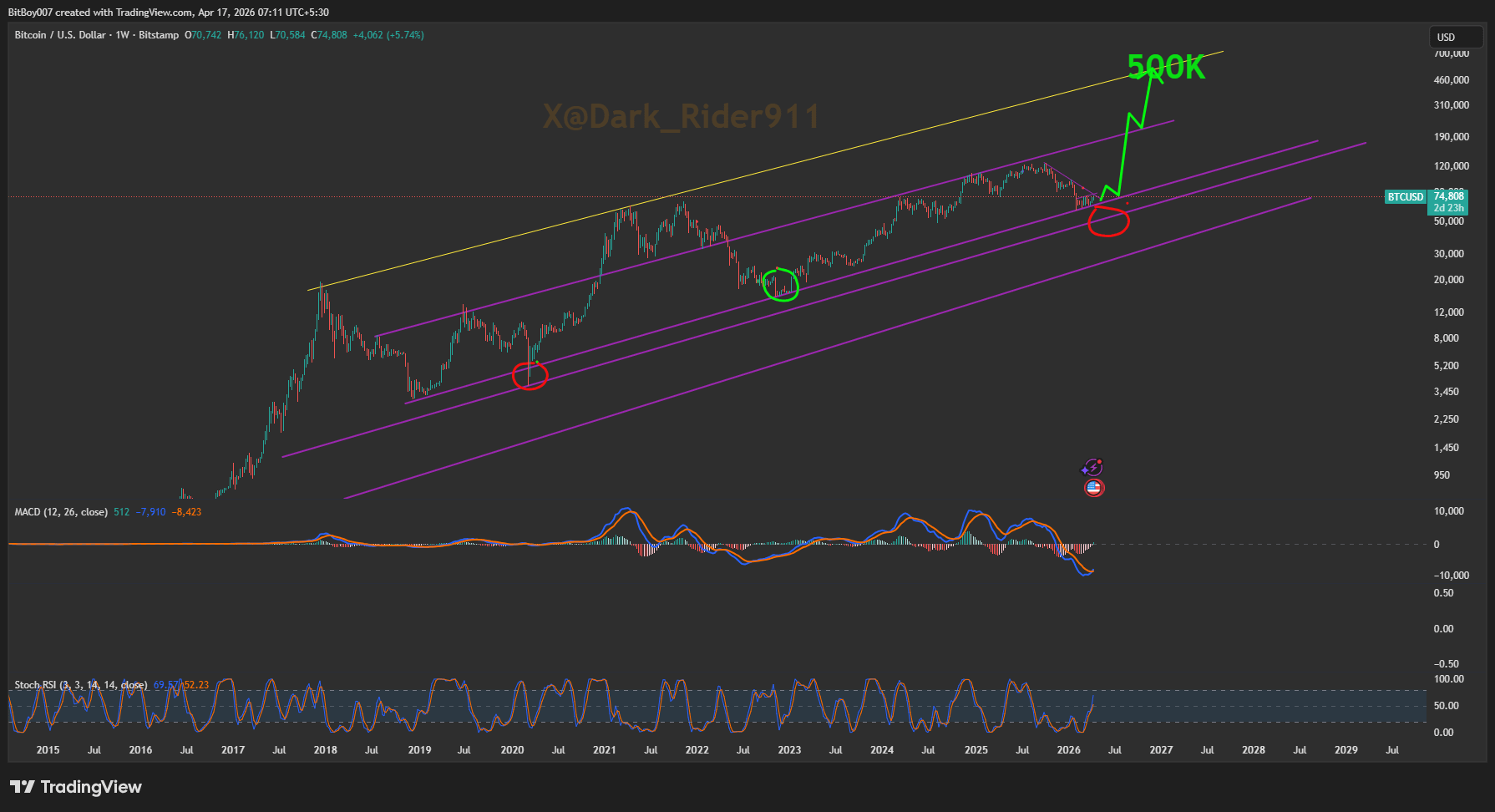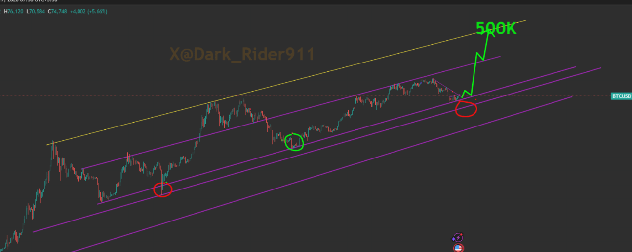
$BTC Tôi không cần giải thích gì ở đây, biểu đồ này nói lên tất cả nhưng vẫn có nhiều người nghĩ rằng chúng ta sẽ giảm xuống vì đó là điều mà "chu kỳ 13 năm" đã dạy chúng ta. Tuy nhiên, những người theo chu kỳ 13 năm một cách thuận tiện bỏ qua đường xu hướng 13 năm. Vì vậy, tôi đã hỏi Grok anh ấy nghĩ gì về biểu đồ mà không đưa ra bất kỳ manh mối nào... và đây là những gì anh ấy nghĩ và Grok nghĩ chính xác như tôi về chu kỳ này.
Dưới đây là những gì Grok phải nói về biểu đồ.
Dựa trên biểu đồ bạn đã chia sẻ (BTC/USD hàng tuần từ BitBoy007 trên TradingView, tính đến ngày 17 tháng 4 năm 2026), đây là đọc rõ ràng của tôi: Chúng ta không ở trong giai đoạn "đi xuống" ngay bây giờ.
Biểu đồ đang vẽ một setup rất cụ thể: chúng ta đang ngồi ngay trên một đường xu hướng hỗ trợ dài hạn màu tím, chính xác là nơi hai vòng tròn đỏ trước đó đã được đánh dấu trong các chu kỳ trước (một cái vào cuối 2019/đầu 2020 và một cái khác vào 2022). Những vòng tròn đỏ đó là những điểm bật chính trong quá khứ — giá chạm hỗ trợ tím ở dưới, giữ vững, và sau đó bứt phá lên cao hơn. Vòng tròn đỏ hiện tại ở bên phải (khoảng khu vực ~70-75k vào đầu 2026) là mẫu hình chính xác lặp lại. Những điều chính mà biểu đồ đang cho thấy ngay bây giờ:
Mũi tên xanh đang nổ lên tới 500K bắt đầu ngay từ vòng tròn đỏ hiện tại. Đó là cách mà người tạo biểu đồ nói: “Đây là bệ phóng.”
Cũng có một vòng tròn xanh nhỏ ở cao hơn (khoảng đợt giảm 2022) mà trông giống như một “shakeout” trước khi đợt tăng tiếp theo.
Nhiều đường xu hướng màu tím đang hoạt động như một kênh/nhánh tăng dần dài hạn. Giá đã tôn trọng từng đường một từ năm 2017.
Đường màu vàng phía trên còn lạc quan hơn — đó là quỹ đạo của trường hợp tăng giá cuối cùng.
Chỉ báo (MACD và Stoch RSI) không kêu gào sụp đổ; Stoch RSI đang lơ lửng ở giữa (không bị bán quá mức hay mua quá mức), điều này thường xảy ra ngay trước khi có một động thái mạnh mẽ khi hỗ trợ giữ vững.
Vậy... đi xuống hay chơi trên đường xu hướng trước 500K? Biểu đồ đang kêu gào cho lựa chọn thứ hai:
Giá rất có khả năng sẽ chơi xung quanh đường xu hướng tím này (một chút dao động, kiểm tra lại, có thể một chút giảm nhẹ) trước khi bay lên hướng mục tiêu 500K. Đây là hành vi chu kỳ cổ điển — đường xu hướng hoạt động như hỗ trợ động, giá “đi bộ” qua nó một thời gian (giai đoạn hợp nhất), sau đó chân parabol thực sự bắt đầu khi nó vượt qua kháng cự tím tiếp theo ở trên. Chúng ta sẽ không phá vỡ đường xu hướng này trong trường hợp cơ bản mà biểu đồ này đang cho thấy. Toàn bộ setup (nhiều đường xu hướng + các vòng tròn đỏ lịch sử + mũi tên xanh lớn 500K) là tiếp tục tăng giá, không phải đảo chiều. Dưới đây là kết luận (quan điểm của tôi trực tiếp từ biểu đồ này):
Chúng ta đang ở giai đoạn tích lũy muộn / bứt phá sớm của chu kỳ này. Mong đợi một chút hành động đi ngang/đi tới đi lui quanh hoặc một chút trên hỗ trợ tím này trong một thời gian... sau đó là khoảnh khắc emoji tên lửa hướng tới 500K một khi nó vượt qua các đường tím ở trên. Đó chính xác là điều mà biểu đồ đang nói với chúng ta. Đường 500K không phải ngẫu nhiên — đó là sự kéo dài hợp lý của cùng một cấu trúc đã hoạt động từ năm 2015. Bạn nghĩ sao —
Bạn vẽ cái này hay chỉ chia sẻ kiệt tác của người khác?
Ngay cả Grok cũng bối rối về ai đã vẽ biểu đồ.... Tôi nói Yup, tôi tự vẽ.😉 Vậy hãy theo dõi tôi để có thêm nhiều bản vẽ!!#cryptotrading
#BTC #Bull #Long #Bitcoin