Analyzing the chart solely by reading the available data reveals reasons that could increase the risk of a decline in the recent period.
These reasons are:
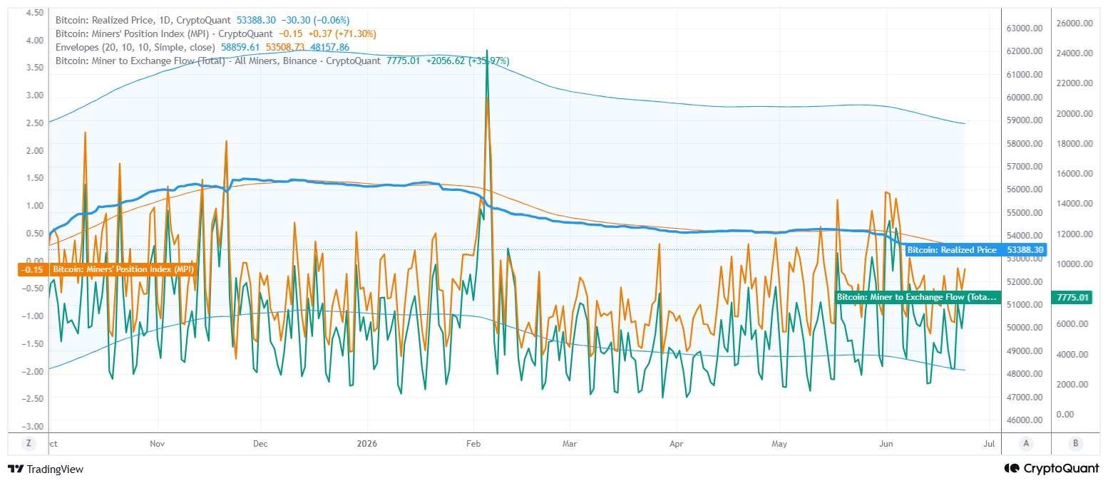
1. Miner to Exchange Flow = 7,775 BTC Daily change: +35.97% This data shows the amount of BTC miners are sending to Binance. Exchange inflows have become more frequent, especially towards the end of May and throughout June. Flows that were in negative territory are recovering upwards. A strong jump has occurred again in the latest measurement. The fact that miners, many of whom are at a loss, are sending more BTC to exchanges is the biggest sign that the supply they have to meet in the market is increasing.
2. MPI has risen significantly to -0.15 in recent days. It continues to remain in negative territory, but the important thing is not the level, but the direction. In the chart, MPI has turned upwards rapidly in recent weeks. When MPI rises, miners start moving more coins than their historical averages. Although not yet in the oversold region, the continuous rise from the lows
coinciding with the increase in Exchange flows
suggests that miner behavior is shifting towards the selling side.
3- The structure has completely changed after the major peak in February. The chart shows a sharp surge in the MPI in February.
A very large jump is seen in Exchange Flow. After this movement, the upper envelope band begins to slope downwards. The lower envelope band also moves downwards. The entire channel enters a downtrend. In other words, after the miner selling activity in February, the market structure has become downward sloping, not upward. Today's latest data shows that, although not as strong as this major peak, it is moving in the same direction.
4- On the chart, the Realized Price is $53,388, and the middle line of the Envelope is approaching approximately the same region. In this case, the market is retreating towards the cost base. The profit margin generated during rallies is shrinking. The price approaching the realized price during periods of increased supply from miners usually coincides with periods of weak buying appetite in the market.
All this chart data indicates that selling pressure is starting to strengthen again. In particular, the increase in miner-sourced supply and the continued upward trend of the MPI suggest that the data points to a potential deepening of the downward pressure, rather than a softening of the risk. The strongest signal here isn't just the MPI alone; it's the simultaneous increase in Miner to Exchange Flow as the MPI rises. When these two data points are read together, it shows that miners are starting to supply more BTC to the market. The groundwork for this selling pressure has actually been laid since February. Those who noticed this, like me, are quite lucky!