
One of the most common AI-generated UI errors we see in the Caffeine prompt challenge: the first screen tries to do too much.
Users will see after opening the app:
Dashboard
Analysis
Notifications
Activity Feed
Settings
…even before they understand the capabilities of the app.
Our recommendation is: indicate to Caffeine to take one or two clear actions first.
Imagine this page like this:
Title
An input/action
A primary button
Everything else (features, trust, etc.)
Let's look at some examples.
1. User interface examples
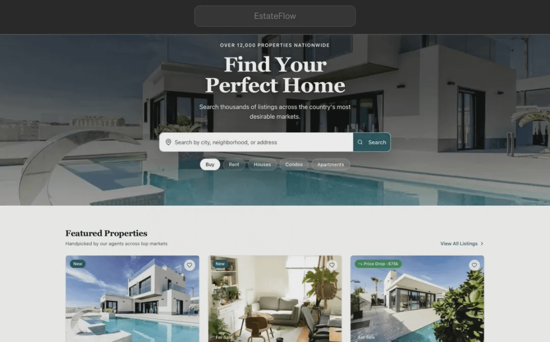
On one hand, let's take a look at the 'EstateFlow' app created by EdUniteDapps and released in the Caffeine app marketplace.
We can understand the functionality of this app in just 1 second, and it has only one main, clear action - search for properties.
Now let's look at an example from the other extreme.
To avoid provoking developers in the Caffeine community, we will use the homepage of Ling's Cars, which proudly claims to be "the UK's craziest car rental website."
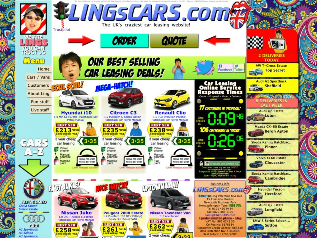
When you enter the page, you will immediately see dozens of elements competing for your attention: banner ads, buttons, animations, promotional messages, and navigation links.
This is interesting, but it also clearly indicates one thing: when everything is vying for attention, users find it harder to know where to start.
In most cases, the simpler approach used in the first example will make your application easier to understand.
2. Example prompts
When building an app with Caffeine, the prompt information on the first screen is very important.
Suppose we want to build a website to sell second-hand bicycles.
Option One:
Design a clean, modern homepage for a website that helps people buy and sell second-hand bicycles locally.
The homepage should focus on a primary user goal: helping visitors quickly find bicycles nearby.
Hero chapter:
Main headline: "Find your next bicycle nearby"
A striking search bar where users can input their location and filter by bicycle type and price.
A primary call-to-action button: "Search for bicycles"
Navigation - Simplify navigation as much as possible, including only:
Browse bicycles
Sell a bicycle
Working principle
Log in
Option Two:
Design the homepage for a second-hand bicycle trading platform, the homepage should showcase special offers, featured bicycles, popular bicycles, new arrivals, and sponsor-recommended bicycles, adding a large navigation bar containing sections for buying bicycles, selling bicycles, auctions, bicycle parts, accessories, bicycle rentals, bicycle insurance, bicycle installment payments, repair services, community forums, blogs, and events.
Add filters in the sidebar that can filter by brand, price, frame size, wheel diameter, color, location, condition, and seller rating. Place buttons of various shapes and sizes above the first screen for 'Sell Bicycle', 'Browse Offers', 'Start Auction', 'Compare Bicycles', 'Join Community', and 'Subscribe to Newsletter'. Add pop-ups for discounts, newsletter registration, and chatbots, displaying product cards, statistics, user reviews, and promotional images on the same screen, so users can immediately access a rich selection and information.
It's your app, your decision.
But one pattern we see repeatedly is that when the first screen asks users to make fewer decisions, they can understand the application faster - that's why we think your prompts should look more like 'Option One'.
Generally, the simplest entry points work best:
A clear goal
A primary action
A button that allows users to proceed
Once people understand the features of your app, you can always ask Caffeine to add more features in other areas.
\u003ct-202/\u003e\u003ct-203/\u003e\u003ct-204/\u003e
IC content you care about
Technological progress | Project information | Global events

Follow IC Binance channel
Stay updated