
• Renko is a Japanese charting method from the 19th century, introduced to the Western world by Steve Nison in his book Beyond Candlesticks (1994). His work was later continued by Prashant Shah, CMT and CFTe. The key distinction is dimensional: candlesticks are two-dimensional, as they use both time and value. Renko is one-dimensional. It only plots a new brick when value moves by a defined amount, removing time from the equation entirely. This makes it a "noiseless" chart. This method is particularly effective for identifying trend changes.
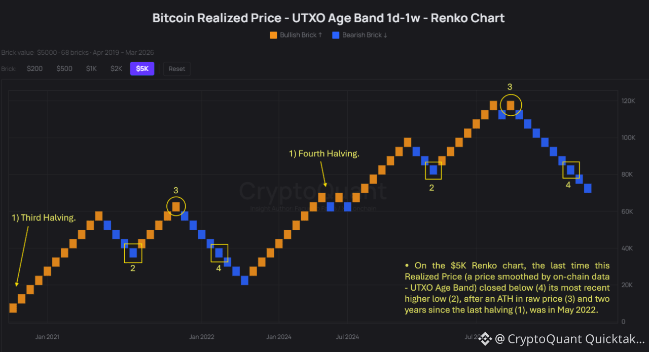
• Here, I apply a Renko chart to a price smoothed by on-chain data (Realized Price - UTXO Age Bands), in order to visualize Bitcoin’s prevailing trend more clearly (behind raw price movements).
• Insight: On the $5K Renko chart, the last time this Realized Price (a price smoothed by on-chain data - UTXO Age Band) closed below (4) its most recent higher low (2), after an ATH in raw price (3) and two years since the last halving (1), was in May 2022.
• If you want to know technically why this Realized Price is displayed using Renko Chart, check the link below ↓
Written by _OnChain