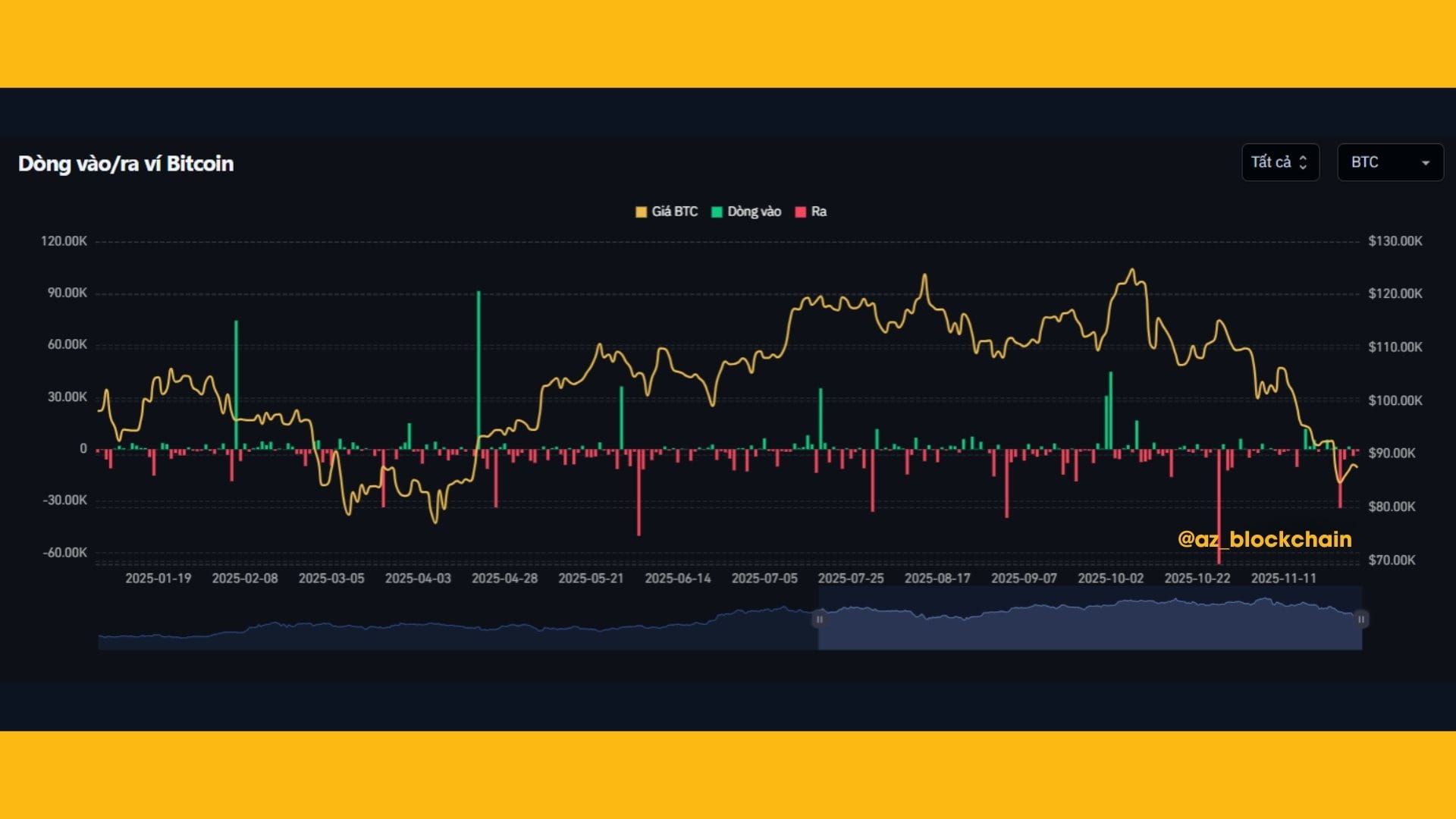
The inflow/outflow chart $BTC shows a fairly clear picture: the pressure to withdraw BTC (red outflow) is significantly stronger than the inflow (green), especially when the price adjusts from the $120K range to below $90K.
📉 Outflow dominates - Selling pressure remains high
✨High red bars continuously appearing indicate that many holders are taking profits or leaving the market.
✨The strong drop at the end of the chart coincides with the moment BTC dropped sharply → a sign of panic selling from whales or institutions.

🟩 Weak inflow - Buying power has not returned
✨Small retail green column, sparse → buyers are not ready to return.
✨Retail is on the sidelines, whales have not accumulated → the market shows no clear signs of reversal.
📉 The price goes down according to the “flow rhythm”
✨The price line of BTC (gold) drops sharply just as the outflow increases.
✨This is a corrective behavior due to active selling, not just a pure technical decline.
🧭 Meaning for newcomers
✨When outflow > inflow → the market is weak, no FOMO.
✨When inflow increases sharply again → it is usually a signal that BTC is about to rebound or create a bottom.
✨Observe the cash flow faster than the price, as wallets always react first.
🎯 Quick assessment
✨Short-term trend: decline, panic selling dominates.
✨Next scenario: BTC may continue to test the bottom or move sideways to accumulate.
✨Watchpoint: strong inflow increase — a true reversal signal.

🛑 THIS POST IS NOT INVESTMENT ADVICE, PLEASE REFER AND ALWAYS STAY CALM IN THE MARKET. 😘