I see many questions and answers from various perspectives. Most of them do not get to the point, so let me provide some solid information.
1. From my over ten years of trading experience, talking about various basic candlestick theories like doji, engulfing lines, and dark cloud cover, people who only understand candlestick MACD, golden cross, and dead cross are basically just familiar with these common yet useless theories.
It is very difficult to understand candlesticks from these theories. The information conveyed by these basic candlestick patterns and indicators is simply too little. They are basically not useful at all.
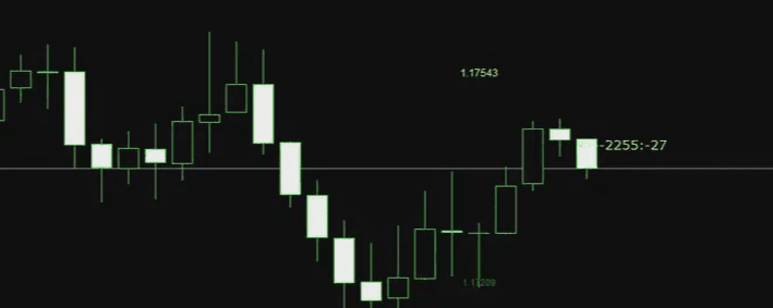
2. Make the candlestick chart very large, as shown in the picture. With several candlesticks, the analysis is quite thorough, yet it is still not understood at all. The market is a continuous whole.
Especially a major overall trend has a cause-and-effect relationship throughout. Just looking at a small structure, a few or several candlesticks, I can only say it’s not very insightful.
 What can a true expert see in candlesticks? This kind of question can actually be viewed from many angles. For example, I wrote an article before, which is also one angle. A normal person might need to rely on indicators to see divergence, while someone who understands the market deeply can directly see the divergence from the candlesticks. This is also one perspective.
In other words, when the candlesticks exhibit a certain state, experienced market watchers can directly sketch what the MACD looks like, what the moving averages look like, and what the Bollinger Bands look like, without even needing to bring up these indicators. I believe that seasoned traders with over ten years of experience should be able to do this. This is essentially the result of accumulated experience over time, which also reflects the so-called market sense.
 The essence and idea of 'divergence' in forex technology
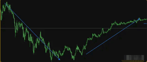
It's important to know what stage the market is currently in. Experts watching the market need to understand what the market is currently doing. For example, is it in a fluctuation, a trend, at the end of a trend, or at the beginning of a trend? This is something that needs to be understood when doing financial analysis.
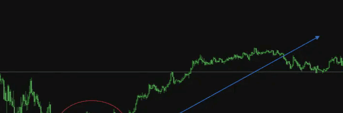
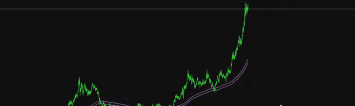 For example, the image above shows the trend of gold, and when we analyze it, we need to look at the whole. What is the current state of gold? Opening the weekly chart, we conclude that gold is currently in a high-level fluctuation after a significant rise. Whether it will rise or fall after the fluctuation in the future is still unknown.
This is a qualitative assessment of the current state of the market through the overall structure. We know the market is in a fluctuation, and at this point, we need to apply the technical knowledge of fluctuations. Then we analyze step by step. Unraveling the layers, we finally formulate a trading plan.
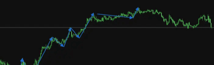
 Divide the market structure as shown in the image of the gold 4-hour chart. In the overall trend of gold during this phase, I will classify the movements with the same rhythm into a structure. In my view, each box in the image below represents an individual structure. Of course, there are also connections between structures.
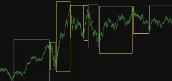 As for how to determine whether a certain phase is a structure, I won’t go into details, but I’ll draw a few pictures for you to understand. Many details require data statistics.
 I won't go into more details, but one small technical point is that within the same structure, the market experiences rises, falls, and adjustments, with each segment moving with a very rhythmic and similar pattern. Within a single structure, there are smaller cycles and even smaller structures. This indeed has a bit of complexity to understand and requires more observation and practice to find the patterns.
In fact, there are too many angles to understand the market, and it's impossible to elaborate on each one. Finally, let me share a tip for watching the market.
When looking at candlesticks, it is necessary to view them as a large whole. Just like throwing a stone into a river, starting from the point where the stone falls, and considering every layer of waves created as a whole.
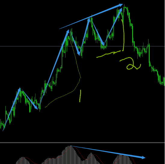
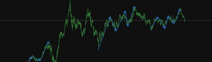
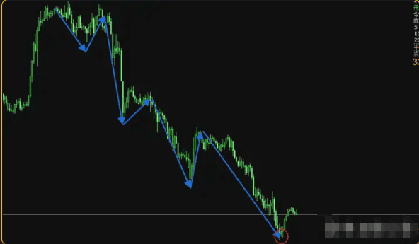
Rather than just looking at a specific point or a single wave. Points and waves, every layer of waves has a cause-and-effect relationship. I will give a practical example from last Friday night, the last wave of gold. I used this small phase as a case study.
At that time, gold first fell, made a simple adjustment, and then rose.
 For the last wave of the upward movement, the market within the circle is like the stone that was thrown. The fluctuating market in the circle is a small accumulation of energy. When this stone is thrown, it creates layers of rising waves.
How can we say that they have a cause-and-effect relationship?
First, that stone is very small, and the image below shows the market cycle enlarged. We conclude that this is a rebound from a previous overall decline. Because the fluctuation cycle of the market is very short, it cannot generate large waves, and the probability of a direct rapid rise in the future is very low.
After a long period of fluctuation and energy accumulation, large waves can be created. This is the cause-and-effect relationship between fluctuations and trends. The longer the fluctuation, the more intense the trend.
Secondly, as shown in the image, at that time I judged within the small structures 1 and 2 that this wave had not yet finished rising and still needed to rise for a while. The reason is that the second segment was longer than the first segment.
If one segment is shorter and slower than the previous one, it indicates that the upward momentum is waning. It may be time to enter a correction and reversal. However, if the second segment is still strong, even stronger than the first, it indicates that there is more to come. This is also a cause-and-effect relationship.
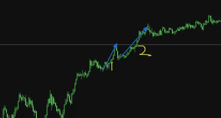
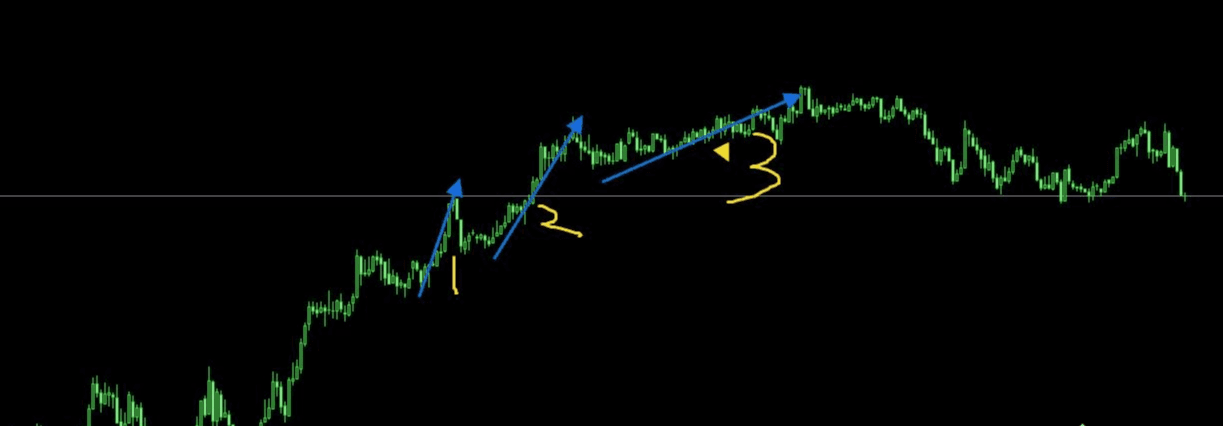
As shown in the image above, the third segment appeared as expected, and the market rose slightly again, but without the strength of the second segment, it slowed down. The market then entered a correction after the third segment. This is the system of cause and effect.
Therefore, analyzing the market is not just about small segments; it's about looking at the overall big picture of cause and effect. There are many technical points here. The example I provided is just a small technical point. If you can clarify numerous cause-and-effect relationships, you will have a clear understanding of what the market is doing and what it will do in the future. Moreover, this is very helpful for strategy formulation.
Wen Jing focuses on ambushing Ether contracts in the spot market; the team still has positions available.#比特币波动性 $ETH