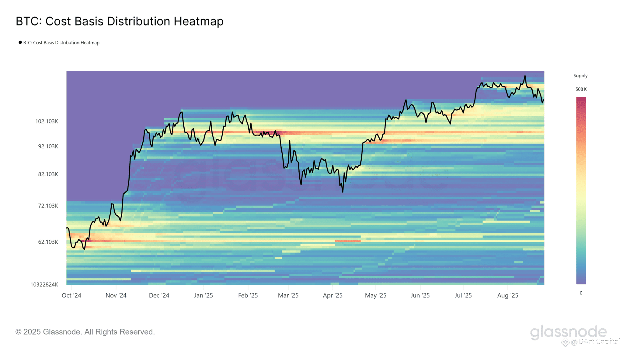
Have you ever wondered, at what price do most people buy Bitcoin? 🤔 Well, there is a magical map that can show that! The chart you provided is a "market psychology map" called the Cost Basis Distribution Heatmap.
Let's break down the map together, shall we? 😊

Reading the Bitcoin Price 'Map' 🔍
This chart shows at what price investors bought Bitcoin and kept it in their wallets from October 2024 to August 2025.
* Hot Colors, Many Buyers: The hotter the color (from yellow to red), the more Bitcoin supply that has been bought or changed hands in that price area. These areas become very important as they serve as strong support (floor) and resistance (ceiling) levels in the future.
* 'Take Profit' Zone ($92K - $102K): Data shows that this zone is a "distribution zone". This is an area where many investors who bought Bitcoin at lower prices tend to take profits or sell their assets. This selling action creates a kind of 'ceiling' that holds the price of Bitcoin from going higher.
* Price 'Floor' Zone ($82K): Conversely, the area around $82K is considered a strong "floor" or support. This is because at this level there is a lot of Bitcoin supply that was bought, and these buyers are likely to hold the price from falling further.
What’s the Conclusion for Us? 🧠
This chart provides us with incredible insights into investor behavior. We can see where the "floor" and "ceiling" prices are based on where most people bought Bitcoin.
This is a very useful tool for understanding market sentiment and making wiser decisions. So now you know, Bitcoin price movements are not always random, but are also influenced by investor psychology! ✨
