I'll try to explain briefly and to the point 👇
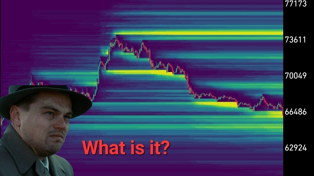
The heatmap of liquidations is a tool that shows the levels on the chart where a large number of forced position closures of traders occur.
In simpler terms, it displays areas where positions with leverage will start to be liquidated en masse as the price moves.
Unlike a regular order heatmap, here it shows not limit orders, but calculated levels where stops and liquidations of market participants are located.
These zones become the source of liquidity for the market — a kind of 'fuel' for price movement.
⚡ How the liquidation heatmap works
When a large number of liquidations accumulate at a certain level, the market often tends to move there.
The reason is simple:
Large players need liquidity to open or close large positions. The cascade of retail traders' liquidations creates this volume.
Therefore, the price often makes a sharp impulse into such zones, activates liquidations — and only after that forms further movement.
🎯 The most effective strategy: liquidity removal + reversal
One of the most powerful patterns when working with the heatmap is the SFP (Swing Failure Pattern) or false breakout of the level.
How it looks
1️⃣ On the liquidation map, look for the brightest cluster (usually yellow or orange).
This is the zone where the most liquidations are concentrated.
2️⃣ Wait for the price to sharply enter this area and start removing liquidations.
3️⃣ On the chart, this usually looks like a quick impulsive breakout of the level.
4️⃣ After the liquidity is gathered, the price returns back to the level.
📌 At this moment, entry into the opposite side occurs.
💡 Why this strategy works
Liquidity magnet
The price often moves exactly where the maximum amount of liquidations is located.
For large players, this is the perfect place to accumulate positions.
Market cleaning
When liquidations trigger, the market clears out weak participants.
After this, the price finds it easier to move in the opposite direction.
Clear stop-loss
The stop is usually placed behind the shadow of the candle that removed the liquidations.
If the price continues to move further — it means a strong trend impulse has started, and the reversal scenario is canceled.
📊 Important nuances
The timeframe matters
Liquidation clusters on 4H and 1D charts are significantly stronger and more reliable than on smaller timeframes.
Coincidence of leverage
Especially strong zones are those where liquidations of different levers converge (for example, 25x, 50x, and 100x).
Such levels become real magnets for the price.
🚀 Summary
The liquidation heatmap allows you to understand one important thing:
👉 the market moves where the crowd's money is located.
Using this tool, the trader stops just guessing the direction and begins to see where liquidity is located, and therefore — where the price is likely to go. 📈