I want to be careful not to give Pixels too much credit for a decision that might have been made because it was cheaper.
Retro pixel art costs less to produce than high fidelity 3D graphics. Smaller team, faster iteration, lower asset budget. A lot of indie games go retro for exactly this reason and then retroactively frame it as an artistic choice once people respond warmly to it. I don't know which came first for Pixels, the aesthetic vision or the budget constraint. I suspect the honest answer involves both and I think that's fine. Most design decisions do.
What I can evaluate is whether the art style works once you're actually inside the game. And it does, more than I expected.
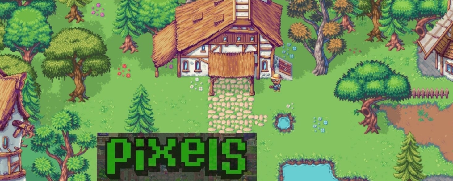
The 2D top-down perspective is immediately readable. You know where you are, what you can interact with, and where you're going without any camera management. That sounds trivial until you've played a 3D game where the camera fights you every time you try to navigate a crowded space. Readability in a game you're going to spend hours inside is not a small thing. It's the difference between a session that feels smooth and one that quietly exhausts you.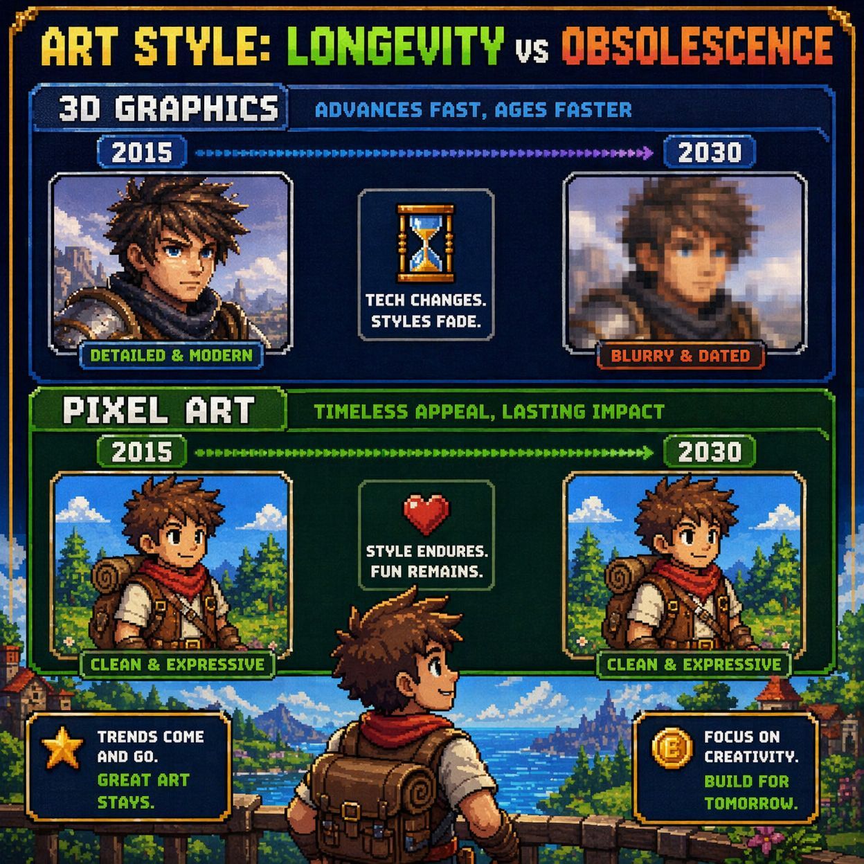
The pixel art style also ages differently than realistic graphics. A game that chased photorealism in 2015 looks dated in a way that's hard to overlook now. Stardew Valley looks roughly the same as it did at launch and nobody finds that jarring. There's something about the abstraction of pixel art that sits outside of time in a way that detailed 3D environments don't. Pixels is building a game it presumably wants people to play for years. Choosing an art style that won't look embarrassing in five years is a reasonable long-term decision.
The nostalgia argument is real but I think it gets overweighted in most discussions of why this style works. Yes, a generation of players grew up with 16-bit and 32-bit graphics and there's warmth attached to that visual language. But nostalgia is a thin foundation for a live game with an ongoing economy. You can't run a functioning token ecosystem on vibes from 1994.
What the art style actually contributes beyond nostalgia is a kind of visual honesty about what the game is. Pixels isn't pretending to be a AAA experience. It's not asking you to be impressed by its graphics before you've had a chance to evaluate whether you enjoy it. The retro aesthetic sets an expectation and then the game either meets it or doesn't on its own terms. I find that more respectful of the player's time than games that lead with cinematic trailers and deliver something considerably less interesting once you're actually playing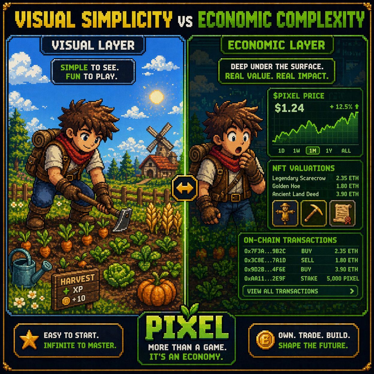
Where I think the art style creates a genuine tension is in communicating the Web3 layer. The visual simplicity of the game sits oddly against the financial complexity underneath it. You're looking at a cheerful pixelated farm while making decisions about token economics, NFT valuations, and on-chain transactions. The disconnect between what the game looks like and what it sometimes requires of you is real. I don't think it's a design failure exactly. But it can create a false sense of simplicity for new players who assume the game is as straightforward as it appears.
The 2D art style works. It works for readability, for longevity, and for setting honest expectations about the kind of experience Pixels is offering.
Whether it works as a disguise for complexity is a different question. And one I think about more than the developers probably intend.