📌 Introduction
Many traders look at charts every day but still feel confused. Candles, moving averages, MACD, RSI — everything is visible, yet nothing makes sense.
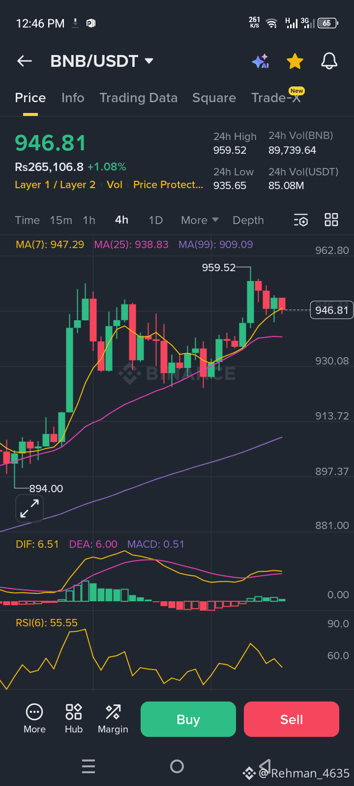
In this article, I will break down the BNB/USDT 4-hour chart step by step, using a real Binance screenshot, and explain every terminology, how candles change, what indicators are signaling, and how to plan an entry, stop-loss, and target like a professional trader.
This is not theory — this is live market education.
⏱️ Understanding the Timeframe (4H)
The selected timeframe is 4 hours (4H).
🔹 Each candle represents 4 hours of price action
🔹 One candle includes:
Open price
High price
Low price
Close price
📌 Important Rule:
Price keeps moving inside a candle, but real analysis is done only after the candle closes. Indicators update continuously, but signals become reliable at candle close.
🕯️ Candlestick Anatomy (Core of Price Action)
🟢 Green Candle (Bullish)
Close price is higher than open
Buyers are in control
🔴 Red Candle (Bearish)
Close price is lower than open
Sellers dominate
Candle Parts:
Body → Difference between open & close
Upper wick → Highest price rejection
Lower wick → Buying pressure from lower levels
📌 From the BNB chart:
Near 959.52, candles formed upper wicks → clear selling pressure & resistance rejection.
📈 Moving Averages (Trend Direction)
🔹 MA(7) – Short-Term Trend (Yellow)
Shows immediate momentum
Price above MA(7) = short-term bullish
🔹 MA(25) – Medium-Term Trend (Pink)
Acts as dynamic support
Strong area for pullback entries
🔹 MA(99) – Long-Term Trend (Purple)
Defines market structure
Major support zone
📌 BNB Observation:
Price is above MA(7), MA(25), and MA(99)
✅ This confirms a strong bullish structure
📊 MACD Indicator (Momentum Strength)
Components:
DIF → Fast momentum line
DEA → Signal line
Histogram → Momentum difference
Interpretation:
DIF above DEA → Bullish
Histogram turning green → Momentum returning
📌 BNB Chart Signal:
MACD histogram is recovering from red → green
➡️ Indicates bullish continuation after consolidation
📉 RSI (Relative Strength Index)
RSI Levels:
Above 70 → Overbought
Below 30 → Oversold
40–60 → Healthy trend zone
📌 Current RSI ≈ 55.55
✔ Market is balanced
✔ Not overheated
✔ Room for upward movement
🧱 Support & Resistance Zones (From This Chart)
🟢 Support Levels
935–938 USDT → MA(25) + structure
909 USDT → MA(99) strong base
894 USDT → Previous swing low
🔴 Resistance Levels
959–962 USDT → Strong rejection zone
Break & close above → Next bullish leg
🎯 Trade Setup Based on This Chart
✅ Bullish Entry Strategy
Entry: 938–942 USDT (pullback to MA25)
Confirmation: 4H candle close above MA25
Stop-Loss: 928 USDT
Targets:
TP1: 959 USDT
TP2: 980+ USDT
📈 Risk-reward remains favorable while trend holds.
⚠️ Bearish Scenario (Invalidation)
If price closes below 938
Expect move towards 909 USDT
Bullish bias invalidated below MA99
🧠 Key Trading Lesson from This Chart
“Strong trends don’t move in straight lines — they pull back, test support, and continue.”
BNB is currently: ✔ Holding structure
✔ Above key moving averages
✔ Supported by RSI & MACD
✔ Consolidating before next move
🏁 Final Conclusion
This BNB/USDT chart is a perfect example of a healthy bullish trend with controlled pullbacks.
If you understand candles, moving averages, MACD, RSI, and structure, the chart tells a clear story — buyers are still in control unless key supports break.
Now you don’t just see the chart —
👉 You understand it.