The main legit project behind $HYPER is Hyperlane, a cross-chain infrastructure protocol.
* It enables communication between different blockchains (L1 + L2)
* Think of it as a “bridge layer” for Web3 apps and assets
⸻
📊 Latest Market Snapshot
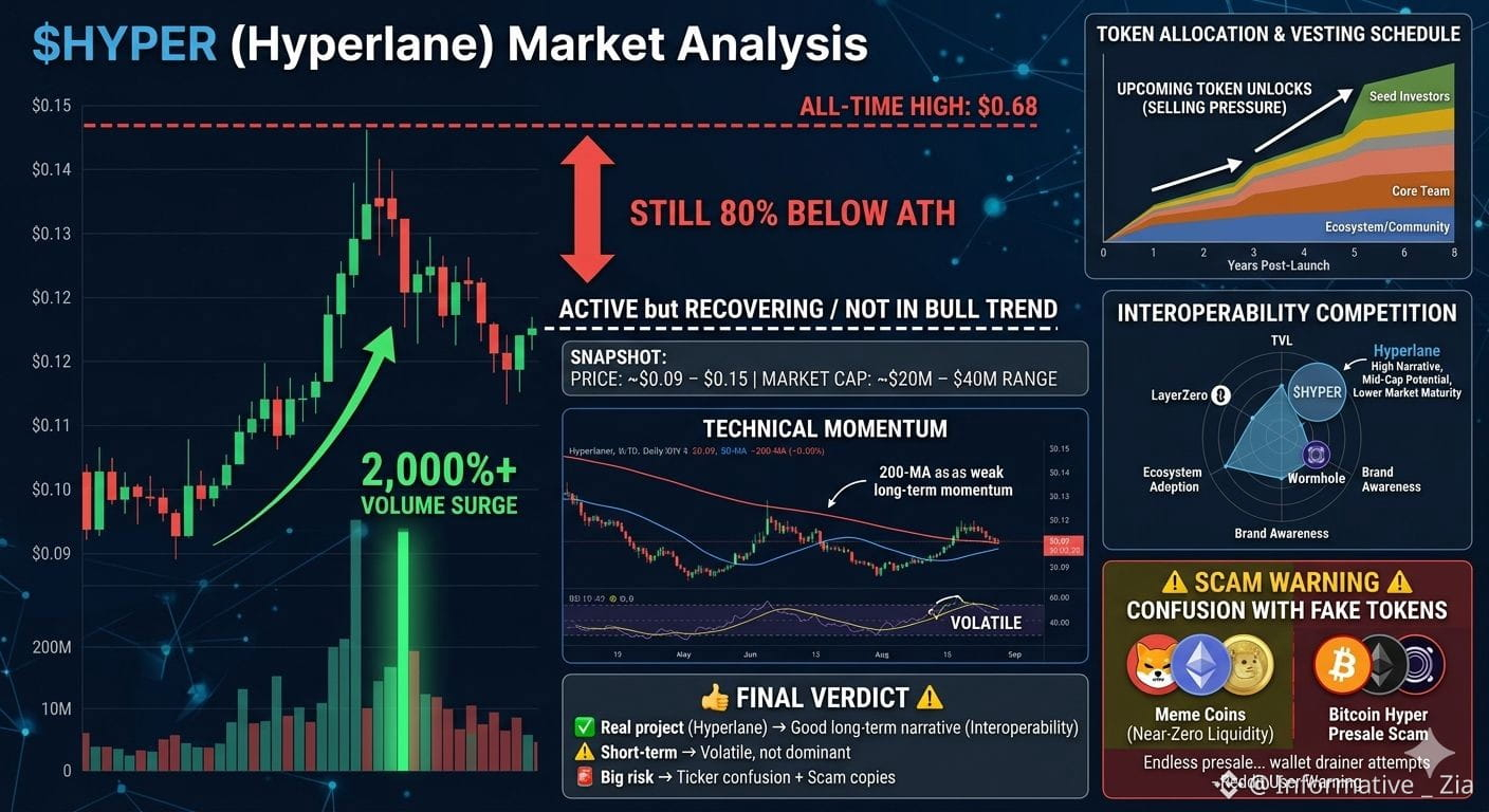
* Price: ~$0.09 – $0.15
* Market cap: ~$20M–$40M range
* Volume recently surged 2,000%+ (high activity spike)
* Still 80% below all-time high ($0.68)
👉 Translation: active but still recovering / not in full bull trend
⸻
📈 Short Analysis (3–4 lines)
$HYPER (Hyperlane) has strong fundamentals as a cross-chain infrastructure project, which is a growing narrative in crypto.
Recent volume spikes show rising interest, but price is still far below ATH, indicating weak long-term momentum.
Token unlocks and competition (LayerZero, Wormhole) create pressure.
Overall: mid-cap potential, but still risky and trend-dependent.
⸻
⚠️ VERY IMPORTANT (Confusion Warning)
There are many fake or low-quality “HYPER” tokens:
* Some meme coins with near-zero liquidity
* Some presale scams like “Bitcoin Hyper” flagged as high risk / speculative
👉 Even Reddit users warn about fake $HYPER presales:
“Endless presale… wallet drainer attempts”
⸻
🧠 Final Verdict
* ✅ Real project (Hyperlane) → good long-term narrative (interoperability)
* ⚠️ Short-term → volatile, not yet dominant
* 🚨 Big risk → ticker confusion + scam copies
Market Performance: Price, Volume, and ATH Context
This style of graph is essential for visually explaining the current market snapshot: the recent 2,000% volume surge, the price recovery, and the distance from the all-time high.
Visualizing the Data:
• Price vs. Volume Spike: Use a candlestick chart (price) paired with vertical bars at the bottom (volume). This would dramatically show the flat price action followed by a massive, vertical volume bar during the recent "surge," illustrating the sudden high activity.
• Distance to ATH: Implement a "percentage off high" line chart overlay. While the price shows a small bump from $0.09 to $0.15, the "off-ATH" line would remain depressed near the -80% mark, visually confirming the "recovering / not in full bull trend" narrative.
2. Competitive Landscape: Interoperability Market Share
The analysis specifically mentions competition from LayerZero and Wormhole. A comparison graph is crucial for understanding $HYPER's positioning as a "mid-cap potential."
Visualizing the Data:
• Total Value Locked (TVL) Comparison: A stacked bar chart or grouped bar chart comparing Hyperlane, LayerZero, Wormhole, and perhaps Axelar. This would show each protocol's TVL (how much value is moving through/secured by them). Hyperlane would likely show a smaller bar (reflecting the $20M–$40M market cap comparison), visually demonstrating it is an underdog fighting established giants.
• Bubble Chart (Risk vs. Narrative): Place protocols on a grid: X-axis (Market Maturity/TVL) vs. Y-axis (Narrative Strength/Growth Potential). Hyperlane would be positioned in the high potential/lower maturity quadrant, visualizing the "mid-cap potential, but risky" summary.
3. Short-Term Risk: Token Unlocks and Selling Pressure
The analysis flags "token unlocks" as a source of pressure. A supply curve graph is the best way to visualize this specific fundamental risk.
Visualizing the Data:
• Token Allocation and Vesting Schedule: A stacked area graph showing the circulating supply over time. Different colored bands represent different groups (e.g., Team, Investors, Ecosystem).
• Visualizing the "Pressure": This graph would show steep vertical increases in the available supply at specific dates (the "unlocks"). This visually explains to investors why price appreciation might be difficult despite good news, as new supply creates constant selling pressure.
4. Technical Analysis: Momentum and Trend
The "Short Analysis" indicates that "weak long-term momentum" exists despite recent interest. Standard technical graphs are required to visualize this trend dependency.
Visualizing the Data:
• Moving Averages (MA): Use a daily price chart with the 50-day MA (short-term trend) and 200-day MA (long-term trend). Currently, the 50-day MA might be curling up due to the volume spike, but if it remains below a downward-sloping 200-day MA, it provides a clear visual signal that the "long-term momentum" is still weak.
• Relative Strength Index (RSI): This momentum oscillator helps define "volatile." The recent 2,000% volume spike likely shot the RSI into "overbought" territory (above 70), indicating the surge may be unsustainable short-term, visually supporting the "volatile" verdict.#EthereumFoundationUnstakes$48.9MillionWorthofETH #Hyperium