
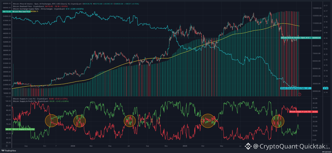
This mid to long-term analysis combines price action with on-chain supply metrics to understand Bitcoin’s structural trend rather than short-term volatility. By using Realized Price, Exchange Supply Ratio, MA 209 (close), Spot Price & Volume, and Supply in Profit vs Supply in Loss, we can identify accumulation zones, trend strength, and risk areas for the average investor.
Realized Price reflects the average on-chain cost basis. When spot price stays above it, the market is generally in a healthy, profitable regime. In the chart, marked bottoms occur while price remains near or above Realized Price, signaling strong demand absorption rather than structural weakness.
MA 209 (close) works as a long-term trend filter. Each highlighted dip aligns with price testing or briefly dipping below this average, followed by recovery. Historically, these interactions favor long-term positioning rather than trend failure.
The Exchange Supply Ratio shows a persistent decline, meaning fewer coins are held on exchanges. This reduces immediate sell pressure. Notably, during consolidation phases and marked intersections, exchange supply continues to fall, indicating ongoing accumulation despite price hesitation.
Supply in Loss (%) and Supply in Profit (%) explain investor behavior. At highlighted bottoms, Supply in Loss rises while Supply in Profit compresses, reflecting stress and capitulation. As these lines intersect and reverse, Supply in Loss declines and Supply in Profit expands, coinciding with price rebounds. Spot Price & Volume confirms this shift, as volume increases after these transitions, supporting moves driven by real demand.
Conclusion & Risk Management
Risk increases when price extends far above MA 209 while Supply in Profit is elevated. More favorable risk-adjusted zones appear near MA 209 when Supply in Loss spikes and Exchange Supply keeps declining. Investors should size positions based on trend structure, define invalidation below MA
Written by The Alchemist 9