MACD is not used to predict price movements; it is an indicator used to confirm the strength of momentum and trend.
First, MACD is an indicator that reflects the difference in strength between buyers and sellers.
It consists of three parts: 1) the fast line DIF, 2) the slow line DEA, and 3) the red and green bars. What you need to observe is not the color, but the direction and change of momentum. Don't just look at the golden cross above the water and the death cross below the water. We need to understand its underlying logic.
What exactly does MACD calculate?
Fast line ➖ Slow line = DIF, then smooth DIF again to get DEA, and plot the difference between DIF and DEA as bars, which is the red and green bars we see. In other words, MACD answers two questions.
1. The price difference between the short-term and long-term moving averages equals the difference in the strength of the bulls and bears.
2. Is this difference increasing or decreasing? (Is the kinetic energy increasing or decreasing?)
You can think of it as an electrocardiogram of bullish and bearish forces.
Now that we know what MACD is talking about, let's look at what the different parts are saying. First, let's look at our DIF, which is the fast line.
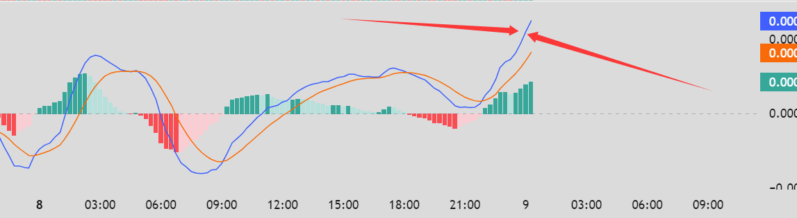
This refers to my blue line, DIF, which reflects the market's "current sentiment." The short-term EMA reacts quickly, representing the market's attitude in the recent period. The larger the DIF value (higher above the 0 line), the stronger the bullish sentiment; the deeper it is below the 0 line, the stronger the bearish sentiment. Currently, this chart shows strong bullish momentum! You can think of it as what people want to buy at this timeframe—whether they want to buy vegetables or meat.
Next, let's look at our slow line, the yellow line. It's significantly slower than the blue line. This reflects the market's long-term sentiment. In other words, this month people wanted to buy groceries, but the slow line (over the past year) shows people wanted meat – it represents the average sentiment over time. When the DIF crosses above the DEA: it indicates the current sentiment is shifting from bearish to bullish. When the DIF crosses below the DEA: it indicates the current sentiment is shifting from bullish to bearish. This is just a turning point in sentiment, not a turning point in price. Price may have already turned ahead of this; the MACD is merely for confirmation.
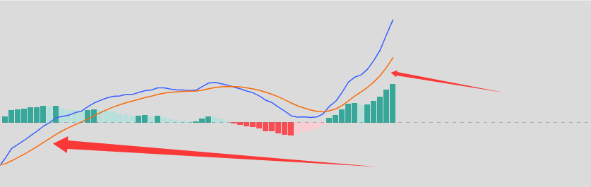
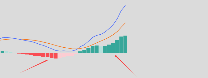
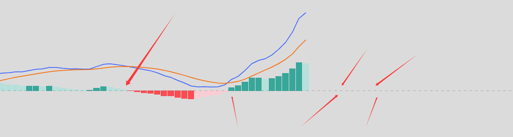
The bars represent the speed of change in sentiment. If red represents a desire for vegetables, then green represents a strong craving for meat. A longer bar indicates increasing bullish momentum and a stronger desire to buy, while a shorter bar signifies decreasing momentum. This explains why: after a significant rise, the red bars begin to shorten → the bulls are exhausted; after a significant fall, the green bars begin to shorten → the bears are exhausted.
True experts, when analyzing MACD, first look at the changes in the length of the bars, rather than whether the two lines intersect.
What is the zero axis in the "golden cross below zero" and "death cross above zero" that we often talk about? It's the dividing line between bullish and bearish trends, or the life-or-death line. This means that if you only remember the following points, it's enough for live trading: DIF hovering above the zero line for a long time → the overall trend is bullish; DIF hovering below the zero line for a long time → the overall trend is bearish.
Above the zero line: A golden cross usually indicates a change in the rhythm of an uptrend (such as the end of a pullback). A death cross is more often a consolidation/shakeout in the middle of an uptrend and does not necessarily indicate a major top.
Below the zero line: a death cross usually indicates a continuation of a downtrend, while a golden cross often indicates a rebound (not necessarily a major bottom).
So here's a very simple logic: first look at which side of the zero line the DIF is on, then interpret the golden cross and death cross. Looking at golden crosses and death crosses without considering the zero line is like trading blindly, and you'll inevitably lose money.
Divergence is the most valuable part of MACD, and also the most hyped-upon part. In fact, divergence is not a trend reversal, but rather an indication of insufficient momentum.
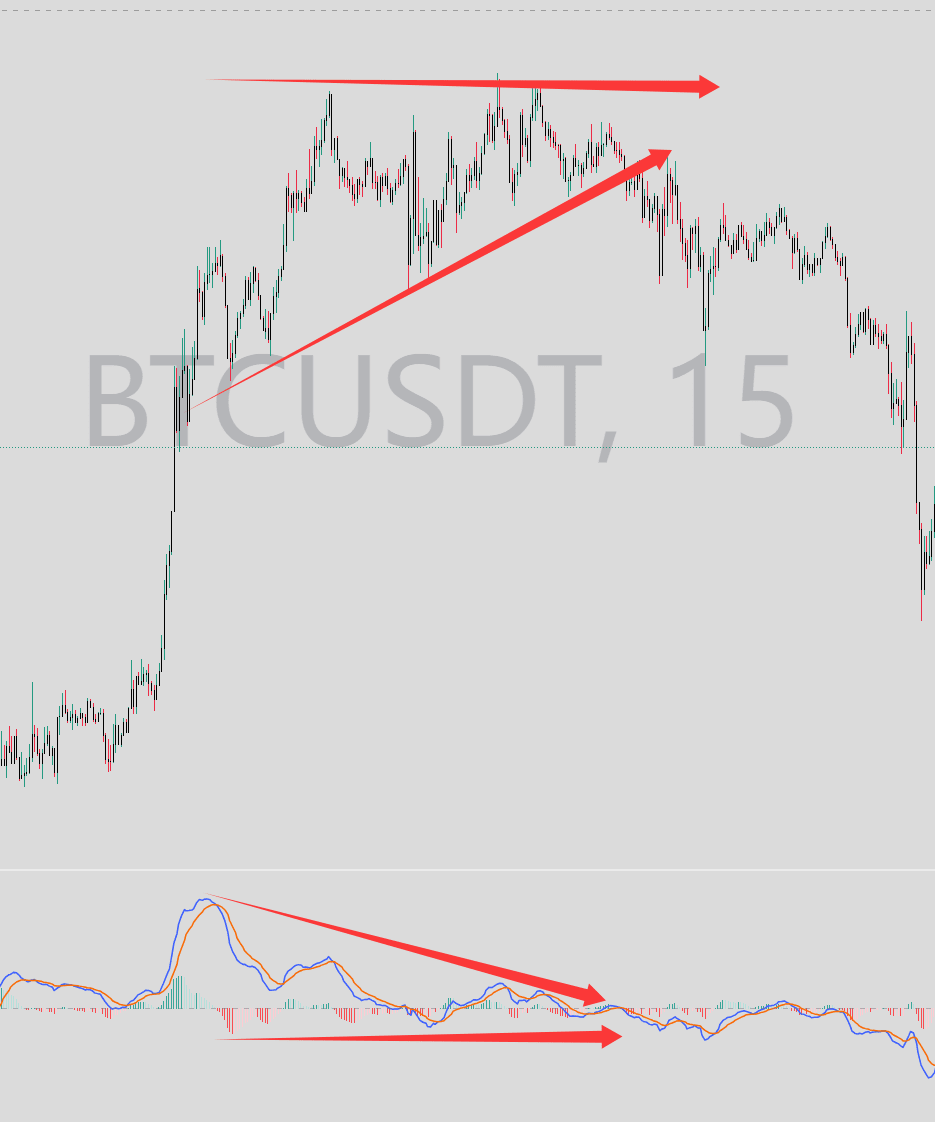
Top divergence: This means that a new high is reached, but the MACD fails to reach a new high or even declines. It indicates that the price was artificially inflated, like carrying a large bucket of water up stairs; the bullish momentum is insufficient. The 15-minute chart for BTC clearly reflects this lack of upward momentum, which will likely lead to a decline.
Bottom divergence: The price makes a new low, but the MACD does not, indicating that the bears are selling, but their strength is weakening. There are many sellers, but they can't push the price down any further. This chart is the "condom price movement" that was very popular a few days ago. However, when you break it down to a smaller timeframe, you can indeed see the divergence. Even though the price is lower, the MACD is still moving upwards.
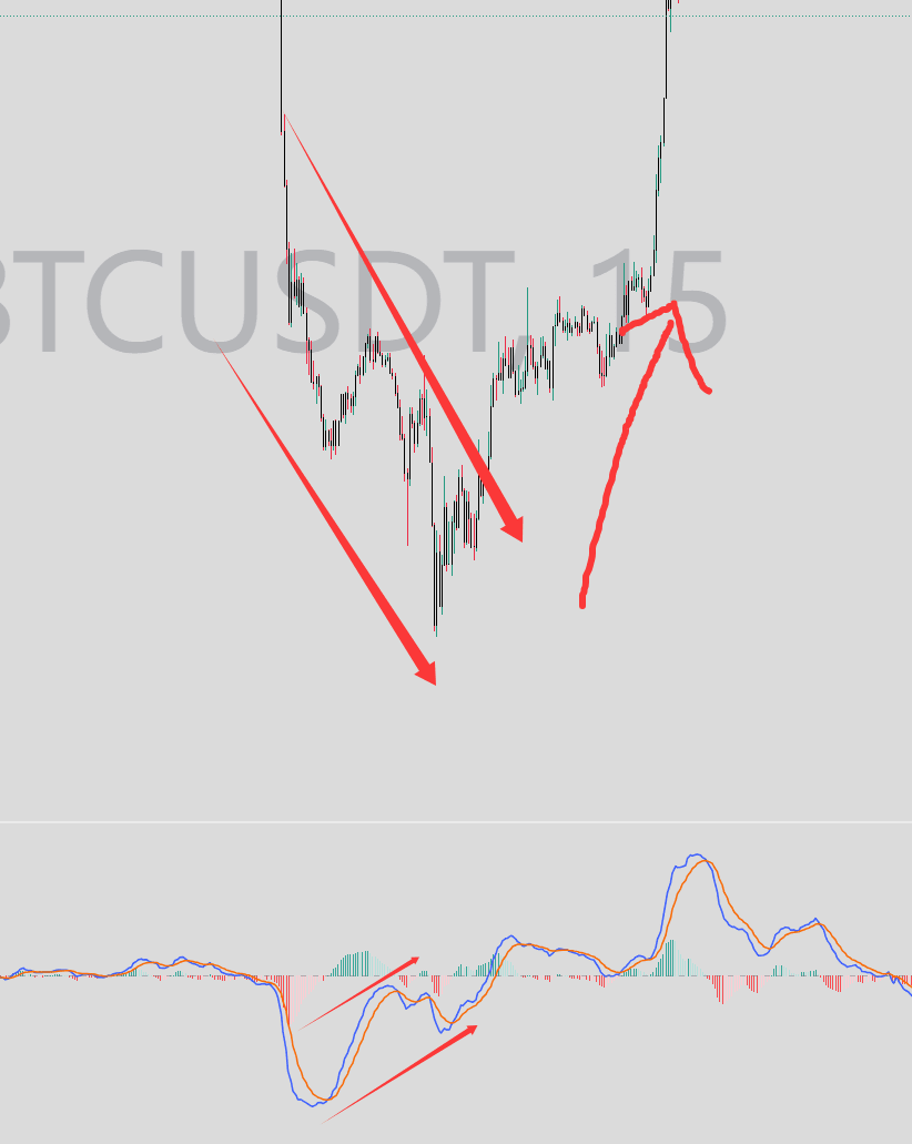
Therefore, we can see two trading strategies: a sharp rise at a high level followed by a divergence at the top and a sharp fall at a low level followed by a bottom divergence. This is the best time to use MACD.
MACD is a great tool, but only if you understand what it calculates. Use it to analyze trends, momentum, and divergences; it's your assistant. First, understand the structure, then the position, and finally look at the MACD. Remember: indicators are always secondary; logic is the soul. Let me know in the comments what you'd like to learn next! Wishing everyone ever-increasing profits, boundless wealth, low-multiplier compound interest, and the creation of miracles! #MACD Teaching


