What is MACD? What are the components of MACD
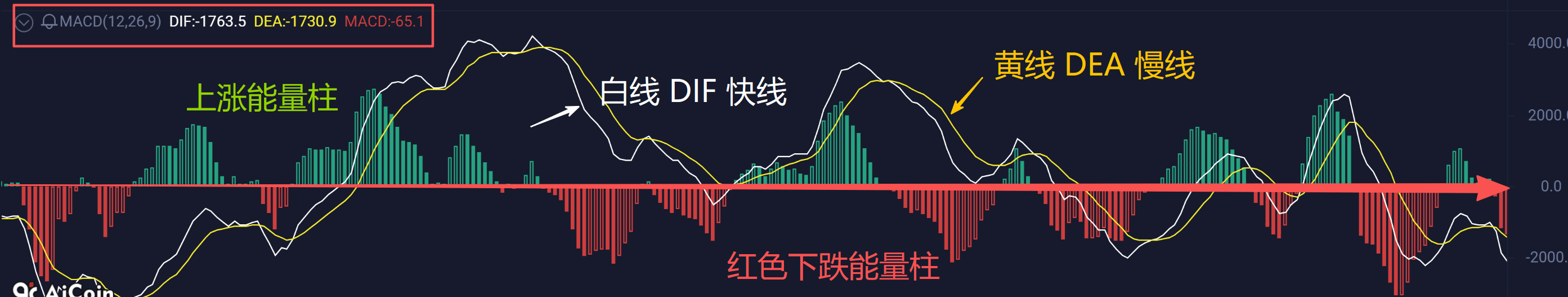
A standard MACD chart consists of four parts: two lines, one column, and one zero axis
1. DIF line (fast line) 2. DEA line (slow line) 3. MACD histogram (energy column) 4. Zero axis
How to use MACD:
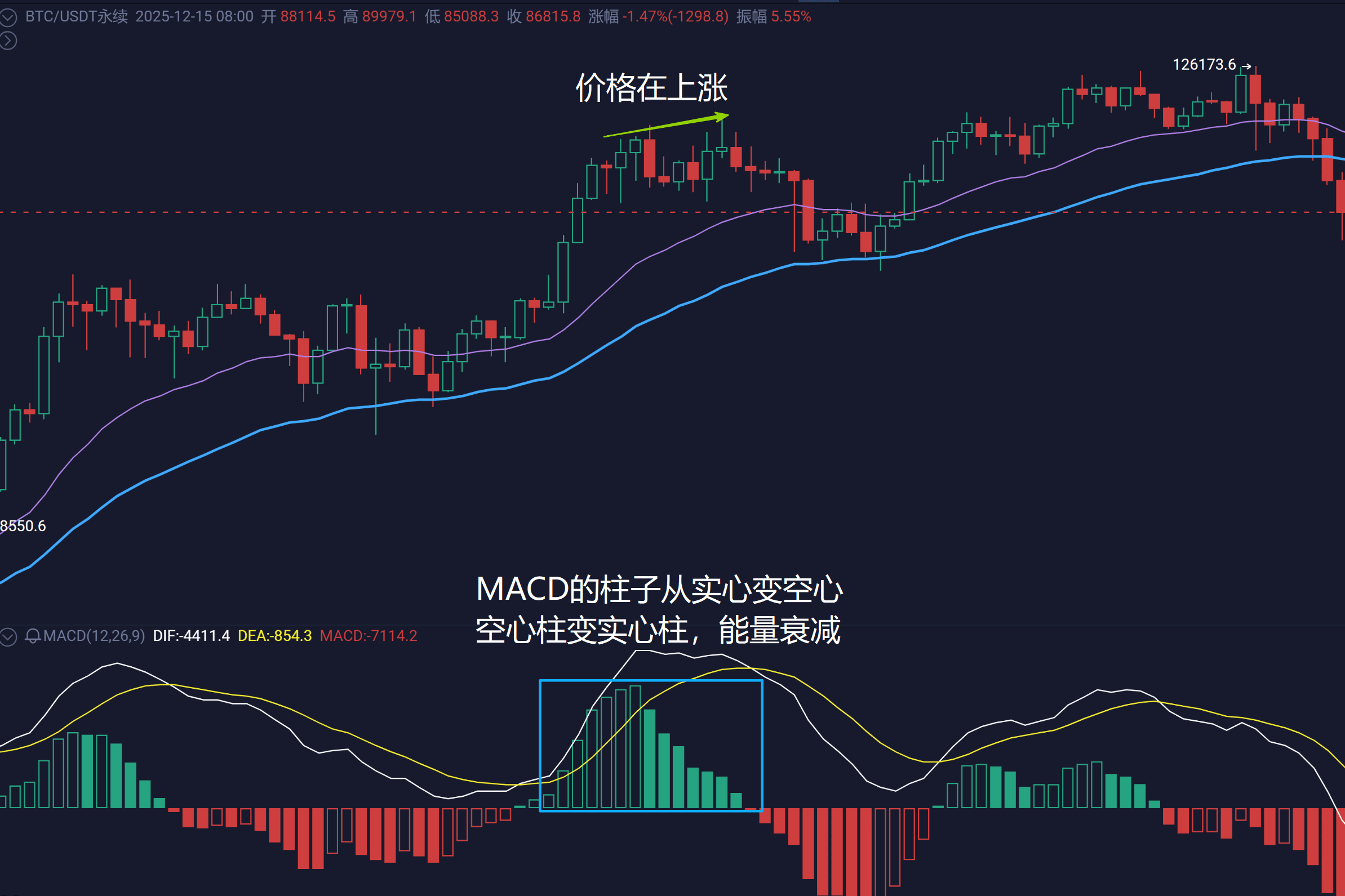
Change of energy column: Insight into the strength of momentum
Histogram growth: Indicates strengthening momentum for upward (green column) or downward (red column) movements.
· Histogram shortening: Indicates that the current directional momentum is weakening.
· 'Peaks' and 'Valleys': The turning point where the histogram changes from elongation to shortening often leads price turning points and can serve as an early warning.
· For example: The price is still rising, but the green bars have started to become solid and shorten, which may indicate weakening upward momentum.
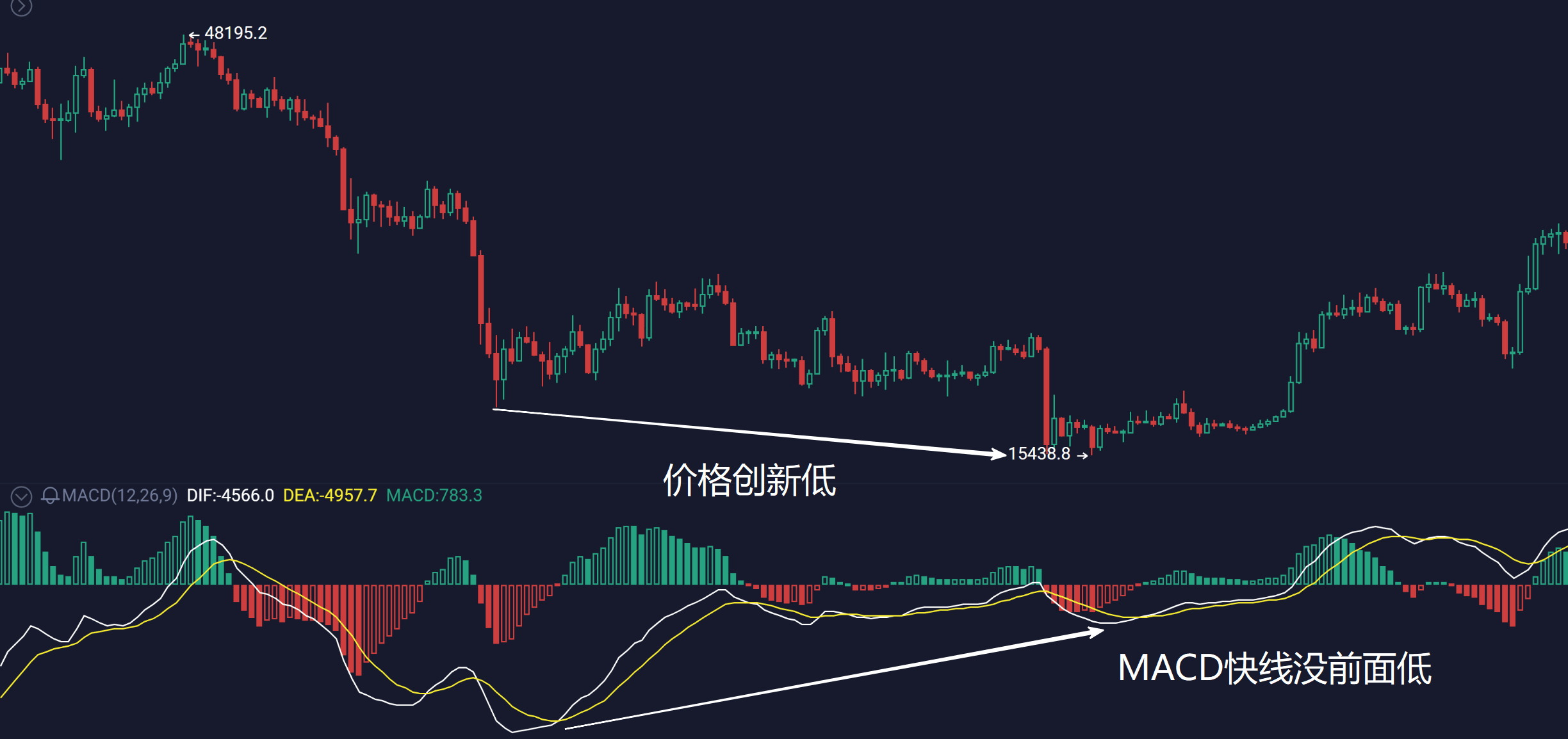
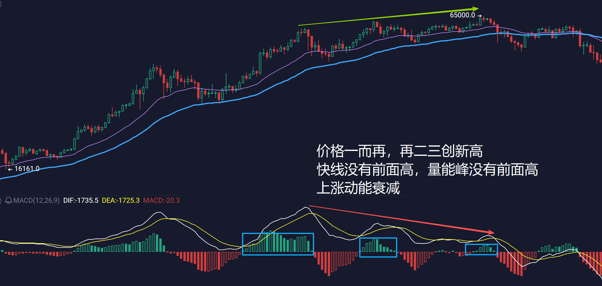
Divergence: A warning signal that the trend may reverse (very important!).
Divergence: Price makes a new high, but the MACD DIF line (or histogram) high is lower than the previous one.
· Meaning: The momentum of the price increase is insufficient, and the uptrend may soon come to an end.
· Signal: A potential trend reversal warning, especially more reliable after multiple divergences.
· Bottom divergence: Price makes a new low, but the MACD DIF line (or histogram) low is higher than the previous one.
· Meaning: The momentum of the price decline is weakening, and the downtrend may soon come to an end.
· Signal: A potential trend reversal warning.