What are patterns?
All technical analysis of the stock market trading is based on the assertion that market history repeats itself, so similar events can be periodically observed in comparable trading situations. These situations are called patterns. Trading patterns are specific shapes formed on the price chart by price or an indicator, which allow for a high probability prediction of future price movements in the market.
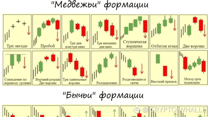
Long-term market assessments have revealed recurring patterns in the data that can be used to forecast price movements in the future. There are bearish and bullish patterns, as well as patterns signaling a trend change and patterns indicating trend continuation. It is worth noting that the probability of price change depending on types of graphical patterns is not 100%, but is sufficiently high to be useful in trading. Trading patterns can also be applied to cryptocurrency assets on various exchanges.
It is probably just impossible to list all types of patterns in trading within one article, so we will break them into several large groups. Traditionally, there are three types of different graphical patterns. The main factor determining the figure's place in the classification is the direction of price movement after the pattern formation.
Trend continuation patterns. Price movement in the same direction is considered most likely after the end of a trend continuation pattern.
Trend reversal patterns. The appearance of such patterns warns of a change in the current trend or a significant price correction. Such patterns often form at historical maxima or at strong support/resistance levels.
Indeterminate patterns. They may inform the trader about trend continuation as well as reversal. The direction of the price depends on other indicators and trends.
For each of these types, there exists a vast number of trading chart patterns. We will consider only some types of patterns in trading, namely the 10 most popular ones that every trader should know.
Why are patterns so important?
The importance of patterns can be explained by the following advantages.
Visibility. Thanks to the analysis of graphical patterns, the trader can clearly see which figure begins to form and what further changes are possible.
Systematicity. If a trading pattern is formed, it is formed according to strict rules. If the rules are violated, it is not a pattern and the corresponding analysis methods cannot be applied.
Independence. Graphical constructions of technical analysis allow analyzing the market without using additional tools. Everything a trader needs for decision-making is presented on the monitor screen.
Names of the most popular graphical patterns
1. Head and Shoulders
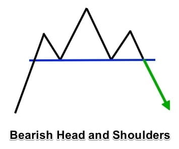
This pattern forms during an uptrend at price maxima. It has three upper points - a conditional head in the middle and shoulders on the sides plus two lower points - through which a conditional neckline must be drawn. When the pattern is well-formed, the price falls below the neckline after the right shoulder is formed. The price is likely to drop by an amount equal to at least the number of points from the neckline to the top of the 'head'. Sale is executed immediately after the breakout of the chart below the neckline level.
As soon as you identify the 'Head and Shoulders' pattern in an uptrend and the right shoulder has formed, you can open a sell order as soon as the price breaks the neckline. Before entering the market, wait for the candle to close below the neckline to avoid a false breakout.
2. Inverted Head and Shoulders
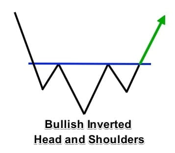
It is opposite to the previous one and forms at price minima when the trend is downward. Accordingly, the peaks of the 'head' and 'shoulders' are located below the neckline level, rather than above as in the standard figure. After breaking the neckline, a price increase is forecasted by a number of points, at least no less than the distance from the neckline to the top of the 'head'. At the moment of breaking the neckline, the purchase of the asset is executed.
After you have identified the inverted head and shoulders figure in a downtrend and the right shoulder has formed, you can open a buy order as soon as the price breaks the neckline. Wait for the candle to close above the neckline before entering the market to avoid a false breakout.
3. Double Top
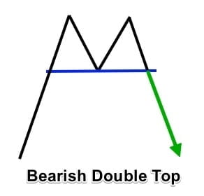
This is a local trading pattern that occurs during an uptrend at the price peak. The figure is formed by two equal or approximately equal price peaks, between which there is one peak of a local minimum. After the figure concludes, a downward trend is forecasted, during which a sale is executed.
When the market reaches an overbought level, it may encounter resistance and form a double top figure. It starts with the first peak when the price retreats until it finds local support. At this time, you cannot detect a pattern. After the first peak, the price pulls back to support (the neckline) and then bounces back to test the newly formed resistance again. If the price cannot break above it, it will form a second peak. That is when traders fear the trend and should be ready to open short positions when the price breaks the neckline.
4. Double Bottom
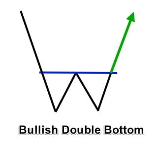
As with the 'Head and Shoulders', the 'Double Top' has a mirror variant that forms in a downtrend around a local minimum. At the price minima, two lower points of the mirror top are marked, with a local maximum point in between them. When the formation is complete and the baseline passing through the local maximum point is broken, the asset is purchased with the aim of selling it at a higher price, as an upward trend is forecasted after the 'Double Bottom'.
Rounded Bottom and Rounded Top may also be included. The pattern with a rounded bottom resembles the letter 'U', therefore it is also called a 'bowl'. It develops as a result of sustained downward price movement. It consolidates within a certain range before starting to rise and finally breaking through the resistance line.
'Rounded Top', in turn, looks more like an inverted 'U'. The appearance of this pattern indicates a reversal of the uptrend and a likely beginning of a downtrend.
5. Triple Top and Triple Bottom
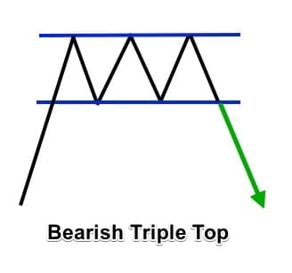
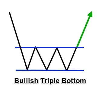
'Triple Top' is drawn at the maxima when quotes are rising - unlike 'Double Top', it has three price peaks. This means that the chart goes up three times locally and falls down three times. After the third drop, the baseline is broken and a sale is executed. 'Triple Bottom' reflects the top but not at local maxima, but at local minima. Accordingly, after breaking the baseline, a purchase is made.
There are certain rules when trading the graphical patterns 'triple bottom'. First, you need to see the market phase, whether it is moving up or down. Since a triple bottom forms at the end of a downward trend, the preceding trend must be downward. You need to determine if three rounded bottoms are forming and also note the size of the bottom. You should enter a long position only when the price breaks the resistance level or the neckline.
6. Wedge
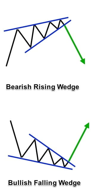
It can form at both price peaks and troughs. This trading pattern 'compresses' the chart between two lines – the support line and the resistance line. Within the lines, the price may go up and down several times; a breakout is considered when the chart goes below the support line or above the resistance line. In the first case, it is a sale, in the second – a purchase. The wedge graphically resembles a triangle but is not identical to it. It belongs to reversal patterns; indicators fairly accurately identify this figure (like most classical patterns).
Ascending wedges are bearish signals that develop when the trading range narrows over time but has a clear upward slope. This means that, unlike ascending triangles, both subsequent lows and subsequent highs in the wedge pattern will rise as the trading range narrows to the top of the wedge.
Descending wedges are the opposite of ascending wedges and are always considered bullish signals. They develop when a contracting trading range has a downward slope, so subsequent lows and subsequent highs within the wedge fall as trading progresses.
7. Triangle
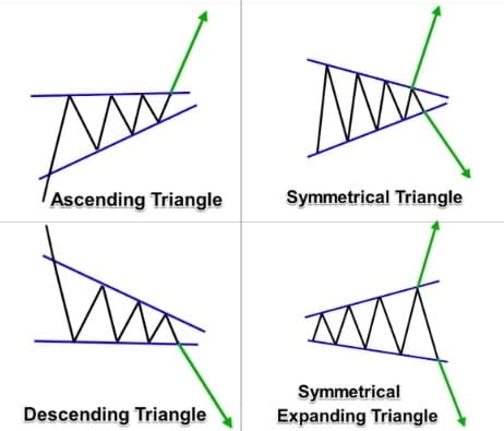
This figure can be equilateral, ascending, or descending. All three types either continue the trend or reverse it. Unlike the 'Wedge', the support line and the resistance line completely intersect on the right side of the drawing. Then, buying/selling is done depending on the type of formation and trend:
In an equilateral triangle, if the chart breaks above the resistance line – buy, if below the support line – sell.
In an ascending triangle, the purchase is made when the chart breaks above the resistance line.
If the chart breaks below the support line in the case of a descending triangle, sell.
8. Diamond
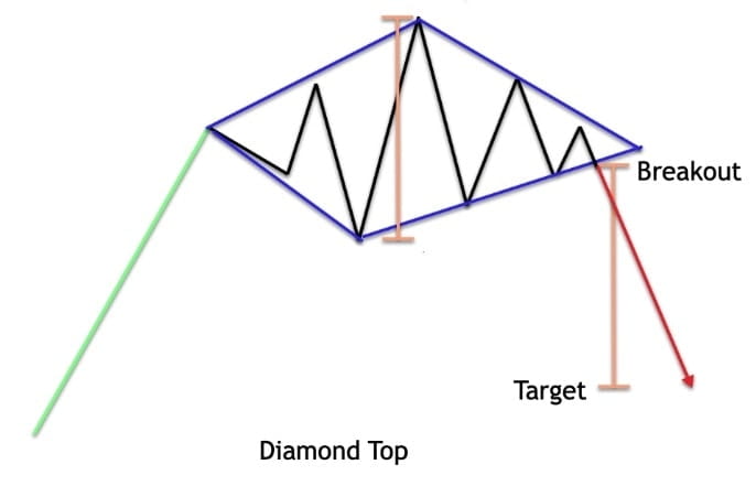
An alternative name for this trading pattern is 'Diamond'. This is quite a rare market reversal model that can form during any trend at local minima/maxima. If the diamond appeared at the price chart's maxima, it indicates that the upward movement has ended and you can now sell. If the pattern formed at the bottom of the chart, after a downward trend, then one can wait for a reversal upwards and prepare to buy.
The diamond pattern most often occurs after a prolonged trend phase. When this occurs in the context of a bullish market, the pattern is called a diamond top or bearish diamond pattern due to its bearish significance. Conversely, when it occurs in the context of a bearish market, the pattern is called a diamond bottom or bullish diamond pattern due to its bullish significance.
9. Rectangle
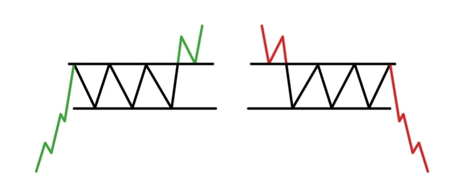
It is formed by parallel support and resistance lines, creating a conditional corridor of price movement on the chart. Within the corridor, the price consolidates and chaotically changes direction. It makes sense to trade in the direction of the breakout of the formation – if it closes above the resistance line, then buy. A sale is executed when the figure closes below the support line.
Prices fluctuate between two parallel lines, and eventually, a breakout occurs in one direction or the other. Rectangles can have a slight upward or downward tilt, but the two lines (support and resistance) are always parallel. In this respect, they seem similar to horizontal channels. These formations reflect the indecision of market players, so the most important here is the direction of the breakout when it occurs.
10. Flag
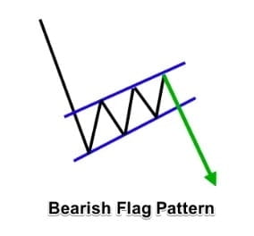
The 'Flag' pattern predicts the continuation of the current market trend. It consists of two parts: the 'flagpole' and the flag (the channel in which the price moves). The flag corridor can go strictly perpendicular to the 'flagpole' or with a slight tilt; its overall shape may correspond to different figures – triangle, rectangle, or wedge. The correction ends with the price breaking out beyond the resistance lines. At this point, a purchase is made.
The flag portion of the pattern should pass between parallel lines and can be tilted up, down, or even sideways. Flags angled in the same direction as the previous movement – for example, a spike up and a flag tilted upwards – reduce the effectiveness of the pattern. Therefore, ideally, you want to see a sharp upward movement followed by a sideways flag or a flag slightly tilted down. If the sharp movement is downward, ideally, you should trade on a flag that is sideways or angled upwards, meaning it moves against a strong downward movement.