
$BTC has pulled back from a recent high of $98,000 to just over $90,000.
Momentum has weakened somewhat, but remains above neutral levels.
Indicates that the market is in a consolidation phase, rather than deteriorating trends.
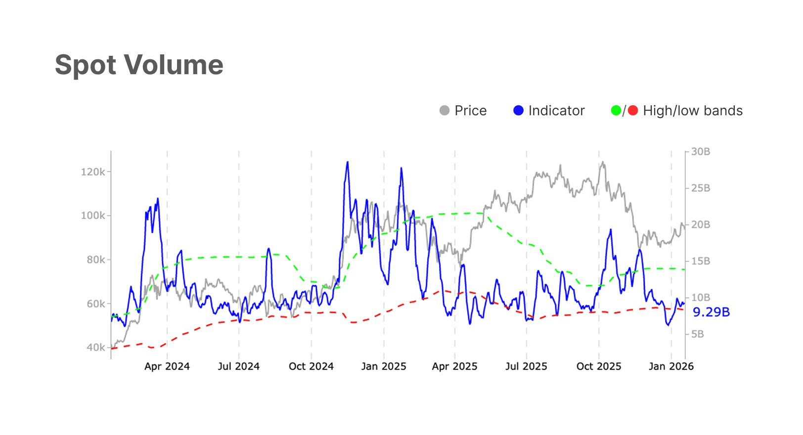
① This chart shows a comparative analysis of **spot trading volume** and price trends;
This is a typical on-chain data and market technical analysis chart, usually used to assess market sentiment, capital activity, and potential price reversal points.
Gray line (Price): Represents the price trend of Bitcoin BTC. The current price (January 2026) is approximately between $90k - $100k, in a consolidation recovery phase after pulling back from the mid-2025 high (around $120k).
Blue line (Indicator - Spot Volume): Represents the trading volume indicator of the spot market. Current value: 9.29B. This is a relatively low level.
Green/Red dashed lines (High/low bands): This is a volatility band based on trading volume.
Green dashed line: High resistance band of trading volume (indicating an overheated market).
Red dashed line: The low support band of trading volume (indicating a quiet market or reluctance to sell).
- Trading volume is in a state of 'extreme shrinkage'
The current blue line (trading volume) has reached or slightly fallen below the red dashed line (low band). The current reading is 9.29B, one of the lowest levels since early 2024.
Reviewing similar situations in the chart (for example, April 2024, October 2024), when the blue line touches or approaches the red dashed line, it usually indicates that the market is at an **'emotional freezing point'. This is often a precursor to a trend change**.
- Divergence between volume and price and market phases
The frenzy at the beginning of 2025: The chart shows that around January 2025, prices rose significantly and trading volume surged (the blue line pierced the green dashed line), which is a typical characteristic of a bull market's main rise.
The correction in the second half of 2025: As prices fell back from the high point of $120k, trading volume also declined.
Current status: Prices remain at relatively high levels (around $90k), but trading volume has dropped to freezing point.
This **'volume contraction and consolidation'** usually indicates that the selling pressure has exhausted (no one is willing to sell at lower prices), but there is also a lack of new buying momentum.
Trend analysis for the upcoming movement
Based on the principle of 'volume leads price', combined with the chart pattern, the following is the prediction for future trends:
Short-term trend: Consolidation at the bottom
Due to the trading volume (blue line) being close to the red support band, it is difficult for the market to experience significant unilateral crashes in the short term (unless a black swan event leads to panic selling, in which case trading volume will suddenly surge).
The market is currently in an **'observation period'**, and prices may narrow oscillate in the range of $85k-$95k to digest the remaining profit.
Mid-term trend: Higher probability of a trend reversal upwards
Bottom rebound signal: When the trading volume indicator touches the red lower bound, it is a strong counter-indicator. In a bull market cycle (assuming the larger cycle is still not over), low trading volume often corresponds to local bottoms.
Once the blue line starts to turn upwards from the red dashed line (Volume Pickup), while prices remain stable, this will confirm that **'the cleaning phase is over'**.
Target: If new capital enters, prices are expected to challenge previous highs (100k-120k) again.
The market is in a calm period of 'building up momentum'.
Key signal: Closely monitor the movement of the blue line (trading volume). It can be seen that the blue line is leaving the red zone and rising sharply.
If prices rise + trading volume expands: Confirm trend reversal, it is a right-side buy signal.
Current strategy: This is the area of focus for left-side traders (counter-trend traders) because the risk/reward ratio is favorable, and stop-loss can be set very tight, aiming for a price rebound after trading volume warms up.
Spot trading volume has reached a freezing point, the market is extremely reluctant to sell, and it is highly likely brewing a new round of volatility, with upward elasticity greater than downward risk.
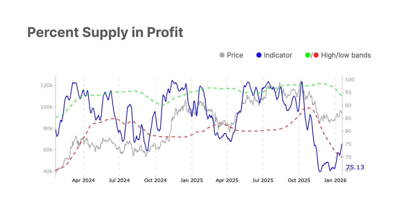
② The 'Percent Supply in Profit' on-chain data indicator spans from the beginning of 2024 to the beginning of 2026.
This is a classic indicator for detecting market sentiment cycles and macro tops/bottoms.
What is 'profit supply percentage'?
Definition: This indicator tracks the proportion of all tokens that have moved on-chain, where the last price at the time of movement was lower than the current market price. In simple terms, it indicates **'what proportion of chips are currently profitable'**.
High values (>95%): Usually appear at bull market tops. When almost everyone is making money, the market is prone to FOMO (fear of missing out) and excessive greed, which often leads to selling pressure.
Low values (<50%-70%): Usually appear at bear market bottoms or during deep correction periods. A large number of chips are in a loss state (underwater), and the market is filled with fear, which often marks 'surrender' (Capitulation) and is the range where smart money (Smart Money) accumulates.
In-depth analysis of chart patterns (Current status: January 2026)
Key data point: 75.13%
The blue number 75.13 displayed on the right side of the chart is the current latest reading. This is not just a number; it represents that the market has just experienced a sharp **'V-shaped reversal'**.
Key technical pattern: Red line crossover (The Red Band Crossover)
Crossing below the red line (surrender signal): Pay attention to the end of 2025 (the right side of the chart between Oct 2025 and Jan 2026), where the blue solid line (indicator) quickly drops and falls below the red dashed line (lower bound/Low Band). This corresponds to the sharp decline of the gray price line. This usually indicates that the market has undergone a deep clean, with a large number of short-term holders cutting losses and market sentiment dropping to freezing point.
Crossing above the red line (reversal signal/current position): Currently, the blue solid line has strongly rebounded and is back above the red dashed line, with the reading rising to 75.13%.
Historically, when this indicator quickly pulls back from the bottom region (below the red line) and breaks through the red line, it often signals a strong right-side buy signal. It means that selling pressure has exhausted, and demand starts to regain control of the market.
Divergence/Synchronization between price and indicators
The gray price line has shown significant upward signs after bottoming out at the end of 2025, now following the indicator.
Trend analysis for the upcoming movement
Based on the pattern of this chart, the future trend prediction is as follows:
Short-term trend: Confirming the bottom, oscillating upwards
Trend: Bullish (Bullish Reversal).
Logic: The current pattern is a textbook 'bottom confirmation'. The market has just emerged from the 'panic zone' and entered the 'recovery zone'. A 75% profit ratio is a relatively healthy level—neither as overheated as 95% nor as desperate as 50%. This usually means the market is entering the **'Disbelief/Hope'** phase, and prices tend to rise amidst hesitation.
Medium to long-term evolution: Returning to the green line
Target: The indicator will attempt to approach the green dashed line (upper bound/High Band).
Resistance: When the indicator approaches the 90%-95% range again, caution is needed. That means the market has entered a state of full profitability again, and selling pressure from profit-taking will reappear.
Key support: The future key is to hold the red dashed line. As long as the indicator does not fall below the red dashed line (approximately in the vicinity of 65%-70%), the upward trend remains intact. If it falls below again, it means the recent rebound was a 'dead cat bounce', and the market will face deeper bottoms.
The darkest moments are likely over.
Current phase: Post-Capitulation Recovery.
Signal significance: A strong return after the blue curve pierces the red line is a typical trend reversal signal.
Expectations: In the coming months (Q1-Q2 2026), as the profit chip ratio rises moderately, prices are expected to experience a sustained recovery trend. Now is a good time to focus on right-side building opportunities, rather than panic selling.
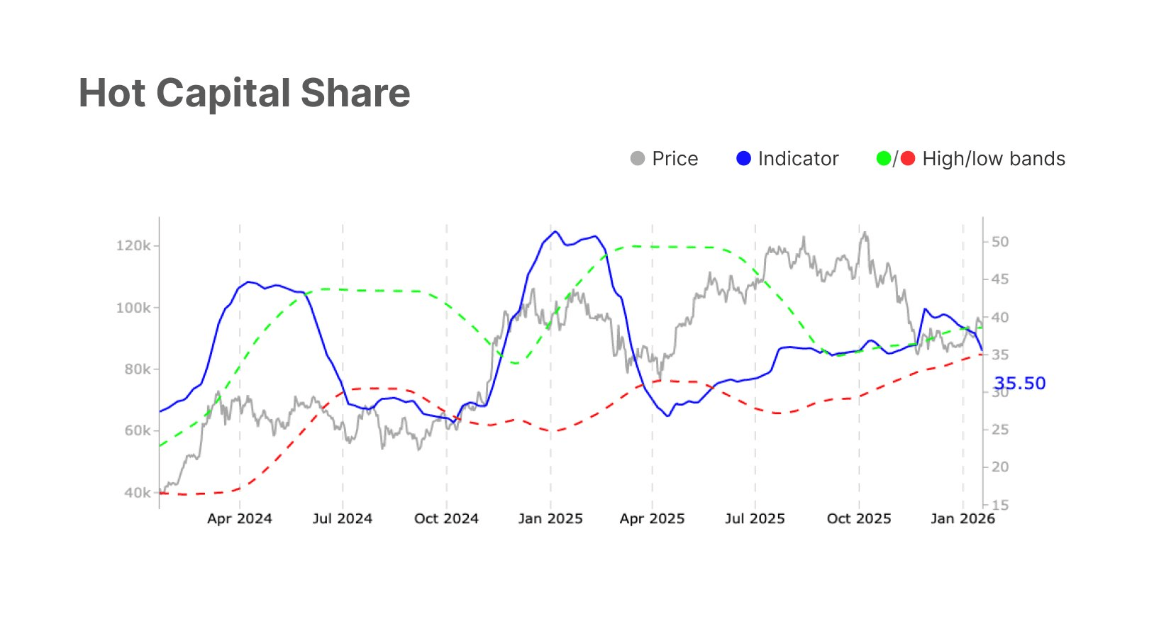
③ 'Hot Capital Share'. This is a very professional and insightful on-chain data chart.
Gray line (Price): Bitcoin BTC asset price, the left axis shows the price range from $40k to $120k+.
Blue line (Indicator - 35.50): The core indicator 'Hot Capital Share'. It reflects the proportion of active, short-term speculative funds in the market.
Green dashed line (High Band): The overbought alert zone at the top (overbought warning line). When the blue line touches this line, it usually indicates that the market is overheated, and prices may peak.
Red dashed line (Low Band): The oversold alert zone at the bottom (oversold/value line). When the blue line touches or falls below this line, it usually indicates that speculative bubbles are being squeezed out, presenting a good buying opportunity.
The core logic of this indicator is reverse thinking:
When the hot capital share is too high (blue line rises): it indicates that the market is dominated by FOMO (fear of missing out) emotions and short-term speculators. Although prices are rising, they are extremely fragile, usually corresponding to local tops.
When the hot capital share decreases (blue line falls): it indicates that speculators are leaving, and positions are shifting to long-term holders, market sentiment is calm, usually corresponding to local bottoms or accumulation zones.
Historical trend review (2024 - 2025)
January 2025 (Major Top): The blue line (hot money) surged sharply, breaking through the green dashed line (High band). This corresponds to the explosive phase of the gray price line (approaching $120k). Subsequently, the market experienced severe corrections.
April 2025 (Stage Bottom): The blue line plummeted below the red dashed line (Low band). This marked the complete 'surrender' of speculative funds, and the price stabilized around $60k-$70k, initiating the second wave of increases in the second half of the year.
In the second half of 2025: The price rebounded to new highs, but the blue line did not surge through the green line as crazily as at the beginning of the year, indicating a healthier rise, but then entered the current cooling period.
Current status analysis (January 2026)
Current reading: 35.50.
Price status: Prices have fallen from the high point (around $120k) and are currently in a consolidation phase (around $90k).
Indicator position: The blue line is trending downward and is very close to the red dashed line (Low Band).
The red dashed line is currently rising in the range of approximately 30-33.
The current value of 35.50 indicates that the market is undergoing a 'de-bubbling' process, and speculative enthusiasm is rapidly fading.
Trend analysis for the upcoming movement
Based on the chart pattern and the logic of 'mean reversion', the upcoming trend is as follows:
Short-term trend: Inertial downturn (washing out)
Bearish/Oscillation: Since the blue line (35.50) has not yet fully touched the red dashed line (support band), the market may need a little more time to complete the final 'cleaning'.
Prices may continue to oscillate or slightly decline, aiming to let the blue line further touch the red line. This is usually the final stage of tormenting the patience of position holders.
Mid-term trend: Bottom rebound (buy signal)
Key turning point: Once the blue line touches or slightly pierces the red dashed line (expected value around 32-34), this will constitute an extremely strong buy signal.
Logic: Historical data shows (referencing late 2024 and April 2025) that whenever the hot capital share drops to near the red line, prices often experience a rebound.
Expected actions: If the blue line rebounds in the coming weeks, prices are expected to build a bottom in the range of $85k-$90k and initiate a new upward trend, challenging the $100k level again.
Opportunities are brewing
Do not chase highs currently: The indicator is still in a downward channel, indicating that the adjustment is not yet fully over.
Closely monitor the change from 35.50 to 32.00: This is the golden observation window.
Operational strategy: When the blue line further declines and touches the lower red dashed line, this is a point with a very high winning probability for left-side building/addition. The market is returning from 'frenzy' to 'rationality', which is often the starting point for the next healthy rise.
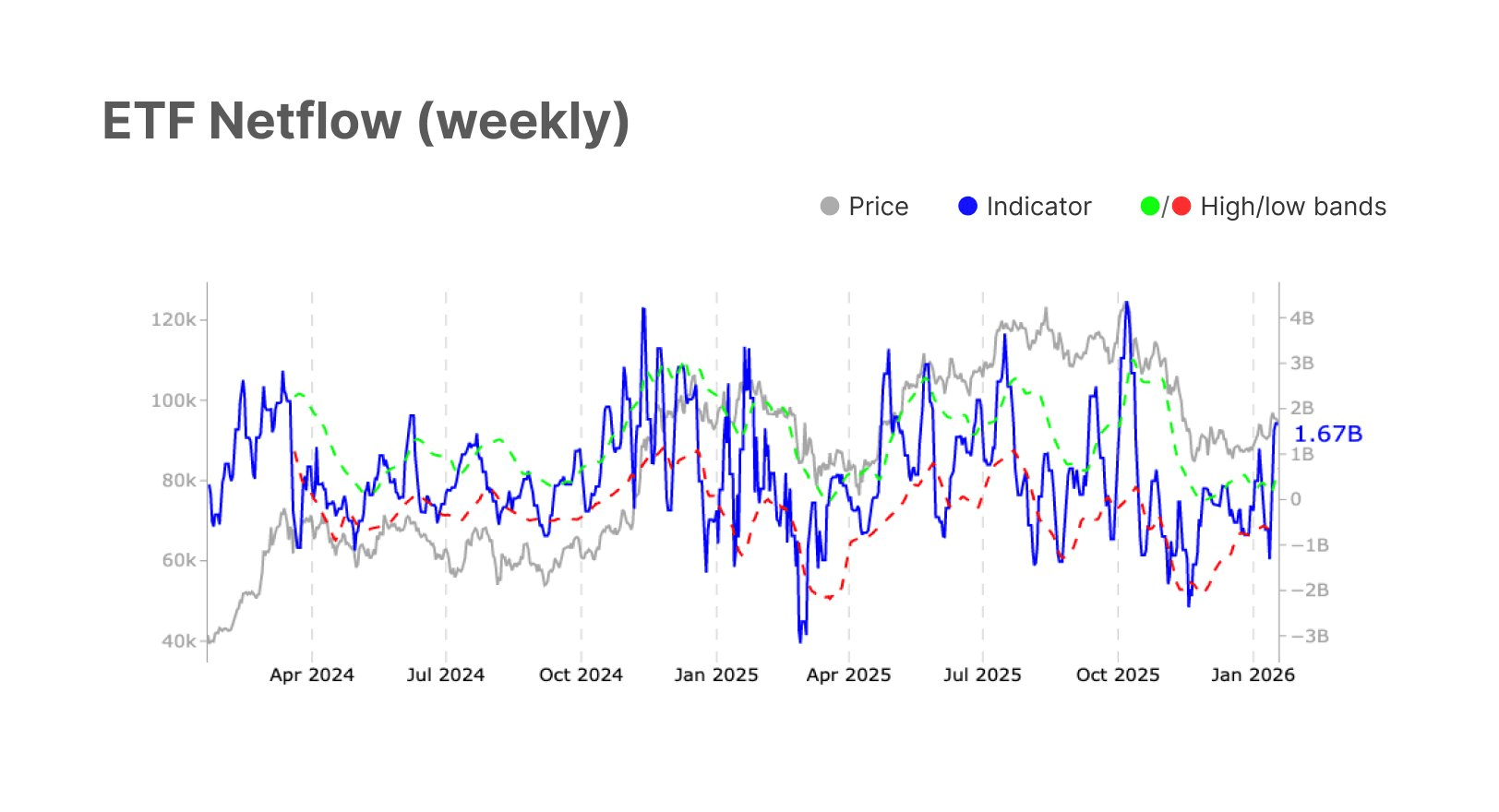
④ Bitcoin's (Bitcoin) spot ETF fund flow chart
Gray line (Price): Represents the price trend of Bitcoin. The left axis shows the price range, and the current price seems to be in the pullback phase, approximately in the range of $90,000 - $95,000 (based on an estimated midpoint of $80k-$100k).
Blue line (Indicator - Netflow): Represents the weekly net flow of the ETF. The right axis shows the amount of funds; positive values (above the zero axis) represent net inflows (buying), while negative values represent net outflows (selling).
Green/Red dashed lines (High/Low Bands): This is the volatility band of fund flow (similar to Bollinger Bands).
Green dashed line: Oversold/High alert zone for capital inflows.
Red dashed line: Oversold/Low alert zone for capital outflows.
Current status analysis (as of January 2026)
Strong capital inflow: The most critical data point in the chart is the current value shown by the blue line of 1.67B (1.67 billion USD). This shows that in the past week, institutions net bought a large amount of Bitcoin through the ETF channel.
Bottoming rebound: Observe the end of 2025 (Oct 2025 - Jan 2026), the blue line (fund flow) once fell below the zero axis and even approached the red dashed line, accompanied by a price drop. But now, the fund flow has strongly reversed, breaking through the zero axis and is climbing toward the green dashed line (high band).
Price and fund flow divergence (Bullish Divergence):
Price performance: The gray price line peaked at the end of 2025 (around $120k+) and then began to decline, currently still in a relative low-level consolidation.
Fund performance: Fund flow (blue line) surged significantly during the price consolidation period.
Conclusion: This is a classic bullish divergence signal. It means that despite the price weakness, institutional investors are taking advantage of low prices to accumulate.
Reviewing historical movements in the chart reveals patterns:
Apr 2024: Fund flow touches the green dashed line, then the price peaks and falls back.
Jan 2025: Fund flow surges again, and the price maintains strength and reaches new highs over the next few months.
Apr 2025: Fund flow plummets below the red dashed line (extreme panic/selling), which usually corresponds to a phase bottom in prices (and prices indeed rebounded afterwards).
The current pattern is similar to the initiation phases of Oct 2024 or Jan 2025: fund flow swiftly turns positive from negative values or lows, and the momentum is substantial.
Trend analysis for the upcoming movement
Based on the principle of 'capital leads, prices follow', the upcoming trend analysis is as follows:
Short-term trend: Bullish
Institutional bottom confirmation: A weekly net inflow of 1.67 billion USD is a very strong signal. It indicates that institutions believe the current price of around $90k offers very high cost performance.
Price rebound expectations: Such a scale of capital buying typically translates into immediate buying pressure. It is expected that in the next 1-4 weeks, prices will stop falling and attempt to retest the psychological level of $100,000.
Mid-term trend: Oscillating upwards
Observe the green dashed line: The blue line has not yet touched the green dashed line (High band). This indicates that there is still room for capital inflow growth and has not reached the 'overheated' stage. The upward trend usually continues until the blue line touches the green line and turns downward.
Target price: If buying pressure continues, the price is expected to return to the previous high area of $110,000 - $120,000 in Q1 2026.
Main funds are entering the market in large numbers to bottom fish, and the market is on the verge of a reversal.
Suggested actions:
Focus: Closely monitor whether prices can stabilize above short-term moving averages and follow the capital inflow upwards.
Signal: Currently, this is a good right-side buy/add position signal. Institutional funds (Smart Money) are already in action, and the current price pullback is likely to cleanse retail investors' positions in preparation for the next surge.
