Gold and silver are moving sharply higher at a time when global markets are showing clear signs of strain. The combination of rising precious‑metal prices, stretched equity valuations, elevated geopolitical tension, and growing concerns around debt and currency stability has led many traders to draw comparisons to the environment that developed ahead of the 2008 financial crisis. The similarities are not superficial — they are grounded in data and market behavior.
Below is a structured breakdown based on verified research.
1. What the Data Shows: Gold and Silver in Strong Demand
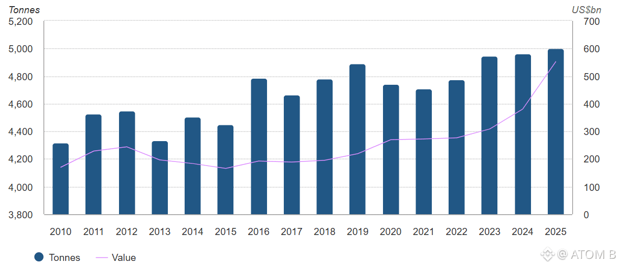
Gold: Record Demand, Record Prices, Record Value
According to the World Gold Council, 2025 marked a historic year for gold:
Total gold demand (including OTC) exceeded 5,000 tonnes for the first time.
$XAU set 53 new all‑time highs in 2025.
The total value of gold demand reached $555 billion, a 45% increase year‑over‑year.
The World Bank’s 2025 Commodity Markets Outlook confirmed that precious metals — led by gold — reached new highs due to geopolitical tension, economic uncertainty, and shifting global risk appetite.
In early 2026, CNBC reported gold breaking above $4,800/oz, driven by trade‑related concerns and tariff discussions, with analysts projecting potential targets between $5,000 and $7,000.
This is not a typical bullish trend. It reflects a broad repricing of gold’s role in portfolios during periods of elevated macro risk.
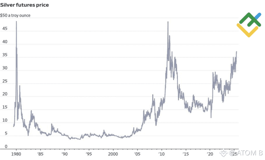
Silver: A Strong Move Supported by Both Monetary and Industrial Demand
Silver has shown even more volatility than gold:
2025 saw silver deliver a significant rebound, reaching new highs before sharp pullbacks and rapid recoveries.
By late 2025, silver had more than doubled from the start of the year.
It broke a 45‑year‑old all‑time high set in 1980.
Analysts describe the current environment as a combination of:
Monetary demand
Industrial demand
Policy‑driven liquidity shifts
Several 2025 reviews noted that silver has, at times, taken on a role similar to gold during periods of geopolitical tension.
Both metals are behaving in a way that typically appears when investors are preparing for potential instability.
2. Why This Environment Resembles 2008
The 2008 crisis was ultimately about a breakdown in confidence — in banks, credit markets, ratings, and policy direction. Precious metals tend to rise when that type of erosion begins to appear.
Key parallels supported by research:
• Strong flows into defensive assets
In the months leading into the 2008 downturn, gold and silver began rising steadily as investors reduced exposure to risk assets.
Today, the pattern is similar.
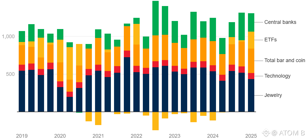
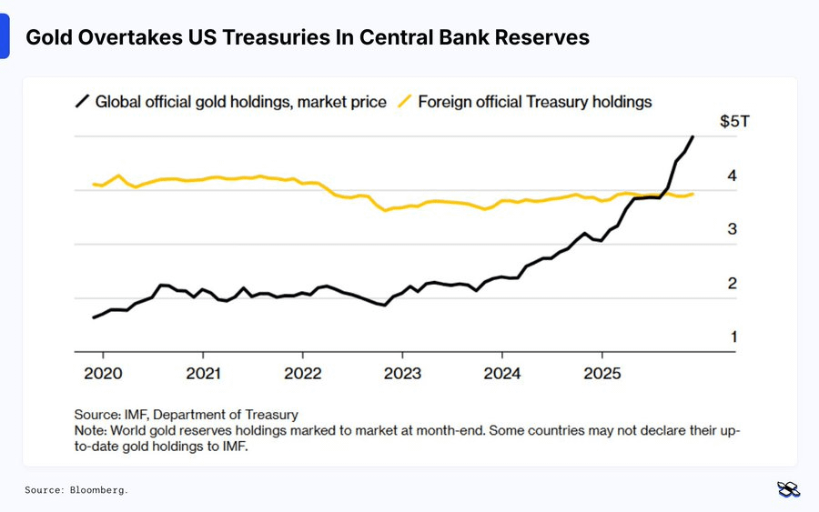
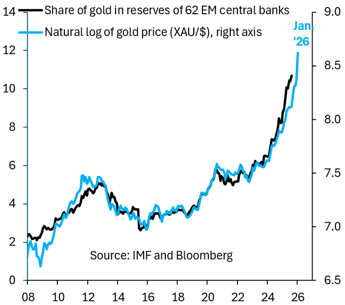
• Central bank accumulation at near‑record levels
Central banks have been major buyers of gold in 2024 and 2025, driven by:
Reserve diversification
De‑dollarization
Long‑term risk management
• New highs combined with elevated volatility
Both metals are breaking historical levels while showing rapid price swings — a pattern that typically appears when markets are adjusting to deeper structural risks.
• Historical comparison
Between 2008 and 2011, silver nearly went vertical, and gold entered a multi‑year expansion as the world processed the financial crisis.
The current setup — new highs, strong demand, and macro uncertainty — shares several structural similarities.
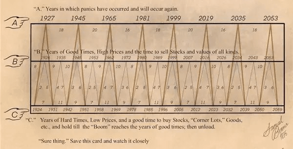
3. The Benner Cycle Perspective: Expansion, Panic, Hard Times
The chart you referenced is based on the Samuel Benner cycles, which outline alternating phases of:
High‑price periods
Panic years
Low‑price accumulation phases
While not a precise forecasting tool, the concept highlights a recurring pattern:
Long expansions lead to overvaluation
Overvaluation is followed by correction or panic
Panic is followed by accumulation and recovery
Gold and silver rising while risk assets appear stretched aligns with what traders typically see near the end of a cycle.
4. What’s actually driving the current precious‑metal spike?
Based on verified research, several core drivers stand out:
→ Geopolitical and macro uncertainty
The World Bank and World Gold Council both highlight geopolitical tensions, war risk, trade conflicts, and political instability as key reasons investors are rotating into gold.
When the future looks unstable, capital hides in assets that:
Don’t depend on any single government
Can’t be printed
Have deep, global liquidity
Gold and increasingly silver fit that bill.
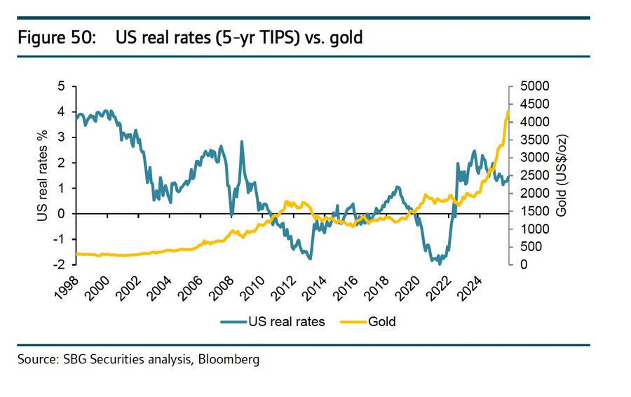
→ Inflation, Real Rates, and Currency Concerns
Research shows that gold performs strongly when:
Inflation remains above target
Real interest rates are low or negative
Fiscal sustainability becomes a concern
This environment resembles the post‑2008 period, but with higher global debt and more complex financial linkages.
→ Central Bank and Institutional Positioning
Central banks have been adding gold to reserves at some of the fastest rates in decades.
At the same time:
Gold ETFs have seen significant inflows
Silver participation has increased across both retail and institutional channels
When both sovereign and institutional capital move in the same direction, it typically reflects a strategic shift rather than short‑term speculation.
5. Are We Actually in a 2008‑Style Setup?
The similarities:
Strong demand for defensive assets
Elevated volatility across risk markets
High leverage and stretched valuations
Growing concerns about policy direction
Central banks accumulating hard assets
These are classic pre‑crisis signals.
The differences:
The 2008 trigger was a concentrated credit‑market failure.
Today’s risks are more distributed:
Sovereign debt
Fiscal deficits
Geopolitical fragmentation
Currency realignment
De‑globalization
The system is more regulated than in 2008, but also more interconnected and more leveraged.
This is not a repeat of 2008 — but the underlying dynamics share important similarities.
6. What Gold and Silver Are Signaling
When both metals rise strongly while risk assets appear stable, they are not signaling optimism — they are signaling caution.
They indicate that:
Large investors are hedging against tail risks
Confidence in fiat and policy direction is weakening at the margin
The probability of a disruptive event is increasing
This is why the current environment feels similar to 2008:
not because the charts match, but because capital is behaving the same way.