I've seen a lot of Q&A from various perspectives. Basically, they all miss the point, so let me share some valuable insights.
1. From my more than ten years of trading experience, when someone talks to you about various basic candlestick theories, like doji, engulfing patterns, dark cloud cover, those people basically just understand a bit about candlestick MACD, golden cross and death cross, which are common yet utterly useless theories.
It's very difficult to understand candlestick patterns from these theories. The information conveyed by these basic candlestick shapes and indicators is simply too little. They are basically of no significant use.
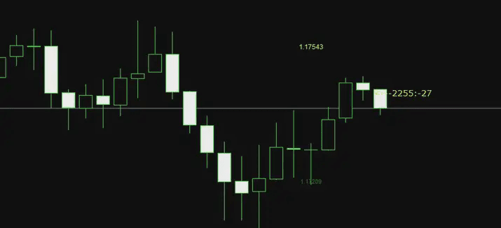
2. If you enlarge the candlesticks, as shown in the picture below, analyzing a few candlesticks might seem impressive, but in reality, they understand nothing. The market is a series of wholes.
Especially a significant overall trend, which has causal relationships before and after. Looking at a small structure, a few, or a dozen candlesticks, I can only say it's a bit vague.
 What can true experts see in candlesticks? This kind of question can actually be viewed from many angles. For example, in an article I previously wrote, it was also one perspective. Ordinary people may need to use indicators to see divergence, while those with a deeper understanding of the market can directly see divergence from the candlesticks. This is also a perspective.
In other words, when the candlestick exhibits a certain state, experienced observers can directly sketch what the MACD looks like, what the moving averages look like, and what the Bollinger Bands look like, without needing to pull up these indicators. I believe that veterans with more than ten years of experience should be able to do this. This essence reflects the skills accumulated over time, also known as market feel.
 The essence and thought of 'divergence' in foreign exchange technology.
It is important to know what stage the market is currently in. Experts observing the market need to understand what the market is doing at the moment. For example, is it oscillating, is it a trend, is it at the end of a trend, or is it at the beginning of a trend? This is essential in financial analysis.
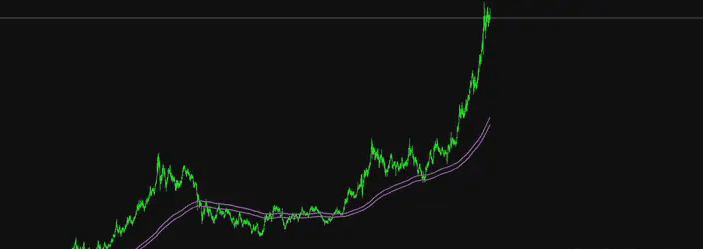 For example, the figure above shows the gold trend. When we analyze it, we need to look at it as a whole to see the current state of gold. Open the weekly chart and draw conclusions: currently, gold is in a high-level oscillation after a significant rise. It is still unknown whether it will rise or fall after the oscillation in the future.
This is a qualitative assessment of the current state of the market through the overall structure. We know the market is in oscillation, so we need to apply knowledge of oscillation. Analyzing step by step, peeling back the layers to finally formulate a trading plan.
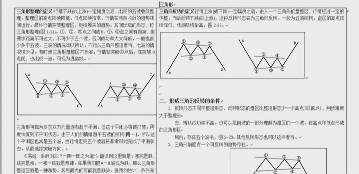 Dividing the market into structures, as shown in the figure below for the gold 4-hour chart. In the trend of this overall phase of gold, I will divide the same rhythm trend into a structure. In my eyes, each box of gold in the figure below represents an individual structure. Of course, there are connections between structures.
 As for how to determine whether a certain phase is a structure, I won't go into details here. I will draw a few figures for you to interpret. Many details require statistical data.
 I won't go into more details, but one small technical point is that within the same structure, the market rises, falls, and adjusts, and each segment has a very rhythmic and similar feel. In a single structure, place smaller cycles, and there are even smaller structures. This is indeed a bit challenging to understand and requires more observation and practice to find the patterns.
In fact, there are too many perspectives to understand the market, and it's impossible to explain them all in detail. Finally, let me share some tips on market observation to conclude.
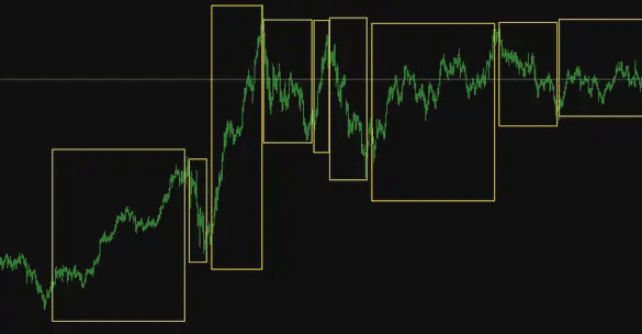
Looking at candlesticks requires viewing them as a large whole. Just like throwing a stone into a river, from the point where the stone falls, from that point to every layer of waves triggered by the stone, all should be viewed as a whole.
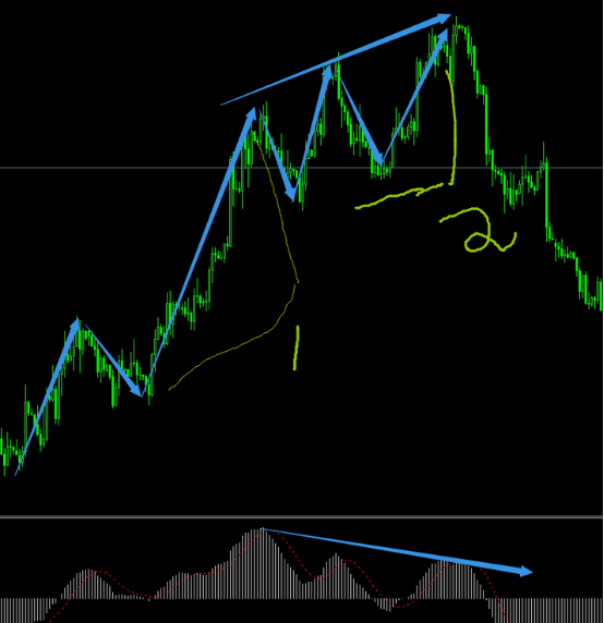
And not just looking at a specific point or a particular wave. Each point and wave has its causal relationship. Let me give a practical example: last Friday night, during the last wave of the gold market, I used this small phase as an example.
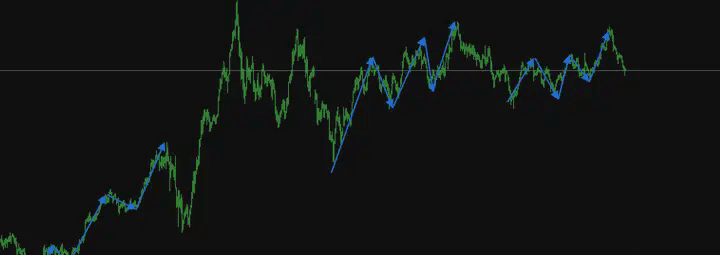
At that time, gold first declined, made a simple adjustment, and then rose.
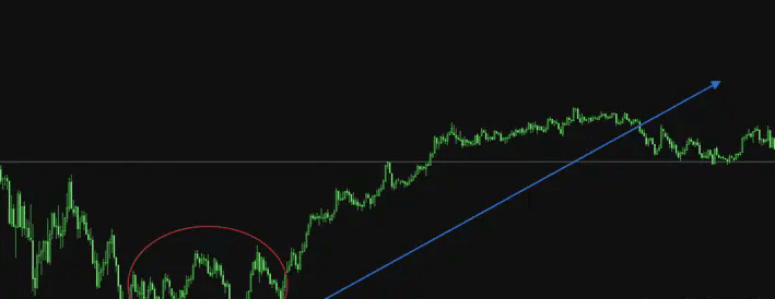 For the last wave of the rise, the market inside the circle is like the stone thrown in. The oscillating market inside the circle is a small energy accumulation. When this stone is thrown, it triggers layers of rising waves.
 How can we say they have a causal relationship?
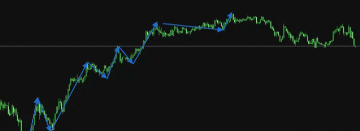
First, the stone is very small. The figure below shows the market cycle enlarged. We conclude that this is a rebound from the previous overall decline. Because the oscillation cycle of the market is very short, it cannot trigger large waves, and the probability of a rapid rise in the future is very low.
After a long period of oscillation accumulating energy, it can trigger large waves. This is the causality between oscillation and trend. The longer the oscillation, the stronger the trend.
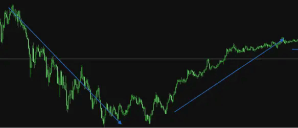
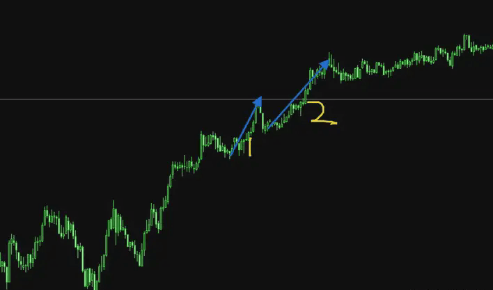
 Second, as shown in the figure below, at that time I judged in this small structure of 1 and 2 that this wave had not finished rising and would rise again for a while. The reason is that the second segment is longer than the first.
If each segment is shorter and moves slowly, it indicates that the upward momentum is diminishing. It may need to enter a correction and reversal. However, the second segment is still quite strong, even stronger than the first, indicating that there is still more to come. This is also a causal relationship.
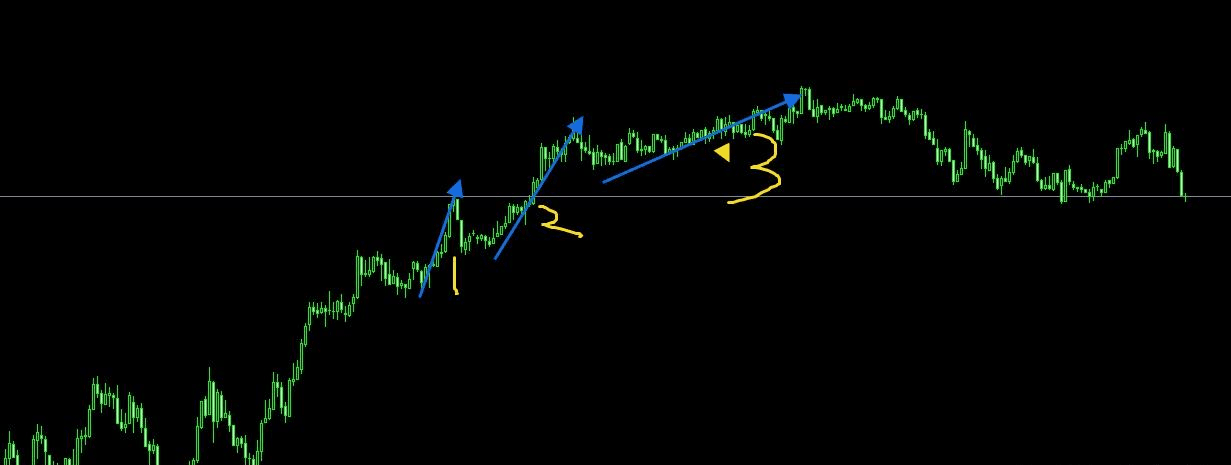
As shown in the figure above, the third phase has indeed appeared, and the market has risen slightly again, but there is no strength in the second phase's rise, it has slowed down. The market then entered a correction after the third phase. This is the system of causality.
Therefore, analyzing the market is not about analyzing small segments separately, but about looking at the overall causality. There are many technical points involved here. The example I provided is just a small technical point. If you can clarify numerous causal relationships, you will generally understand what the market is doing and what it will do in the future. This is also very helpful for strategy formulation.
Thank you for watching. I am Xiao Fei. Nice to meet everyone. Xiao Fei focuses on Ethereum contract spot laying in ambush. The team still has positions available. Hop on quickly and let you become the dealer and a winner.

