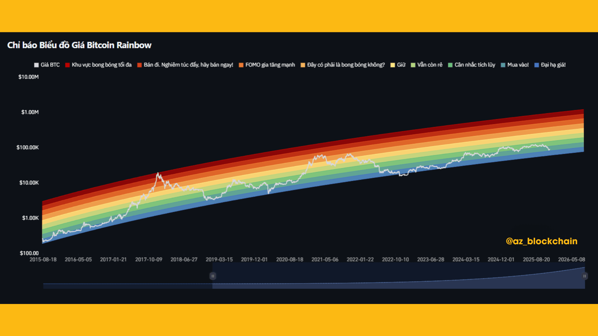
📌 Bitcoin Rainbow Chart is a long-term chart that helps assess whether BTC is in the zone: too cheap – accumulation – reasonable – FOMO – bubble.
It does not predict the future, but provides a very intuitive view of market psychology & cycles.
💠 BTC is currently in the BLUE COLOR zone → “MAJOR DISCOUNT / BUY IN!”
✨This is a zone that often appears at the beginning of a new growth cycle.
✨10 years of history shows: every time BTC is in this zone → it subsequently enters a strong upward phase lasting several months to several years.
💠 Not yet entered the yellow/orange area → Market is still far from FOMO
✨The yellow/orange/red areas are where the market is overly excited, everyone is FOMOing, and BTC is near the cycle peak.
✨Currently, BTC is still far from those areas → meaning the valuation is still cheap compared to history.

💠 The long-term trend still follows a stable growth curve
✨ Bitcoin continues to maintain a logarithmic growth trend over time.
✨ The colored areas help filter noise, making the position of the cycle clearer.
💠 Market sentiment is currently "mixed"
✨Prices are down but still in a nice buying zone → indicating short-term panic, long-term opportunity.
✨Those who are new to the market are often influenced by emotions → The Rainbow Chart helps to see the bigger picture.
🧭 Conclusion:
✨BTC is in a cheap valuation zone according to 10-year data.
✨This is usually the appropriate area for long-term accumulation, not for quick trades.
✨The next growth cycle usually starts after BTC leaves the green areas.
✨When BTC hits the yellow/orange area → that's when many people start FOMOing.

🛑 THIS IS NOT INVESTMENT ADVICE, PLEASE CONSIDER AND STAY CALM IN THE MARKET. 😘