
This is a BTC annual K-line chart that uses a logarithmic scale, which reflects the percentage change in BTC price over a year, rather than absolute price changes. From this chart, what problems can you see, my friends? I'll start by throwing out a brick to attract jade...
Firstly, the most intuitive thing is that BTC has consistently followed a four-year bull-bear cycle over the past 15 years, indicated by the '3-4-1-2' marked in the figure as one cycle, maintaining a rhythm of 3 bullish and 1 bearish, where 3-4-1 represents bullish candles (bull market) and 2 represents a bearish candle (bear market).
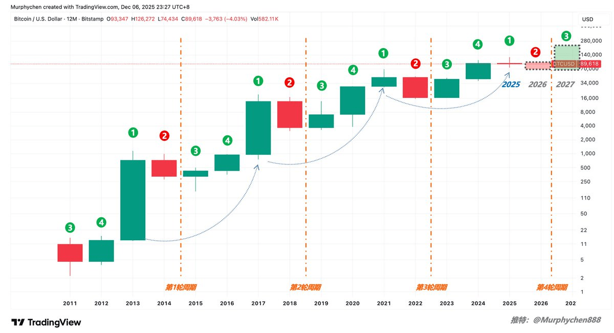
Secondly, if we compare the three K-lines of 2013, 2017, and 2021 individually (the blue dashed line in the figure), we can see that '1' is getting shorter and shorter, meaning the increase is getting smaller. And the year 2025 is just '1'.
According to the pattern, originally 1 should be a bullish candle (green bar), but now we still see a bearish candle (red bar); it is necessary for BTC to close above $93,347 at the end of December to be a bullish candle. Even so, it is still a doji, which is a situation that has never occurred in history (previously, there were always solid bullish candles).
If the December close is below $93,347 and closes with a bearish candle, it further indicates that the timing of the previous 4-year bull-bear cycle has been broken! This means that not following the rhythm of '3 bullish 1 bearish' could imply that the '2' in 2026 may not necessarily be a bearish candle.
At the same time, we observe that '2' is also getting shorter, indicating that regardless of how the year 25 ultimately turns out, 2026 is likely to only be a small segment of a solid bearish or bullish candle, meaning the drop or rise will not be significant. Moreover, if year 25 closes with a bearish candle, according to past patterns that do not allow two consecutive years of bearish candles, year 26 is more likely to close with a bullish candle.
In addition, both '1' and '2' are getting shorter, and only '3' is getting longer. Therefore, could it be that the increase in 2027 is the most significant, and by 2028, the body of the K-line shrinks again, and in 2029, it turns into a bearish candle...
From this perspective, the cycle of BTC still exists, but the timing no longer aligns with past patterns, and it may not necessarily be a 4-year transition in the future. The feeling is that 'the cycle has accelerated, and the increase has diminished.'
The reason I'm using this chart is that I believe it contains both logic and metaphysics, and is related to our 'three-line convergence' indicator. In the next article, we will use 'three-line convergence' for comparative analysis, which may lead to some very interesting discoveries.
If you have different observations, feel free to leave comments in the comment section for discussion.

